Vector typography is the use of scalable vector graphics (SVG) to create and display text in a digital format. This allows the text to be resized and displayed at any size without losing quality.
Today in this article, we will try to let you know about the whole things related to vector typography, including its importance, uses, and other facts as well.
What is Typography?
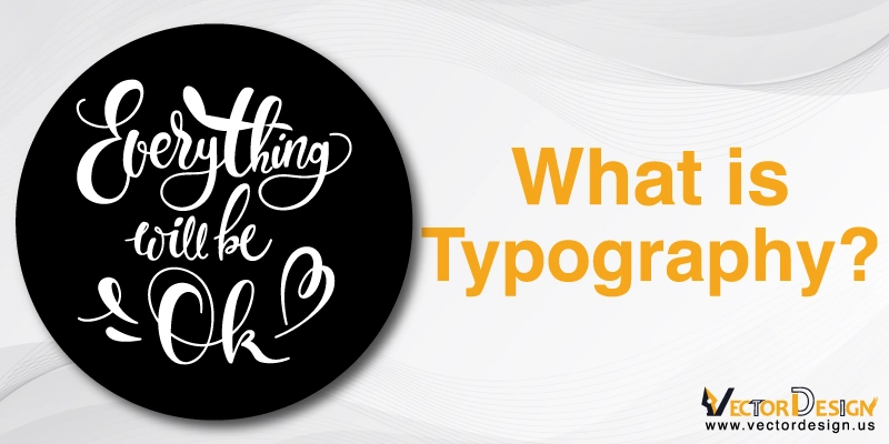
Typography is the art of arranging letters and text so that people can easily read, perceive, and get the material visually pleasing.
It comprises typeface style, appearance and formation, with the target of evoking individual feelings and communicating particular messages. Means typography creates the text more graphical or descriptive.
The development of typography began with the creation of movable type in the eleventh century.
The Gutenberg Bible is where typography made its debut and helped spark a typography revolution in the west.
Vector Typography & Fonts
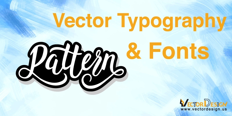
Besides whitespace, A designer’s closest friend is typography since it can transform commonplace phrases into imaginative works of art. However, typography abilities go well beyond just creating beautiful writing; they are crucial to making sure text is readable.
Typography offers a visual hierarchy that highlights the appropriate information and directs viewers as they absorb it. Finding the appropriate typographic balance can influence a design’s usability as much as its artistic worth.
Vectors are used extensively in typography. Because they provide the same straightforward scalability as vector images, vector fonts are widely used in visual design.
They are a simple option for text elements that must fit into a predetermined visual space and continue to be readable.Here are a few key concepts in typography that you should be aware of.
Typefaces
A typeface is a group of symbols, or glyphs, produced according to a certain design aesthetic.
The characters will all display comparable visual cues and proportional scaling inside each typeface so that the collection as a whole provides a unified appearance.
Spacing
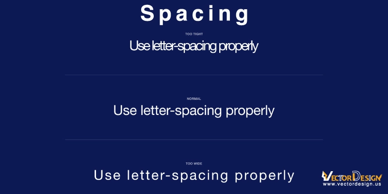
The secret to making a font readable is spacing.
Due to the increased visual density when the letter spacing is wrong, reading the text becomes more difficult. Reading letters that are too close together or too far apart makes the design less appealing as a whole.
Kerning
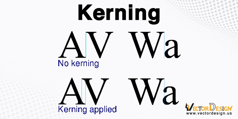
A font’s visible space between letters. It serves as a permanent variable in design development.
Manual kerning can be used in creative applications to arrange letters of various proportions utilizing placement and overlapping to provide visual appeal.
Contrast
In order to make the design visible and readable, contrast is crucial.
The Importance of Typography to a Vector Designer
The practice of typography, which uses typefaces, point sizes, and line spacing to arrange letters in a visually appealing way that is both artistic and readable, is the art of lettering. Fonts can be classified as raster or vector files, just as other forms of digital art.
When typefaces are resized, a collection of pixels in their bitmap or raster image storage become deformed. Designers using these files must produce unique assets for each application to allow for scaling. A vector typeface, on the other hand, provides complete scaling via a text file that includes a collection of points and lines coupled with mathematical equations that permit proportional scaling.
Raster pictures can be compared to well painted canvases where background colors were meticulously chosen to generate the intended final masterpiece in that they only show the top layer of a design. In a raster file, there is no way to go back and alter the layers that are present inside. It is particularly challenging to edit separate objects once they have been joined since this file type stores image data as pixels.
What makes typography so crucial?
It is a very important part of user interface design and comprises much more than just selecting charming fonts.
The overall tone of the product, severe visual hierarchy and graphic balance everything can be achieved with good typography.
So, let’s explore the significance of typography in more detail.
Typography builds brand recognition
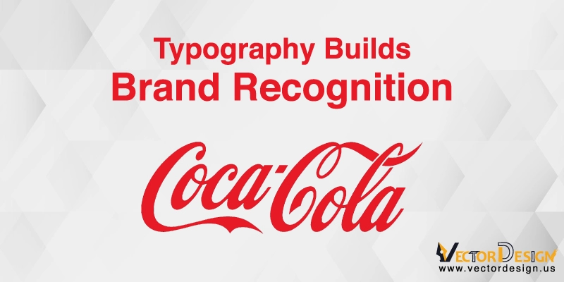
Building brand recognition using typography
Good typography will not only give your website more personality, but it will also cause your viewers to subconsciously start associating the typeface you use with your business.
You may develop a loyal user base, earn people’ trust, and advance your brand by using distinctive, consistent fonts.
Decisions are influenced by typography.
The way that consumers understand and interpret the information contained in the text is significantly influenced by the typography.
Strong fonts that support the text’s theme are far more persuasive than weaker type.
The reader’s focus is maintained through the typography
The difference between a visitor staying on your website for a minute or a half-hour could be due to typography.
Your website needs to be visually appealing and memorable, and typography is crucial to achieving these goals.
When Should a Designer Take Typography Into Account?
Typography aids in transforming language into aesthetic design components.This is something that designers frequently work with while making logos, marketing materials, and websites. Some examples are described below-
Create a logo
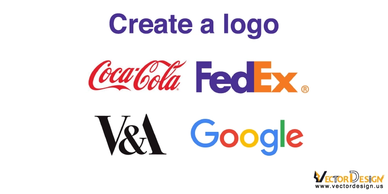
A company’s branding must include a logo. The creation of logos is frequently a lucrative entrance point for designers into a career because these high-value visual assets have the power to create or break a company. Effective logos are readable, distinctive, and use both visual and verbal features to identify the company.
Additionally, logos are shown in many various mediums, including print and digital, and in a range of sizes. The use of vector typography in logo design is crucial. That’s why designer should avoid mistakes in logo design and try to make it professional.
Flyers
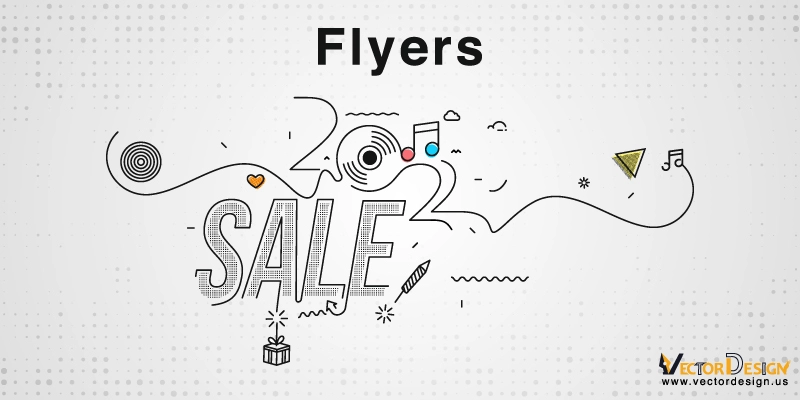
Flyers for events, promotions, and items need to strike a balance between informational content and eye-catching design. The foundation of great design is selecting the appropriate fonts to do both. The information in the flyer will be forgotten if the imagery is very distracting. Additionally, the information will be disregarded if the design is overly basic. For language communication in huge formats, vector typefaces are appropriate.
Large-format signs and message boards
Large-scale architectural signage and mobile-friendly digital graphics are just two examples of the many sizes available for marketing materials. Simpler designs that can go up in size are also more efficient. For instance, while driving, a car driver might catch a quick glimpse of a billboard. The message must be conveyed clearly by using simple language and a readable font. Vector typefaces are good for large amounts of text
Font Style
As they develop their talents, many designers investigate typeface design. Designing a typeface is a distinctive approach to add a personal touch to design work, and graphic design is a form of creative expression like any other artistic media.To create, improve, or change typography as a design element, one needs a solid understanding of vectors, letter spacing, and kerning.
In Conclusion
Typography is frequently disregarded while being an essential part of user interface design.
You’ll be well on your way to being a brilliant UI designer if you can master typography! If you are unsure of where to begin, visit your favorite websites and begin noting the typefaces they have chosen.
Since language makes up a significant portion of how we interact, graphic designers and vector artists are frequently charged with coming up with inventive visual ways to convey information. These designs frequently feature visual features at their core, but they also use linguistic components like single letters or words, small passages of copy, and longer blocks of text.
Designing with language in mind necessitates a grasp of typographic elements.
You may produce expert designs by having a thorough understanding of how vector fonts operate, what design features make fonts more or less readable, as well as how and when to change these elements.As your design abilities develop, you can combine vector typography, typefaces, and style sets to keep project outputs uniform.
FAQs
What’s the difference between typography and font?
Typography is the art and technique of arranging types to make written language readable and visually appealing when displayed. A font is a specific typeface of a certain size and style.
How is vector typography created?
Vector typography is created using a vector graphics editor, such as Adobe Illustrator or Inkscape. The designer creates the text using shapes and paths, which are then saved as an SVG file.
What are the advantages of using this?
Some advantages of using vector typography include the ability to resize the text without losing quality, the ability to create complex text effects using shapes and paths, and the ability to create text that is fully customizable and scalable.


