The nature of design is very complex. Some people like animation. On the other hand, someone may like web development. But in the case of a logo, everyone needed it perfect and unique. There is no confusion at all. So, become more conscious about the mistakes a person done in designing their logo.
We’ve had plenty of work experience designing logos, so we know how to help you guys to avoid those rookie mistakes. If you’re embarking on a fresh and unique logo design or hitting a wall with your current design of yours, here’s a roundup of the most common problems, plus our best tricks and amazing tips to get you through the process.
Logo Design Mistakes
Going through you’ll find the most common and major mistakes that happened during designing a logo.
Typographic chaos
Typography in logo design is very essential. It may make or break a design, so it’s a vital issue that you should know about your typographic ABCs. And the most important thing is that your logo should keep as simple as possible. Again, you have to still portray the intended message. For this to happen in a proper way, one must consider all types of typographic aspects of the design.
Poor font choice
As we touched on above when it is the matter of creating a new logo, choosing the right font can make or break your design. Choice of Fonts can often take as long as the creation of the logo mark itself and you should not do it briskly.
Spend some more time researching all the various fonts. It could use for the project you have, narrow them down further, and then see how each one gets with the proper logo mark. Don’t be afraid of purchasing a font.
Too complex, too abstract
Simple logos are always more memorable as they allow us for easier recognition. Yet, for the logo to be more memorable and if you want it to stand apart from the crowd. It must have some unique quality, without being too overdrawn.
Simplicity makes a logo more memorable. And also makes the logo more versatile, meaning it could work over more mediums. For example, a logo should work based on something the size of a postage stamp. And something as large as a billboard.
Relying on special effects or color
If your logo requires colors or special effects to make it a stronger one. To get around this modern era, work in a black and white mood first. And then you should add the special effects or color later. This allows you to focus on the shape and concept rather than these types of special effects.
Never use drop shadows, embossing, or another layer of styles to gloss up the logos — a good logo will stand on its own. You can also make different variations of a logo to ensure it works in color or greyscale.
Using raster images
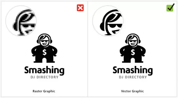
A logo should be always designed in a vector graphics program. You can use an app like Adobe Illustrator to ensure. Thus, the final logo can be scaled to any size according to need. Enabling the logo design and apply easily to other portions of the media.
We know, A vector graphic is made up of mathematically precise pear points. It ensures visual consistency across all kinds of mediums and sizes. A raster image (made out of pixels, such as what you would find in Photoshop). It can’t scale to the perfect size, which means at big sizes, the logo would be unusable. So, Use a vector graphics program when creating logos.
Settling for a monogram
One of the most common mistakes of an amateur logo designer is trying to create a monogram. And that is out of the business’ initials. Although this may sound like a smart solution at first. it’s rather difficult to build proper credibility. It is also difficult to convey an intended message with the initials of a company.
You can certainly discover this route. But don’t always settle on it unless you can create an original and creative one
Also, you should not try to shorten a business name into acronyms. until it has been around for a while or it may suit the target goals. HP, FedEx, IBM, and GM like companies never started as acronyms. They became the acronyms after many years of hard work and high-profile exposure.
Using visual clichés
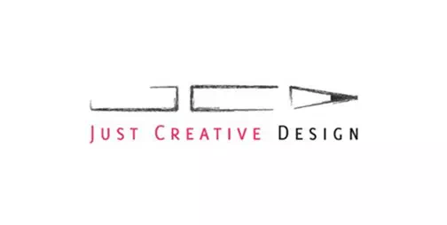
Using Light bulbs for ‘ideas’, using speech bubbles for ‘discussion’,. And using those swooshes for dynamism. These ideas are often used in the first things. To pop up into one’s head when it comes the time of brainstorming. And for the same old reason should be the first ideas get discarded.
How is your design could be unique when other logos have got the same feature and the same idea? So stay clear of these visual clichés and you should come up with an original idea and design.
Copying, stealing, or borrowing design
It is very sad and this has to say, but it’s an all-too-common practice these days. A designer just sees an idea that he likes. Then he does a quick mirror, color swap, or gets some word changed, and then calls the idea all his own.
That is not only is unethical, illegal, and downright stupid. But also you’re going to get caught sooner or later surely. It is not good to use stock or clip art either — the point of a unique logo is to be original.
Getting too much client input
A client is paying you as a professional designer. And it is obvious that he desired you to come up with a unique relevant design. so you should also direct the client to the best possible solution. The best way to do that thing is to offer your expertise feature. It is not by letting them get directly to the project (entire work). If a client asks you for a misinformed change.
you can explain why it is not such a good idea and then offer a better alternative. If they still refuse the proposal. Try sending your own design decisions as well as they suggest the design. They will often realize that their suggestions may not the best. Yet, you as a logo designer should also realize that you are not always right, so try giving the client’s some priority.
Providing too many concepts
If you got loose and linked the things to the above point. It is providing the info and introduces the client to too many options. That means the client will have too much to say about the design direction of the project. If you provide 10 ideas to a client, more often than not they will choose the idea that you consider, the ‘worst’ design. Be sure it may happen.
A good rule of thumb is to only send the idea one to three concepts that you could see working for their business. Of course, the number of concepts you send can change the form of the project to project. But once you feel confident enough as a designer. These three concepts should nail the project work on the head every time.
Not cleaning up logo files
Logo files must be one of the cleanest files you ever deliver to a client. The Node points should be kept to the smallest circle. Curve ones should be as smooth as possible and without any overlap. Shapes should be directly combined. And if the logo you made is symmetrical, it should be perfectly symmetrical. Everything about the delivered file you have should be perfect. And everything should have as minimal as possible. Imagine that the client needs to blow the logo to put on that on a side of a truck. If the logo has got any mistakes, it will now is clear and visible. Make it perfect.
Not delivering correct files to the client
You should be very careful about the delivery. Delivering the right files to the client is one way to ensure that your client shouldn’t have the chance. They never come back asking for revisions or different versions of a logo.
Going in Blind
Now think you’re a small business owner; nobody also expects you to be an artist. That means, you need to do your homework first and then you can start creating your logo. Never go blind in those things and be very careful.
Look at others and what have they done before you get an idea of where you’re headed. You can also familiarize yourself with the logos of some top-performing business classes in your field. Or browse through a list of general logos until you see something that speaks to you.
Only Thinking About the Trends
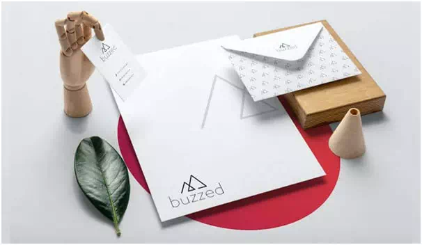
Now that you are doing your research, you’re going to find a lot of design trends that may seem super exciting. So now you may be tempted to apply them all to your new logo.
Trust me, that would be a huge mistake.
Trends always tend to turn into cliches within a year. And the last and latest association you want people to have with the business is that it’s outdated and tacky. On the flip side, your business’s logo design should be timeless.
Embracing Clutter

Sometimes, we people tend to hold on to things that we even don’t need. But this is an actual instinct you should fight against when designing a logo.
While you’re browsing in the world of logo design. You can get attached to a palette that is full of colors or a total family of fonts – and that’s awesome!
Aside from the tagline, there is nothing else to include in the logo you design. Never bother with trademark symbols like ‘™’ or copyright.
Forgetting Your Audience

Like we said above, your logo is created and supposed to intrigue your audience. You should keep it in mind that they get the best possible light. Failing to consider your audience when making the logo is like forgetting to include the main item grapes in a bottle of wine. You’ll end up with a total mess.
So always have your audience in your mind for every part of the design of the logo process. So you can create a logo that will draw them in rather than chase them away.
Choosing Fonts at Random
Choosing fonts at random is a disaster for your work. If their logo doesn’t have an icon. That means the first thing your audience will consider is sure to look at (and judge) is the text.
One of the biggest mistakes designers make with the text is to choose the first random font they see. And they don’t put any intention behind the work. You must remember that fonts carry meaning. You work for the meaning to translate to the customer. Whether you’re telling them about it. That your business is elegant and sophisticated or friendly and down-to-earth. Be real careful about that.
Throwing Colors at the Canvas
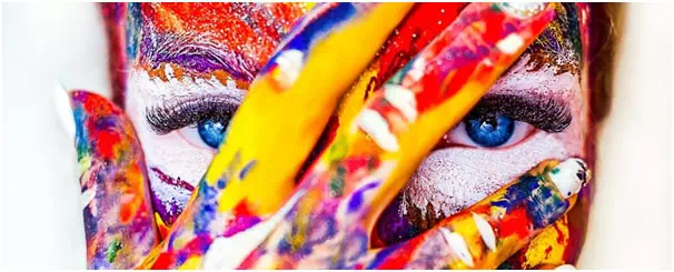
Like focusing on the fonts, and the colors that you have in your logo. Those are also going to send your audience a message about your brand. As much as you can be attached to the purples or your browns, that’s not enough to apply them to your logo.
Colors have their psychology, whether we’re consciously aware of that or not. Blue color conveys serenity and sophistication, whereas reds convey passion and energy. Blacks certainly don’t convey cheerful-terrific fun. Use the perfect one for the design.
Using the Wrong File

A high-quality file can always make the difference between an ordinary logo that gets ignored. And a perfect logo that gets celebrated.
You’ll want to put the logo everywhere once you have it. Which will mean resizing it to fit with the context in which it’s found. Unfortunately, the pixelated images and JPEGs aren’t going to cut it. And the place of resizing these files will make the logo illegible and useless.
A vector file, so, will allow resizing your logo as many times you want while preserving its actual quality.
Poor Placement

While this is all about the post-design mistakes. You can avoid those mistakes altogether only by planning around them beforehand. You’re going to resize your logo everywhere that concerns your main business. Whether that’s on the homepage of the website or your printed merchandise. So poor placement can be a disaster.
Being Inconsistent
After you have finished designing your logo and begun to use it. You might be so much tempted to play around with the way it looks.
Well, Don’t.
Have you ever noticed there’s no picture to go along with this tip? That’s an example of inconsistency – and we know that it doesn’t feel right at all!
Once you start branding with the logo, you need to stick to the old design. As the audience gets to know your brand. They’ll come to associate your new logo with your business and look out for it in the future. Please be patient.
Designed By An Amateur
A professional business should always look professional. New business owners invest a lot of time and a lot of money in property and equipment. But rarely match it by investing quite suitably in their logo design.
Here are the most common facts why many logos look amateurish:
The business owner wanted to save some money by designing the logo quickly themselves.
- A friend or relative who often claims to know a little about graphic design does it as a favor but it gets to no help ultimately.
- Sometimes the wrong people are commissioned.
- The business outsourced jobs via one of the several design websites, which are mostly populated by amateur designers.
- The job was given to an online legit company that offers cheap logos and that brings no value at all.
All of the above can result in disastrous outcomes in your business
Here are the advantages of hiring an established, expert, and professional logo designer:
- Your logo will be unique and memorable to all.
- You won’t run into any further problems down the line with reproducing it.
- Your logo will get a longer lifespan and won’t need to be redesigned in a couple of years.
- Your logo will look awesome and professional
Relies On Trends
Focusing on current logo trends is like putting a sell-by item date on a logo. You shouldn’t look up to the trends rather you should emphasize the brand image and the unique quality of the Logo. You can do one thing that you may not rely on the trends but rather make your logo in that way so people began to follow that.
Contains Stock Art
This mistake is often made by the business owners who design their logo or by amateur designers. Who is not clued to the laws on copyright? Downloading stock like vector imagery from websites such as Vectorstock is not a crime. But it could surely get you in trouble if you may incorporate it into a logo. A logo needs to be unique.
Designing For Yourself Rather Than The Client
You shouldn’t impose your personality on a client’s work. You can often spot the design a mile away; the cause is the designer’s enormous ego. If you have found a cool new font that you can’t wait to use in the logo design. Well… don’t ask yourself then if that font is truly appropriate for the business or not. If you do you’ll lose your creativity. So stay close to that.
Overly Complex
Highly detailed logo designs don’t scale well when printed or viewed in smaller sizes.
What better analogy can we have for thumbnail images than fingerprints? You’ll notice the proper intricacies of your fingerprints. Only when you are looking at them closely. As soon as you move away, those details will get lost.
When you are planning to print in small sizes, a complex design will lose detail. And in some cases will it looks like a smudge or, worse than a mistake. The more detailed image a logo has, the more information the logo viewer has to process.
Relies On Color For Its Effect
Without proper color, your great design may lose its identity. This is a very common issue. Some designers cannot wait a bit to add color to a design, and some rely on it. Choosing color should be your last decision. Be aware of that.
Has Too Many Fonts
A logo always works best with a maximum of two fonts. Using too many fonts is like you are trying to show someone a whole photo album at a stretch. Each typeface of the design is different, and the viewer needs a proper time to recognize it. Seeing too many things at once causes a mess and confusion.
A Logo With a Complex Design
Complex or detailed logos always require a large space of its to be appreciated. Your fingerprints, for example, aren’t noticed during day-to-day life. It’s when you see the designs up close that you notice the various lines and details very carefully.
Logos need to be appreciated every day. Their purpose is to be used across the platforms as well as in printed areas in different sizes. Professional graphic designers recognize this fact and ensure your logo’s design is simple. Yet captures your company’s voice perfectly.
Not Following an Intuitive Process
If you tell your team to start brainstorming some ideas, you might end up creating 3 or 300 ideas. If you tell the people of your team to choose one (with no particular guidelines, rubric, or reasoning), it may be impossible for them to narrow it down. The result? You go into an endless round of fruitless results.
If you want to save everyone’s sanity, from project manager to designer. It’s imperative to have a clear idea, an intuitive process. That process helps you create a strong and wonderful logo that works for you and your company as well.
Confusing Your Terminology
If you want any of such creative projects to go smoothly, you need everyone to get on the same page and speak the same language of requirement. Thus, it’s created important to use the right terminology.
The Fix
Know the logo definitions very carefully. The word “logo” has become a catch-all term for any kind of image related to a particular brand. But in logo design, there are specific definitions for a logomark, wordmark, or combination mark.
Logomark
For the sake of flexibility and total versatility, it’s more common for every company to have all three. Oftentimes, when people are referring to the logo, they mean the combination mark.
Not Doing Enough Research
Well, that is a big kind of mistake guys. Logo design is fundamentally a challenge of communication. How do you want to capture and communicate a brand’s essence through imagery it matters a lot? To do this very well, you need to have a deep understanding of exactly what you’re trying to communicate—or not to communicate. The more knowledge you get, the better you can do this.
Creating Your Logo Design in Color (First)
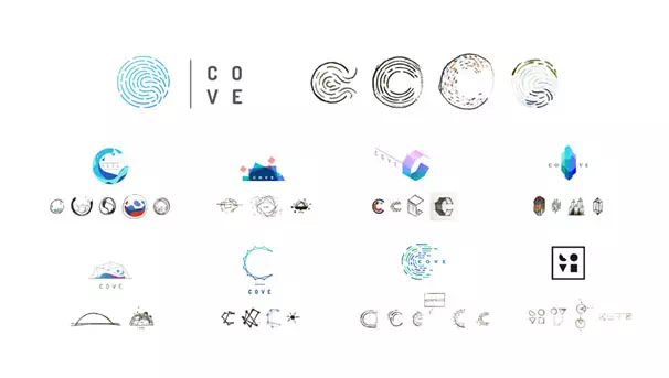
A good kind of logo stands on its own—without color. While color is an important element, of course, starting with the proper color can make it very harder to judge if your design is strong enough to use. Worse, designs that always do work can be dismissed just because someone may be thrown off by a color.
The Fix
To ensure your logo works better, design it in black and white in the first place. This will help you to narrow down your designs (as you will also likely have multiple options). Then, when you are ready to work with color, go for it.
Using the Same Types of Typography for Your Wordmark and Brand Content
When it comes to the wordmark, you want to keep the typography simple and clean. But you don’t want to use the untouched typeface for your wordmark. Why? Because the wordmark should be distinctive, unique, and a representation of the brand’s visual language.
The Fix
Sure, you can use a clean typeface as the basic inspiration (and the typeface you may choose for your brand should complement the wordmark very well), but it should be in a customized way
Using Generic Imagery
This shouldn’t have to be on this list, but we have to say about it. There is nothing fact that will make the brand yours more forgettable than the generic imagery system. In this way, Hands shaking symbolizes the community, a lightbulb symbolizes the great ideas—we think you get it.
The Fix
The point of the logo design is to find something amazing that represents your brand, not a vague idea that creates a mess. You can still use the symbolism, but be creative about that and look for those things that speak to you directly
Using Inappropriate Imagery (Without Realizing It)
The devil is in the soul details, especially when it comes to the form of design. Shapes or white space can be used there strategically to reinforce the brand message in effective ways. However, this can backfire on the design too. We’ve seen plenty of logos that unintentionally deliver the wrong message.
The Fix
When you’re so immersed in a project, it can be hard for you to see any issue. That’s why we always recommend the sanity check from someone with fresh eyes.
Making an Inflexible Logo
Your logo can be used in many ways, in many mediums of that era. It should work very well in print, online, and in different sizes in many ways. If your logo becomes too complicated, it won’t render well in smaller sizes. If it’s too generic, it won’t be distinctive enough to grab attention.
A good logo is always got future-proof, meaning that it will grow with the brand image and work for as many use cases as necessary.
The Fix
Create mockups for both the web and the print assets to get a sense of how well your logo translates
Falling Victim to Hivemind
You want that your logo needs to be unique and distinctive. Still, it’s easy to get sidetracked by the design trends or even the industry standards. This has become true in recent years, as entire industries have started to go in homogenize.
The Fix
Remember that when you’re trying to solve a problem of communication. Your designers need to be able to justify why every element of it and aesthetic choice supports your brand goals.
Not Providing Logo Guidelines
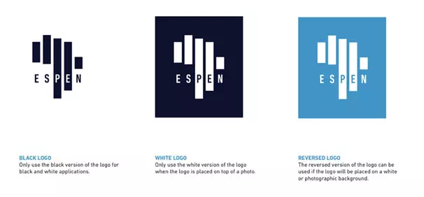
This is one of the most common rookie mistakes by far. Don’t go to all the work to create a beautiful logo design, then sabotage your brand by letting people use it any way they want.
Colors That Are Too Bright
Bright and bold colors in the logo design have been a hit for some brands. They can attract attention, and they tend to stand the compared to muted logos. They can also be good at conveying brands’ emotions, and many business people use colors in psychology as a perfect way to give their brands an edge.
Thin lines
Logos with thin lines look very nice, particularly since people are starting to appreciate the fact that and promote minimalism more and more. The problem with thin lines is that they got nice and minimalist-looking, they can also be quite difficult to scale down. Logos need to have the proper ability to be scaled down while retaining their legibility, which is why you might want to embrace thicker lines in your whole design.
Asymmetrical Layouts
Logos with an asymmetrical layout also variously used to be quite popular, as they can be quite intriguing. Asymmetry has a strong fact effect on people when it is used on logos, as it can lead consumers to view a brand as more exciting. This is why, in the past few years of this edge, I’ve seen quite a few logo designs that were crooked, misaligned, overlapping, or ill-balanced.
You might think that these logo designs should be avoided because they pick at the mindset of the people and their desire for perfection. However, that is not entirely the main problem. When the layout is asymmetrical, some of the content or the message could be lost because people might find the design distracting.
In our experience, asymmetrical layouts can also take a lot of boring time to be created. I believe that is best. You avoid these kinds of complicated logo designs this year. And save time from wasting and money too.
Arcs Over Or Under Text
Even if this approach went quite well for Amazon, it doesn’t mean it will be the same for every design out there. Using an arc in their logo is unique though. Amazon’s logo might illustrate that everything here is sold from A to Z. We believe many companies abused this nice design. So it’s become unoriginal and a total cliché for some brands.
Using bland imagery or visual clichés
How many times have you seen the lightbulb associated with ideas? Or a globe is associated with environmental causes?
These types of visual clichés are everywhere in the world of logo designs and branding trademarks. Think of a new world and ways to express these old ideas that are still recognizable but aren’t seen everywhere.
The same goes for bland imagery, such as basic shapes. Adding an amazing circle to your logo isn’t going to make it perfect. It stands out from the hundreds of other logos that include circles. While you can certainly make a circle look very unique. It takes more time and skill than using an image that isn’t bland or generic, to begin with.
Not making the logo responsive
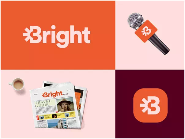
Since logos needed to be scaled for use at various sizes, your logo designs need to be very responsive.
A proper design of a logo that exists in multiple. And in slightly different variations so it displays correctly at the different scales and applications. For example, a logo displayed on an old app icon might need to be reworked for the scale vs. the same logo displayed on a current billboard.
Making your logo design so much more responsive. And it helps to maximize legibility and recognizability for each size and type of communication process for your client’s brand.
Not creating brand guidelines
Brand guidelines are very important and this plays(also known as brand style guides or usage guidelines), a vital part of any logo design package.
These guidelines let your client use the logo in future designs. And branding projects know exactly how the logo should be implemented. These guides help with the cohesion problem. It describes how different assets are coming together in a single visual narrative for your client’s company or product.
Brand guidelines can also include things like padding and margins and exact colors. And the typefaces, ways the logo should not be used. similar information about the proper usage.
Not planning at the beginning of the project
Planning is one of the critical elements at the core of a successful logo design. Designing a logo and making a plan from this perspective is very difficult. because it involves different perspectives of different people. But after all, you can have a great outcome without planning something before. Go for it and don’t make this mistake.
Creating an insulting and discriminating logo
In the 21st century, people have become highly sensitive to some issues. So, you should be very careful about this discriminating and insulting type of issue. When a company starts people first see an amazing thing which is nothing but the logo. You can destroy a company before the beginning of its journey. Be very careful about that.
Creating an attractive but an empty logo
Imagine you made a logo that is very elegant and beautiful but its content is total bullshit. People are nowadays smart enough to find out that thing. Now they started to become aware of internal beauty so give very good care to that.
Conclusion
Now take a desk and start creating your logo. Because you can avoid the mistakes that could make your logo a disaster. You have to be very careful about all the mistakes that we discussed so far and be sure about your creativity. Because besides all that your creative genius matters more in those works.
Never hesitate to make mistakes because through mistakes you learn and be a better one. You should learn through mistakes and so we have discussed the mistakes a person could do in creating a unique logo.
The process of logo design is highly focused on planning and testing. A logo needs to be more transparent and pure. If you can avoid those mistakes that are mentioned above. We promised that both you and your client will be very pleased with the final result of your project.

