Icons are like small pictures that we see on our phones or computers. They help us quickly understand and use different apps or programs. In this discussion, we’ll talk about Icon Editing in vector graphics, which is a way of making these icons look good and clear. Vector graphics are a special type of technology used to create images. This unique quality finds its pinnacle in the process of image to vector conversion. They make pictures and icons sharp and clear no matter how big or small they are. It’s like having a super clear photo that never gets blurry!
Icons are important because they make it easy for us to recognize and use things on our devices. Think of them like little signs that guide us. Without icons, everything might look confusing and be hard to find. When we talk about editing icons in vector graphics, it means changing or making these small pictures. Vector graphics allow us to edit icons without losing their quality. It’s like having a magic tool that helps us make icons look just the way we want them to.
Fundamentals of Icon Editing
Icons play an important role in helping us understand things without using words. Think about the little pictures on your phone or computer that represent apps or actions. These are icons. Here are some important things to know about icon editing:
Suggested Article- Vector Graphics and Icon Design: A Detailed Guide
Understanding the Role of Icons in Visual Communication
Icons are like tiny visual helpers. They quickly show what something is or what it does without needing a lot of explanation. Example: A magnifying glass icon often means “search.”
Importance of Consistency in Icon Design
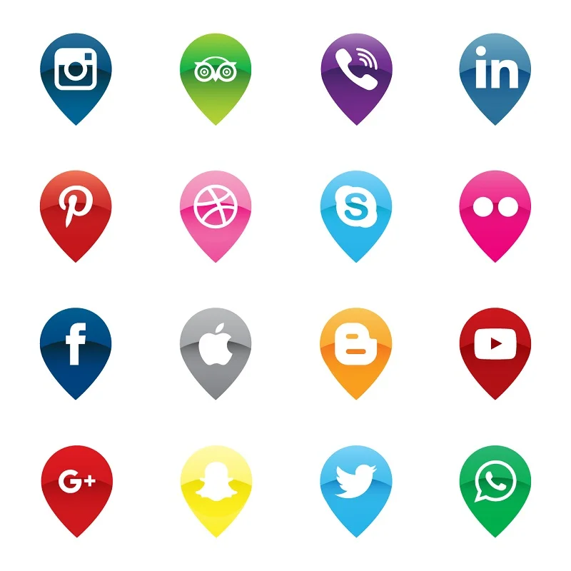
Icons should have a similar look and feel so that people can recognize them easily. Consistency makes everything more organized. Example: All social media icons have a similar style, making them easy to identify.
Key Attributes of a Well-Designed Icon
Icons need to be simple and clear. Too much detail can make them confusing. It should use colors that make sense and grab attention without being overwhelming. Example: A well-designed home icon is a simple house shape with a recognizable door and roof. Remember, icons are like a visual language that everyone can understand, so keeping them simple, consistent, and clear is super important.
Essential Techniques for Icon Editing
Creating great icons involves using important techniques. Let’s explore the simple yet powerful methods to enhance your icon editing skills.
Grid-Based Design
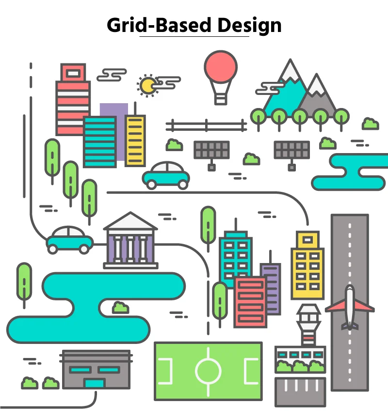
When creating icons, it’s like working on a tiny grid. Each pixel matters, so making sure everything lines up perfectly is crucial for a clean and professional look. For example: Imagine trying to build a house with misaligned bricks – it wouldn’t look right. Similarly, icons need precise alignment for a polished appearance.
Icons in a set should follow the same grid structure. This helps maintain a uniform style and makes them visually pleasing when used together. For example: just like a well-organized city follows a grid layout for its streets, icons in a set follow a grid for a neat and organized appearance.
Simplification and Clarity

Keep icons simple and focused on the essential details. Avoid unnecessary elements to make the icon easily recognizable at a glance. For example, A simplified camera icon representing photography with basic shapes instead of intricate details.
Icons should convey a single idea or action. Overcrowded icons can be confusing, so it’s crucial to keep them clean and straightforward. For example, an email icon should focus on an envelope rather than including unnecessary details to avoid confusion.
Effective Use of Colors
Choose colors that work well together and convey the intended mood or message. Harmonious color palettes enhance the overall visual appeal of icons. Example: Using a combination of soft blues and greens for icons related to nature or environmental themes. Ensure that the chosen colors are accessible to people with color vision deficiencies. High contrast and distinct shades improve visibility for a broader audience. Example: Using a combination of light and dark colors to ensure readability and clarity for all users.
Icon Exporting and Optimization
As we finalize our icons, exporting and optimizing become vital. Let’s explore these key steps to make our icons both visually appealing and functional.
Exporting Icons in Different Formats (SVG, PNG)
When saving icons, think about the format. Use SVG for flexibility and responsiveness, great for logos. PNG is good for detailed icons with clear backgrounds. Picking the right format helps your icons look good and work well on different plat forms. Top of Form
Optimizing File Sizes for Web or App Use
After creating icons, it’s important to make sure their file sizes are just right for the Internet or apps. Compression tools can reduce file sizes without losing quality, making icons load faster. Adjusting resolutions based on the platform ensures they look good on all devices. Optimizing file sizes helps maintain a smooth and efficient user experience.
Considering Accessibility and Compatibility
When working with icons, think about making them accessible to everyone. Ensure there’s enough contrast for people with visual impairments. Test icons on different devices and platforms to make sure they look good everywhere. Following guidelines for specific platforms, like iOS or Android, ensures compatibility and a seamless user experience. It’s about making icons that everyone can use and enjoy.
Tips for Creating Scalable Icons
Crafting icons that maintain their visual appeal across various sizes is an art. Here are some essential icon editing tips to ensure your icons look impeccable:
- Consistent Stroke Width: Maintain a steady line thickness for proportional scaling, ensuring a balanced and visually cohesive appearance.
- Mindful Negative Space: Pay attention to negative space to prevent visual clutter and enhance clarity, especially when resizing icons.
- Prioritize Icon Recognition: Emphasize key features to facilitate quick and reliable recognition across various sizes and contexts.
- Dynamic Color Choices: Choose vibrant and distinguishable colors that maintain visibility and legibility at different icon sizes.
- Avoid Overly Detailed Elements: Simplify complex details for smaller icons to prevent visual confusion and ensure quick comprehension.
- Iterative Testing: Regularly test and iterate on your icons at different sizes to fine-tune design elements for optimal scalability and visual appeal.
Advanced Techniques for Icon Enhancement
Enhancing icons can significantly improve the visual appeal and usability of your application or website. Here are some advanced techniques for icon enhancement:
Gradient and Shadow Usage:

Learn how to skillfully use gradients and shadows to add depth and sophistication to your icons. Explore the art of blending colors and creating realistic shadows for a polished and modern look.
Incorporating Depth and Dimensionality:

Dive into the world of three-dimensional icon design. Discover techniques to give your icons a sense of depth, making them visually engaging and dynamic.
Dynamic Elements for Interactive Icons:

Explore the incorporation of dynamic elements to make your icons interactive. Learn how to add movement or responsive elements to create a more engaging user experience.
New Styles in Making Icons
Explore exciting ways to design icons with a fresh approach, bringing creativity and innovation to visual elements. Discover the following trends:
Icons that Change for Dynamic Screens
Make icons that can adjust and look good on all kinds of screens—big or small. This way, everyone gets a nice experience no matter what device they use.
Small Actions and Moving Icons
Add tiny movements to icons, making them a bit interactive. It’s like giving your icons a little life, making things more interesting for people
Working with Augmented and Virtual Reality
Try making icons for new technologies that make things look real but aren’t. It’s like creating special icons for cool experiences with virtual or augmented reality.
Example: Creating Animated Icons for AR Applications
Show how animated icons can be used in apps that make things look real but aren’t. These moving icons can make the experience more fun and exciting for users. Just think about a cool shopping app where you can try on virtual clothes using your phone. Instead of just clicking on boring pictures, picture this: when you tap on a special hanger icon, it smoothly shows different clothes, almost like they’re magically changing right in front of you. It’s like a fun game that helps you understand how to use the app better and makes trying on virtual clothes way more exciting.
Conclusion
To sum up, when it comes to editing icons, simplicity is crucial—make them clear and easy to understand. Consistency in style ensures a cohesive look across all your icons, maintaining a unified visual identity. Achieving balance and proportion means that elements within the icons are well-distributed, enhancing overall aesthetics. Additionally, selecting colors that work harmoniously together contributes to a visually pleasing outcome.
So, don’t shy away from continuous exploration and experimentation. The world of icon design is dynamic, and your creativity can thrive through trying out new ideas. Each experiment is a stepping stone toward refining your unique style and improving your skills. So, embrace the evolving nature of icon design, find joy in the process of experimentation, and don’t hesitate to break new ground in your creative endeavors. Keep pushing your design boundaries to discover new possibilities and enhance your icon editing proficiency. Remember, the more you explore, the more your creative toolkit expands.

