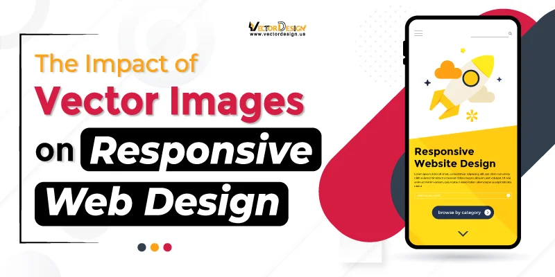
Responsive web design is like having a smart website that fits on any screen, whether it’s on a big computer or a tiny phone. It’s about making sure the website always looks good and works well, no matter what gadget someone is using. Instead of needing different websites for different things, responsive design makes one website that fits everything. It’s like having a magical site that adjusts itself to each device, making things easy and fun for users.
Vector images play a crucial role in ensuring the website looks fantastic on all devices. Unlike regular pictures, these magic images can adjust their size without getting blurry. So, whether you’re on a big computer or a small phone, these special pictures keep everything looking clear and awesome. That’s why vector images, powered by image srcset, are the heroes of responsive web design. They ensure the website fits perfectly on every screen.
In the following sections, we will delve into the specific impacts of vector images on responsive web design. We’ll explore the unique characteristics and capabilities of vector images that contribute to the seamless functioning and enhanced aesthetics of responsive websites.
What is Vector Image
A vector image is a special kind of graphic that uses math instead of dots to create pictures. What’s cool about them is that you can make them bigger or smaller, and they stay super clear—never fuzzy. They are perfect for things like logos and icons on websites.
What is Responsive Web Design
Responsive web design is like a helpful friend for websites. Imagine your website on a computer. Now switch to your phone. Here responsive design kicks in, making everything fit perfectly on your phone screen. It’s like magic! This magic is possible because of smart responsive image tricks like using flexible grids and layouts. These tricks make sure the website knows how to adjust to different devices, like big computers, medium-sized tablets, or small phones. So, no matter what gadget you use, the website stays cool, looking good and working smoothly. It’s like having a website that’s always ready to be your friend, making things easy and enjoyable for you!
Powerful Impacts of Vector Images on Responsive Web Design
Vector images make websites super cool on different screens. Here, we’ll uncover some remarkable impacts of Vector Images on Responsive Web Design
Scalability for Different Screen Sizes

Vector images are like special pictures that can change their size without getting blurry because they use math. This is really handy because it means that the pictures on websites stay sharp and look good, no matter if you’re using a big computer or a small smartphone. So, whether on a big or small screen, vector images, with the clever resizing trick of responsive image srcset, always look just right and polished on the website. It’s like they know how to fit in and look nice on any device you’re using. This clever resizing trick makes sure everything on the website appears clear and well-suited, no matter what gadget you’re using.
Faster Loading Times

Vector images are like lightweight messengers that make websites load faster. Their lightness is a key factor because it means they don’t take much time to deliver information. This speedy impact of vector images on responsive web design is super helpful, especially if you have a slower internet connection or if you’re using a phone to access websites. So, the quick loading times of websites with vector images make the whole experience smoother. It’s like a swift website courier for phone users or slower internet.
Resolution Independence

Unlike traditional images that may lose clarity when zoomed in, vector graphics, with the help of responsive image sizes, remain sharp and detailed. Resolution independence is perfect for devices with high-resolution screens. It ensures users can zoom in without losing image quality, providing a visually appealing experience, especially on devices that prioritize sharp displays.
Reduced Bandwidth Usage

Vector images are like smart data-savers; they use very little data when moving around. It’s like having a smooth and efficient system that doesn’t need lots of data to load websites. This is extra helpful in places where the internet is slow or for people who don’t have a lot of data to use. So, these efficient images help websites load fast, even with slower internet or limited data plans.
Compatibility with High-Resolution Displays

Vector images always look great, especially on devices with really good screens. They work well with these advanced screens, making sure the pictures on a website stay bright and clear. If you have a fancy screen, the website graphics will still look fantastic and vibrant. It’s like having a perfect match between the images and your cool screen, making everything look awesome.
Small Size and Lightweight
Think of these special pictures as superheroes for websites. They make websites super light, like switching from a heavy backpack to a tiny one. Because these pictures are so small, websites load really fast, especially on phones where storage and internet speed can be a bit tight. So, with the magic of image srcset, these special pictures boost websites, making them work great even with limitations.
Branding Consistency

Vector images are key to keeping a brand’s look the same on different devices. Logos and symbols made as vector graphics make sure the brand’s visual style stays identical, whether you’re on a big computer or a small phone. This sameness is crucial for making people recognize and trust the brand. It means the brand’s image doesn’t change, whether you’re looking at it on a large desktop screen or a tiny mobile device. So, these vector images play a big role in making sure a brand is easily recognized and trusted by users.
Dynamic Layouts

Responsive design, powered by versatile vector images, brings dynamic layouts to websites. This adaptability allows content to rearrange smoothly depending on the screen size and orientation. The flexibility of dynamic layouts ensures that users have an optimal viewing experience. By presenting information in a format suited to the specific device, it enhances user engagement. In essence, it’s about making sure the content looks just right, no matter what kind of device someone is using.
Vector Graphics Can Be Animated
Vector images go beyond just sitting still—they can be animated, adding a dynamic touch to websites. This dynamic quality opens the door to creative and interactive elements, enhancing user experiences. Animated vector images bring a range of possibilities, from subtle transitions to lively graphics. They contribute significantly to creating a more dynamic and visually appealing web environment. Essentially, it’s like adding a touch of life to the visuals, making the website more engaging and interesting for users.
Optimized User Experience

Vector images are the architects of a great user experience, ensuring everything runs smoothly. Their seamless adjustment to different devices creates a cohesive and user-friendly interface. This adaptability is key to presenting content in a format that’s easy to navigate. The visually pleasing nature of vector images enhances overall satisfaction for users exploring the website.
Efficient Data Transfer in Mobile Environments

In the mobile world, vector images stand out for their efficiency in data transfer. Their small file sizes play a crucial role in reducing the amount of data needed to send visual elements. This efficiency leads to quicker loading times and smoother interactions on mobile devices. This efficiency is crucial for users on mobile networks where saving data is a must. It’s like a quick, data-saving shortcut for a better mobile experience.
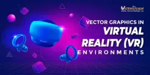
Adaptability to Emerging Technologies
Think of vector images as tech-savvy helpers for websites. They easily fit into new technologies like virtual or augmented reality. This adaptability ensures that websites using vector graphics stay cool and up-to-date with the latest tech stuff. This is a great impact of vector images on responsive web design. It’s like making the website stay futuristic and cool with all the latest tech. In a world where tech is always changing, vector images help websites stay on the front line of awesome visuals for users.
Improved Accessibility
Vector images play a key role in accessibility by staying clear when zoomed in. This feature is particularly helpful for users facing visual challenges, making sure website graphics are always clear and detailed. Enhanced accessibility ensures that a wider audience can engage with and enjoy the content. It’s like providing a clear view, making the website usable for everyone. Ultimately, Improved accessibility creates an inclusive space for more people to connect with the website content.
Simplified Maintenance and Updates
Updating a website with vector images is like easy redecorating. Changes to vector elements automatically spread across the entire site, streamlining maintenance. This simplification ensures efficient website management. It makes it easier for administrators to keep content consistently fresh and up-to-date. It’s about effortlessly managing the site for a consistent experience on all devices.
Considerations When Using Vector Images on Responsive Web Design
- Clear on All Screens: In Responsive Web Design, ensure vector images look good on any device—big or small screens.
- Size Matters: Keep vector image sizes as small as possible in Responsive Web Design. This ensures faster website loading, particularly on mobile devices.
- Adapt to Devices: In Responsive Web Design, use code to adjust vector image sizes and positions for different devices. Make sure they work well with touch gestures on phones and tablets.
- Include Everyone: In the context of Responsive Web Design, employ straightforward language to describe vector images. Additionally, carefully consider color choices to make the content accessible to everyone, regardless of their abilities.
Conclusion
Vector images are like website superheroes, especially in responsive web design. They do many important things to make websites awesome on any device. With the magic of vector images on responsive web design, they help sites load fast, look nice and work well. So, use these special pictures to make your website great. It’s like giving your website superpowers to look fantastic and work perfectly on phones, computers, and everything else. When you use vector images, your website becomes super cool and works smoothly on all sorts of screens.
FAQs
1. Q: What are vector images, and how do they differ from regular images?
Vector images use math to resize without getting blurry, staying sharp. Regular images lose quality when resized.
2. Q: How do vector images contribute to faster loading times on websites?
They’re like lightweight messengers, having small sizes, making websites load quickly. This is helpful for users with slow internet or on mobiles.
3. Q: Can vector images adapt to different screen sizes and devices?
Yes, they adjust smoothly to various screens, keeping the website polished. From big computers to small phones, they always look good.
4. Q: How do vector images enhance the user experience in responsive web design?
They make sure everything looks clear and nice, adapting layouts dynamically. This makes websites easy to use and visually pleasing.
5. Q: Are there specific benefits of using vector images in mobile environments?
Absolutely. With small sizes, they use less data for quicker loading times. This is great for users on mobiles or with limited data.
6. Q: How can vector images future-proof a website’s design?
Think of them as website superheroes, adapting to new technologies. They ensure websites stay cool and relevant as tech evolves.
