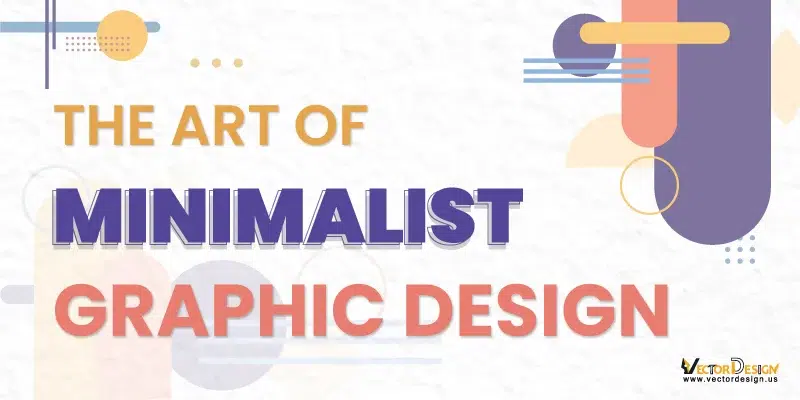
Minimalist graphic design focuses on simplicity. It uses only the most important elements to make a clear and neat visual. The idea behind minimalism is “less is more,” which means taking away anything unnecessary to focus on simplicity and usefulness. While vectorizing an image involves creating a scalable, clean representation. This aligns with minimalist graphic design, emphasizing simplicity and essential elements for impactful visuals.
Minimalist design originated in the 1960s and was popularized by artists such as Donald Judd, Dan Flavin, and Carl Andre. They believed that art should be stripped down to its essential elements and that form follows function. In the design world, minimalist Best graphic design is important because it creates designs that stay stylish over time. People like it because it’s easy to understand and looks clean. Many types of design have been influenced by these simple and purposeful principles.
What is Minimalist Graphic Design?
Minimalist graphic design is a style of creating visuals that keeps things very simple and uncluttered. It uses clean lines, basic shapes, and only a few colors. It likes to have empty space around things. Words are simple and easy to read. It wants to be useful and not too complicated. Minimalist design style is used in logos, posters, and websites to show ideas in a simple way.
Characteristics of Minimalist Design:
Simplicity: Simplicity in minimalist design means keeping things easy and not too complicated. It’s about using the most basic shapes and colors, without adding extra details. Simple designs help people understand things quickly and make them look neat and tidy. In minimalist design, simplicity is like the rule to make everything clear and simple to see and understand.
Clean Lines: In minimalist design, clean lines mean using simple and straight lines to make things look neat and organized. Instead of messy shapes, clean lines create order and simplicity, making the design smooth and straightforward. This helps achieve a balanced and uncluttered appearance, making the overall look clear, appealing, and precise.
Limited Color Palette: It means using only a small number of colors. Instead of using many different colors, a limited palette keeps things simple and cohesive. This characteristic helps create a harmonious and balanced look in the design. By choosing a few key colors, design balanced and easy to understand.
Straightforward Typography: In simple terms, Straightforward Typography means using clear and easy-to-read fonts. It’s about picking simple letter styles that make words easy to understand and don’t have fancy decorations. This helps the text in a design look neat and straightforward.
Functionality: Minimalist design is about making sure everything in the design has a job to do. It’s like not adding things to look minimalist designers aim to maintain clarity and avoid unnecessary complexity. The limited color palette is a deliberate choice to contribute to the overall simplicity and visual appeal of the design.
Negative Space: Negative Space in minimalist design is the empty area around and between things. It’s like the quiet or blank parts in a design. Designers use negative space on purpose to make the design look neat and organized. It helps to show what’s important and keeps everything from looking too crowded. In simple words, it’s the empty space that helps make the nice but including them because they’re useful. This makes the design both practical and easy to use or understand .Top of Form
Why is Minimalism Important in Graphic Design?
Minimalism is important in graphic design for several reasons. Some of them are given below:
Clarity of Message

In the art of minimalist design, clear messages happen because things are kept simple and not too busy. When there’s not a lot of extra stuff, the main message is easy to see. Minimalist design ideas use simple shapes, clean lines, and only a few colors, so people can quickly understand what’s important. It’s like making the main message stand out without too many distractions, making it easier for everyone to get to the point.
Visual Impact

When a design looks really good and catches your attention, it’s called “visual impact.” This minimalist design idea makes the design stand out and easy to remember. It works well in different places like logos, posters, or websites, making it effective and leaving a strong impression.
Adaptability:
Adaptability in minimalist design refers to how easily the design can be used in different places and situations. Because they are simple and uncluttered, they can fit well in various contexts, like on websites, in logos, or on posters. The simplicity of these designs allows them to be versatile without losing their essential qualities.
User Experience

User Experience in simple terms means how people feel and use a design, especially on websites or apps. In minimalist design, it’s about making this experience good by keeping things clean and easy to understand. This helps users navigate easily and find what they’re looking for without any confusion. This makes them happy with the design overall.
Brand Recognition

Minimalist design refers to how easily people remember and identify a brand. Minimalist logos and branding elements, with their simplicity and clean lines, are often more memorable. The simple design establishes a recognizable brand image, enhancing recall.
Reduced Cognitive Load

Simple designs in minimalism make it easier for our brains to understand things. When information is presented in a clear and straightforward way, we don’t have to think too hard to get the point. This is really helpful when trying to explain complicated stuff because the simple design makes it easy for us to take in and understand the information without feeling confused or stressed.
Focus on Essential Elements

Focus on Essential Elements in minimalist design means paying attention to the most important parts. By removing unnecessary details, the minimalist design draws attention to the key elements that matter the most. This intentional focus helps convey the main message or purpose clearly, without distractions. It also helps make the design impactful
Efficiency in Production

In simple terms, efficiency in minimalist design is about how fast and easy it is to create designs. Minimalist designs are quick to make because they use simple shapes and not too many details. This is good because it saves both time and resources, making minimalist design a practical choice for different projects.
Aesthetic Appeal

Lots of people like things that are simple and neat, and that’s why they find beauty in minimalist designs. These designs look clean and straightforward, giving off a feeling of elegance and sophistication. The special thing about them is that they look good without using too many details or fancy decorations. They create nice pictures without making things too complicated.
Cross-Cultural Communication

In minimalist design, cross-cultural communication is like talking to everyone around the world without using words. It uses simple pictures and shapes. For that, everyone, no matter where they’re from, can understand. This makes it easy for people of different languages and cultures to get the message. It’s like making designs that everyone can be a part of, promoting inclusivity, and making things clear for everyone everywhere.
How to create a minimalist graphic design?
Creating a minimalist graphic design involves the following steps:
Start with a Clear Message:
Identify the core message you want to convey through your design. A minimalist design should have a singular, clear focus.
Limit the Color Palette:
Choose a limited color palette with only a few essential colors. This helps maintain simplicity and cohesion in the design.
Use Simple Shapes and Elements:
Opt for basic and straightforward shapes and elements. Avoid unnecessary complexity and embellishments.
Prioritize Whitespace:
Embrace whitespace (empty space) to create balance and prevent the design from feeling crowded. It is a fundamental tool in minimalist graphic design, enhancing overall clarity.
Choose Clean Typography:
Select clean and simple fonts. Ensure readability and avoid using too many different fonts in a single design.
Focus on Functionality:
Every element in your design should serve a purpose. Remove anything that doesn’t contribute to the overall message or functionality.
Remember, the key is simplicity and clarity. Each design decision should serve the purpose of conveying your message in the most straightforward and visually appealing way.
10 Real-Life Examples of Minimalist Graphic Design for Inspiration:
Minimalist graphic design is characterized by simplicity, clean lines, and a focus on functionality.
Certainly! Let’s explore the characteristics of minimalism in some real-life examples of graphic design:
Logo Design: Nike’s Swoosh
Nike’s Swoosh logo nails minimalism with a single, powerful curve. It’s clean, simple, and instantly tells a story of movement and style. No fuss, just a symbol that speaks volumes globally.
Branding: Coca-Cola’s Brand Identity

Coca-Cola’s brand identity is a minimalist marvel. They stick to the basics—bold red color, distinctive font—and repeat it everywhere. This consistency, seen on every bottle and ad, is like a visual signature. It’s simple but powerful. It creates an unmistakable and timeless brand image through thoughtful graphic design.
Print Advertising: IKEA Catalogs

IKEA’s print ads are minimalistic perfection. With clean layouts and simple images, each page is a visual treat. The design is consistent, making it easy to navigate and letting the products shine without unnecessary clutter.
Website Design: Airbnb’s Website

With a clean layout, simple icons, and a cohesive color scheme, Airbnb’s site is a minimalist dream. It’s visually pleasing and super easy to find your way around, putting the spotlight on what matters most: your next adventure.
Package Design: Hershey’s Chocolate Bar Wrapper
Clear typography, simple graphics, and a recognizable layout make it stand out on the shelves. The minimalist design’s simplicity contributes to the chocolate’s visual appeal, showcasing the brand’s iconic image without unnecessary complexity.
Movie Poster: “The Dark Knight” (2008):

The Dark Knight” poster is a minimalist masterpiece. The bold bat symbol against a dark backdrop creates a visually striking design, thanks to graphic designers who skillfully blend simplicity and impact to attract audiences.
Digital Marketing: Social Media Graphics for Starbucks

Starbucks nails digital marketing with minimalist social media graphics. Their graphics are clean and consistent, making sure you always know it’s Starbucks when you scroll through your feed. It’s like a little coffee break for your eyes.
Magazine Layout: National Geographic Magazine

National Geographic’s magazine layout is minimalist magic. It’s clean, captivating, and consistent. The design lets the content shine with a simple yet visually pleasing approach, making every page a journey into the world of exploration and discovery.
User Interface (UI) Design: Spotify App
 Design")
The clean interface, simple icons, and consistent design make it user-friendly. It’s like a well-organized music library in your pocket, where every detail serves a purpose without overwhelming you. The minimalist approach ensures a smooth and enjoyable music-listening experience.
Book Cover Design: “The Great Gatsby” Book Cover

The “Great Gatsby” book cover embraces minimalism with straightforward typography and simple imagery, capturing the story’s essence elegantly and without unnecessary details.
These examples showcase how minimalist graphic design can be applied across different disciplines, emphasizing simplicity, functionality, and a focus on essential elements.
Conclusion:
To summarize, minimalist graphic design is like telling a powerful story with just a few pictures. It’s about keeping things simple and functional, like a recipe for design success that never gets old. Using a limited color palette and timeless principles, it adapts to different needs, creating memorable visual experiences.
Beyond looking good, minimalist graphic design is also about being mindful of the world. It encourages us to be eco-friendly and think about sustainability, taking a step toward a cleaner design future. As we keep going in graphic design, let’s carry the spirit of minimalism—simple, purposeful, and creative. This way, we create designs that not only look great but also make a lasting impact in a mindful world.
FAQ
Are there specific color schemes associated with minimalist design?
Answer: Minimalist designs often feature neutral colors like white, black, and gray. However, bold and contrasting colors are also used to create visual impact.
Is minimalist design suitable for all types of graphic projects?
Answer: Yes, minimalist design is versatile and can be applied to various projects, including logos, websites, posters, and branding materials.
How does minimalist design contribute to effective communication?
Answer: By stripping away unnecessary elements, minimalist design focuses on the essentials, making the message clear and easily understood.
Can I use images in minimalist graphic design?
Answer: Yes, images can be used in minimalist design, but they are often simplified or abstracted to fit the overall clean and simple aesthetic.
Is there a specific font style associated with minimalist typography?
Answer: Sans-serif fonts are commonly used in minimalist design for their clean and modern appearance. Simple and legible typefaces are preferred.
How can minimalist design be adapted for digital platforms?
Answer: For digital platforms, prioritize a clean and intuitive user interface. Use ample whitespace and focus on creating a seamless and user-friendly experience.
Related Blog