The entertainment and Art industry is quite big and extremely competitive. So you need to invest more if you are an entrepreneur. A logo is an effective start considering its numerous benefits. It helps the company to build an image and represents the name prestigiously. For all of that, you need the entertainment & arts logo to be well designed and meaningful.
Entertainment & Arts Logo
Whether we are starting a film production house, a music promotion, an art gallery, or anything related to the entertainment industry, the logo is the key to reaching the fans. And for that, you need hours of heavy toiled research to figure out the symbols, colors, fonts that are mostly used for such logos.
But on your behalf, we have gathered here several tips and sample logo pictures to take you through which designs are most suitable for your needings. Check out our list of 25 Best Entertainment & Arts Logo Design Ideas–
Plural Entertainment:
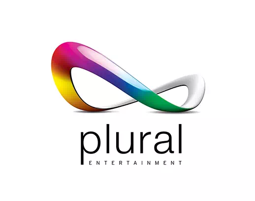
The logo of Plural Entertainment is an elegant and posh-looking logo with its minimalistic features and relatable design. The illustration that you see here is shaped like a masquerade mask that connects the design with the entrainment industry. Such meaningful and relatable features enhance the effectiveness of the logo and make it ‘long term memorable’. For an effortless and simply gorgeous logo design, you can take inspiration from this sample logo.
Everything Entertainment:
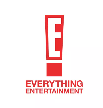
The logo of Everything Entertainment is a fun design. The red mark is an exclamatory mark with that the initial letter of the company. It makes the logo unique as well as eye-catching. Another notable feature of the logo is its bold red color that is catchy and easily recognizable. So for your entertainment logo, instead of straight designs, you can choose such striking elements that can help in the business growth in the long run.
Imagination Studios:
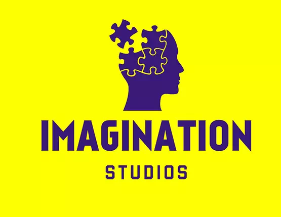
The whole point of a logo is to grab public attention by being engaging and appealing. And the logo of Imagination Studios is the perfect example of an engaging and intriguing design. The human head and puzzle block combination have created a creative look and related the design with the company’s innate perspectives. The monochromic design has given the logo more depth and integrity.
Related Post
• Education Logo Design Ideas
• 40+ Best Apparel Logo Design Ideas
• Best Consulting and Business Logo Design Ideas
WB:
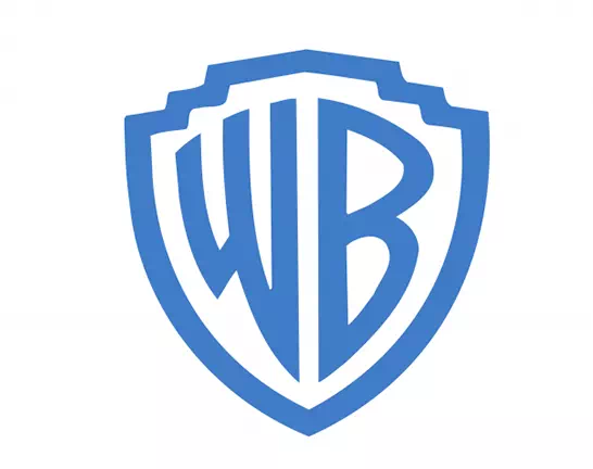
The famous entertainment company Warner Bros has chosen a letter mark design for its logo. So there are the initial letters of the company’s name in a strikingly bright blue shade. The specialty of the logo is its borders that have made the design an emblem one. lettermark logos are easy to remember and recognize. Also, it shows your confidence and aesthetic approach. So, it’s a good pick for an entertainment logo.
Prime Videos:
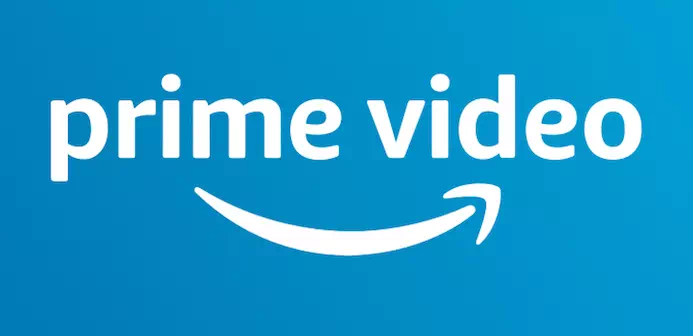
Prime Video is the OTT platform of Amazon.com. As it is a part of the Amazon Company the logo design also bears the identity. We must have seen the logo of Amazon and its famous arrow (or smile!). So the Prime Video also has an arrow in its design representing its brand face. For your entertainment logo, you can add such a peculiar feature in the design so that it becomes an integral part of the company.
Rivo Entertainment:
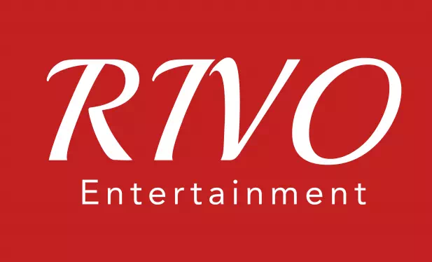
The logo of Rivo Entertainment is a simple wordmark logo that is readable and communicative. Though it lacks illustrations or other elements, the design does not fail to attract the eyes. In fact, since it is straight and clean, people get attached to it quicker than anything. So if you wish to choose a wordmark for your entertainment logo, you can do that with full confidence and creativity.
NCB Home Entertainment:
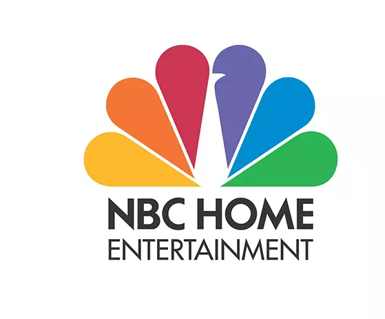
The logo of NBC Home Entertainment is a charming design with lots of colors. The design is a combination of an impressive illustration that represents the entertainment company’s perspectives. The illustration is secretly a peacock with those colors in its wings. How cool is that! Also, the basic serif font has given a balanced look to the logo. Whatever you design for your logo, keep a balance between the elements. Otherwise, it may seem overdone and disorganized.
Walt Disney Pictures:
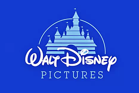
Walt Disney is famous for its fancy customized font that keeps appearing in everything they are involved in. And it is the main element of their logos. So if you wish to keep your entertainment company compatible with others and survive for a long time, you need to build a strong brand face that will keep you remembered. In all these cases, the logo of Walt Disney can inspire you greatly.
Art Gallery of Alberta:
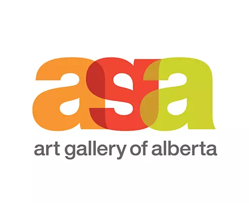
If you are looking for an inspirational logo design for your art gallery, here you go. The logo of the Art Gallery of Alberta is a colorful wordmark logo that can be defined as a letter mark as well. The illustration that they have created is a letter mark design with the initial letters of the company name. You can use as many colors as you want for art logos.
One Art Nation:
The logo of One Art Nation is absolutely gorgeous in its combination style. The logo contains an outstanding illustration of a colorful paper bird that has made the design relatable and relevant to the art company. Also, the mismatched font size in the typography has added more charm to the design. When you are designing your own logo, experiment with different elements to bring out the most suitable one.
Raad Art Gallery:
The logo of Raad Art Gallery is a basic wordmark design except for its colorful brushed line as a detailing. This little element has uplifted the entire mood of the logo and taken it to a new height. As it is an art logo, the colorful brushed line makes much sense and relates it to the company’s services. Following this idea, you can make your art logo perfectly meaningful and relevant.
The Red Gate:
For creating an awesome art logo, you can experiment and play with colors. And who says a monochrome is not an option for that? The sample logo has played with red brilliantly making the logo a lot more fascinating and attractive. When you use a single color make sure it is vivid and bright enough to give the logo the much-needed bold look. This will bring you clients and help your business to grow more.
Lost Lane Entertainment:
The logo of Lost Lane inspires you to go out of the box and bring out the most extensive idea. It is a wordmark logo where you can see the design is not so simple. The designer has used the initial letters to mingle with the road lines, therefore, making the whole logo surreal and enthusiastic. So, if you feel adventurous while designing the logo, go for experimenting with something like this.
Juke Fox:
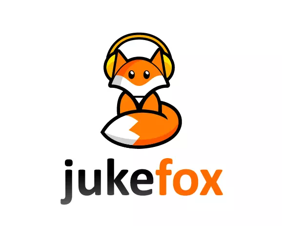
Here you have a fun logo design idea for the entertainment business. It is a mascot logo with the namesake of the company ‘fox’.The mascot has made the logo identical and recognizable. If you create a logo like this, small wonder it will be memorable and immortal. People seem to engage with such designs more than any other logotypes. So choose a symbolic mascot that can compliment your company well.
Happy Warrior Media:
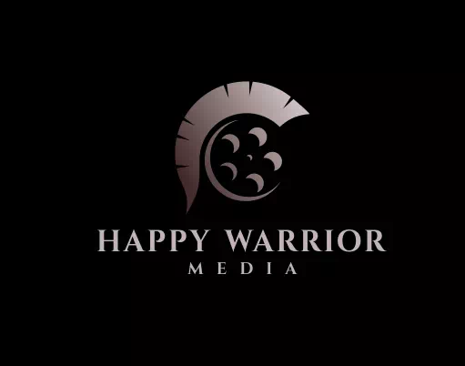
The logo of Happy Warrior media is a dark logo with an identical film reel as its illustration. The reel symbol connects the logo with the company’s concerns. The dark-themed design has given it a mystical look that is hard to ignore and forget. So instead of going for vivid, colorful logos, you can choose a dark theme to design your entertainment logo.
Powerhouse Entertainment:
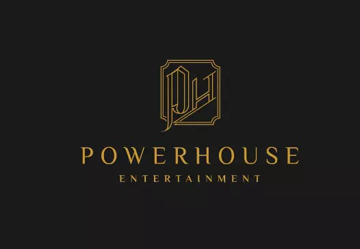
Line art is a great option for designing entertainment logos as they look minimal, elegant, and comprehensive. If you like to decorate your entertainment logo with abstract figurative design, line art is the best idea. The logo of Powerhouse entertainment is a monochrome logo with a line art design. The illustration is created with the initial letters of the company which looks like a lettermark design. You can make any type of illustration suitable for your company with line art.
Clayton gallery:
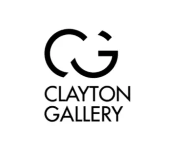
The logo of Clayton Gallery is a wordmark logo with a monogram design. As you know Monogram refers to the combination of two to three words in a symbolic shape. The CG combination is an example of that. It is a common practice in logo designs as it creates an identical sign that helps the company to stay in memory. Also, the all-black color has given a new dimension to its look.
Little Art Pills:
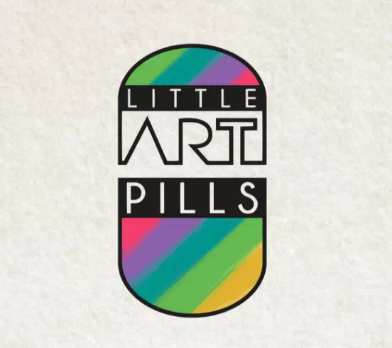
Here is another cool art logo design idea for you. The Little Art Pills is a colorful logo that has the shape of a pill making the design related to the company. The use of different colors has made the logo lively and cheerful. Also, the fonts are there to add more sense as an art logo. So, if you want the logo to represent your art gallery holistically, this can be your inspiration.
The Center for The Arts:
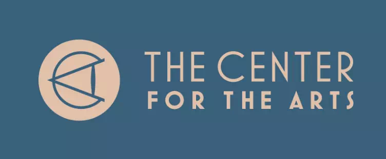
The logo of The Center For The Arts is a combination logo with typography and a monogram. But the monogram here is not with every initial letter rather with the important word’s initial letters. More precisely, C and A have been used to create the symbol. Following this trick, you can make people see what you want them to see through your logo design.
Image Entertainment:
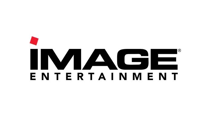
In the sample logo, if there was not the red dot, it would be probably a basic black-colored logo with no specialty. But the designer has put the red dot intelligently and made the logo way too lively and spirited. The point is a small change can bring a big difference in the look of the logo design. You never know which will work perfectly, so keep on experimenting.
Monkey Business Fun House:
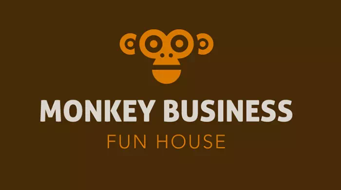
The logo of Monkey Business Fun House, as the name suggests is a fun design. It has a symbolic illustration that is actually a reel but looks like a monkey head. This is how the design has got super relevant from the company’s perspective. Also, the dual-color combination has made the logo more attractive and effective in customer engagement. Overall, such designs are great for entertainment logos.
Blizzard Entertainment:
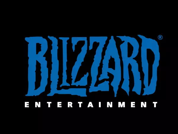
When you design a wordmark logo, make sure you choose a font that will define your purposes well. For instance, the logo of Blizzard Entertainment has a creepy font that looks scary yet attractive. Such striking features make the logo more effective in its services. Anyway, before choosing the font, you must experiment with different types and sizes as in the end, the font is everything for a wordmark logo.
Art Attack:
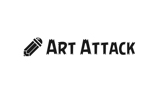
For an art gallery logo, you can use brushed, decorative fonts as they resemble the business more than anything. For example, the logo of Art Attack has used a hand-drawn font in all uppercase letters with a bold weight. Along with that, there is a pencil symbol in the logo to make sense as an art logo. All the elements have worked together brilliantly to make the logo meaningful and memorable.
De Serres:
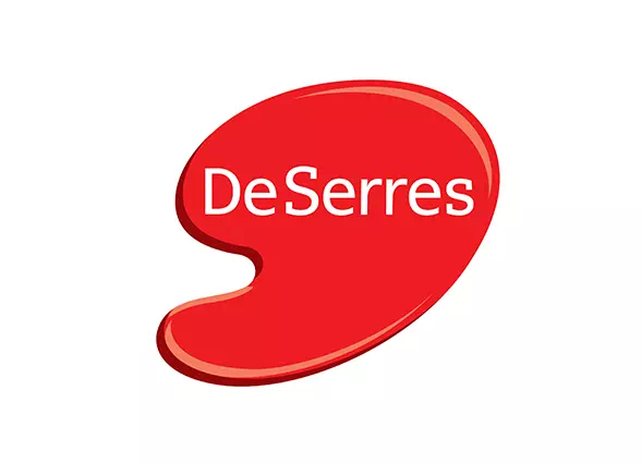
The logo of De Serres is a creative and inspirational logo design for those who want to experiment with shapes and styles. It is a wordmark logo. But as you can see it is not very basic. The most amazing feature of the design is its spilled color symbol that looks not only magnificent but also very attractive. To avoid haphazardness, the designer has kept the font simple.
The Art Store:
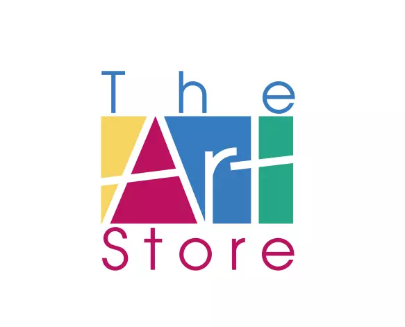
The last idea is for art logos again. When you are creating a unique logo for your art gallery or store, you cannot go wrong with colors. You can use colors thoughtfully and creatively to make your logo look vibrant and stunning. The logo of The Art Store has proved it. It is a wordmark logo in its surface level but if you dig deep, the logo is extremely creative for its peculiar style of using colors.
Now that we have reached the end of our list, it is your turn to let your creativity fly. While designing an entertainment and art logo for your startup, don’t follow regular trends and styles blindly. Instead, follow your ideas and creative thoughts to establish a new trend. And we hope this list will help you with that.