If you are about to start a kindergarten, a nursery, or a school, a well-designed logo to demonstrate its aims and perspectives is one of many essential things. The logo acts as your mouthpiece and creates a communicative approach between the institution and the students. A logo not only communicates with people but also becomes an inevitable part of the institution and spreads the name even more. So, there is no way to underestimate its necessity. So you should read this education logo design idea.
Education Logo Design
Education logos mostly look relatable with cons like books, pens, pencils, boards, and many more. You can different shapes, patterns, and logotypes according to your requirements. Depending on your institution type, the logo design will be customized. For example, if it is a nursery school, the design can be a bit fun and colorful.
Looking for ideas, here you have our holistic list of 25 Best Education Logo Design Ideas.
We have listed some renowned logos to give you ideas about which logos have done great.
University of Cambridge:
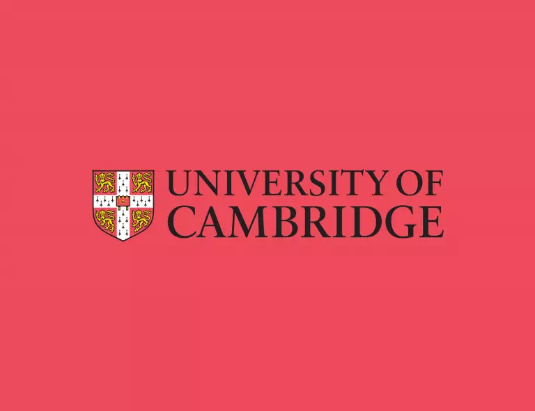
The logo of the University of Cambridge represents their standard and quality to a great extent. The design is fascinating with its shield-shaped illustration that has four golden lions and a closed bible. The design is known as the coat of arms for the university. So you can understand the value of a well-designed logo for educational institutions. Also, the designer has used a customized font in the typography.
SkillShare:
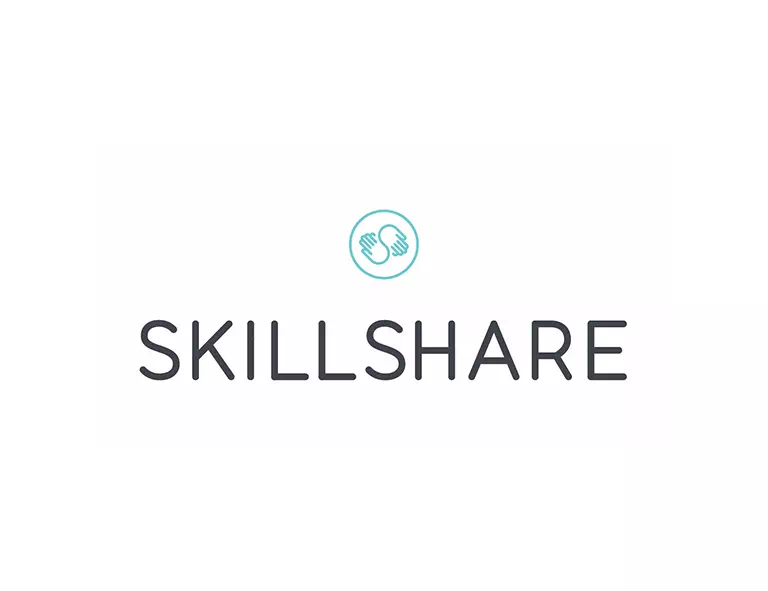
The logo of SkillShare is a typography-based logo with a little complimentary illustration. The font is a basic serif font that is clean and easily readable. The illustration is a significant one as it shows two hands in the shape of the letter S. It represents the institution’s motto of sharing skills with others. That is how you can present the perspectives of your schools or coaching centers through the logo design.
Hexagon Books:
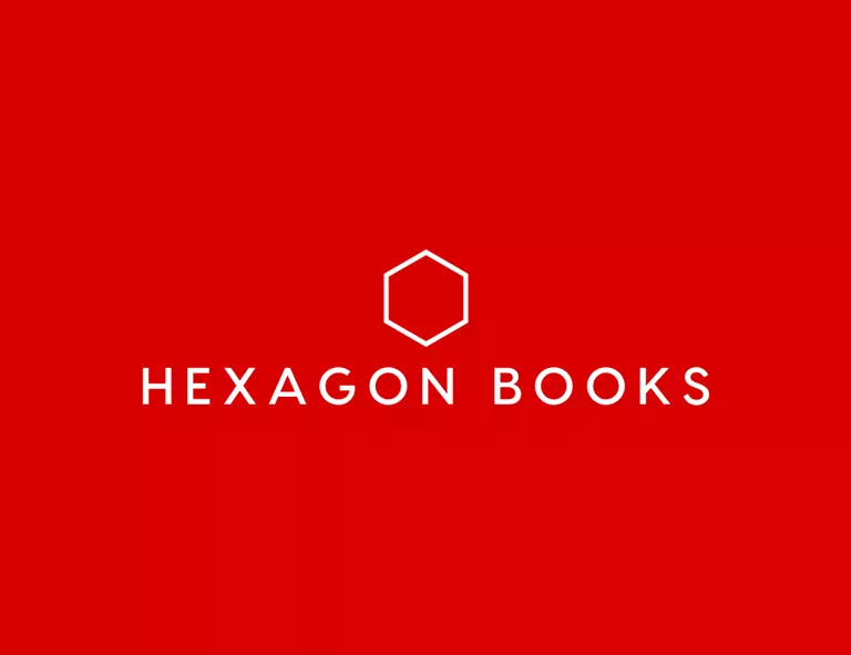
The logo of Hexagon Books is a modern design with minimal features. It is mainly a typography-based design. The illustration is there to complement the typography. It is a hexagon shape that perfectly resembles the name. The design is effortless, yet it gives the logo a much more professional look. If typography seems too simple to you, go for such combination styles.
Aspire Academy:
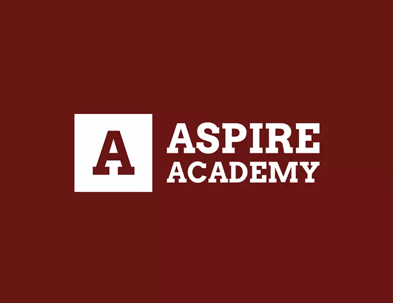
The logo of Aspire Academy is another inspiration logo design idea for you. It can be categorized as a wordmark logo. Wordmark logos only contain typography making them super simple yet, smart-looking and elegant. It makes the logo phenomenal and timeless. Also, the logos become easy to remember and recognize. Besides, this design is perfectly suitable for education logos. So, if you don’t like fancy designs go for this idea.
Public Academy of Computer Education:
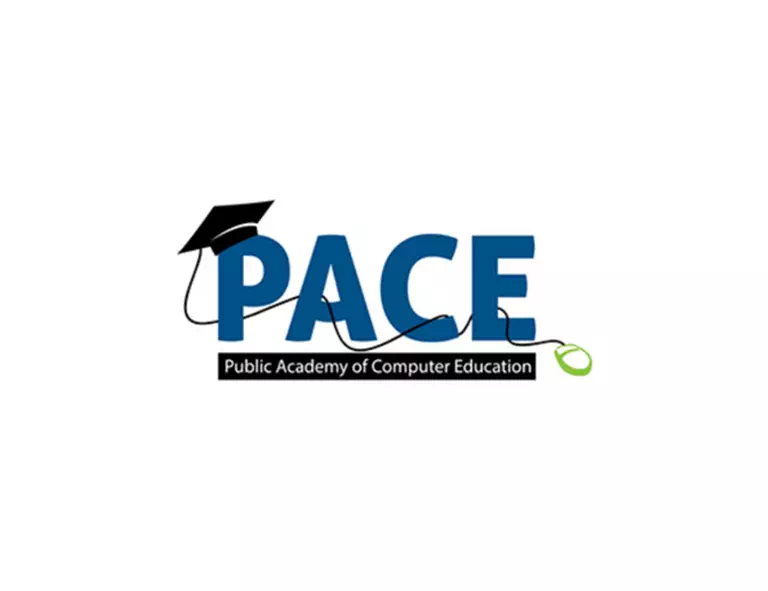
If your educational institution’s name is wordy and big, you can take the initial letters of each word and make a short version of the name in the logo design. It will help people remember the name as well as the institution. The logo of the Public Academy of Computer Education has done a similar thing. The designer has added a few details like the mouse and the hat to make the design more fitting and relatable.
Indiana University:

The logo of Indiana University is another combination design that you can follow. It has a bold, thick typeface along with an illustration. The trident represents the university’s standard and oath to do something good. It also gives a trustworthy look which has taken the logo to another level. So if you need a logo that is simple and effortless, here you go.
UBC:

The logo of The University of British Columbia is a brilliant design and you can get your inspiration from it as well. The logo design consists of a crest that has three waves line and a setting sun beneath it. They represent the university’s core motto of responsibility and quality-full education field. It is a classic university logo design suitable for schools, colleges, or other institutions for educational purposes.
Austin College:
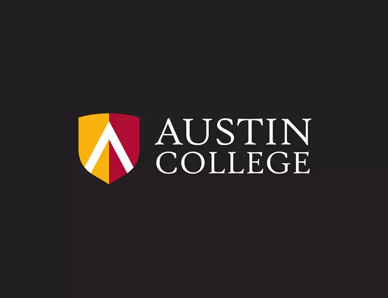
The logo of Austin College is quite simple yet elegant on its own. It has a shield-shaped illustration that contains two complementary colors. The rest of the design is typography. Such designs are mostly perfect for educational logos as they are timeless and non-fancy designs. Try to bring out a perspective of your institution and show that through the logo design. It will make the logo successful as well as worthy.
NCC Education:
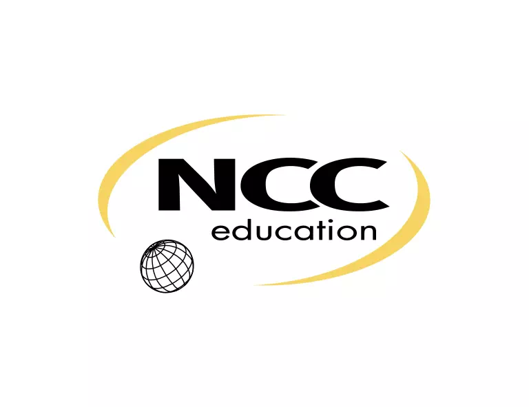
The logo of NCC Education is a combination design with a thick gothic font and identical illustrations. The global icon of the logo represents the institution’s approaches for students from all over the world. This little icon has lifted the logo’s entire look positively. However, the logo is quite compact and minimal in design. So, it can be one of your inspirations for creating the exclusive logo for your educational institutions.
WHC Training:
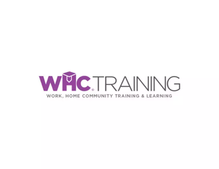
If you want your logo to contain a little more and convey certain messages, this sample logo will show you the way. The logo of WHC Training has written their services and mottos in the logo design so that they reach people easily. It is an intelligent way to make people interested and engaged. Also, to make the logo more interesting, they have added a graduate hat on top of the letter ‘H’ that has made a meaningful depiction of the institution.
Abbey Creek Elementary:
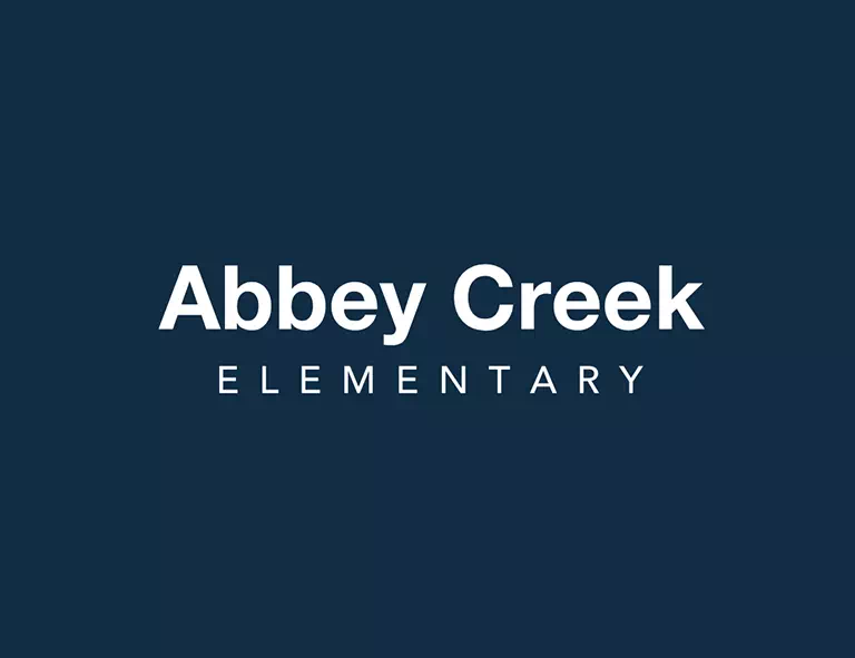
The logo of Abbey Creek Elementary is a wordmark logo that contains only the typography. This genre of logo designing is both minimal and modern. And the best part is that it suits all types of logos. So, you can choose it to design your education logos. Select a font that will complement the logo design even more. You can use different sizes to write the name which will make the logo exceptional and unparalleled.
Redbridge Academy:
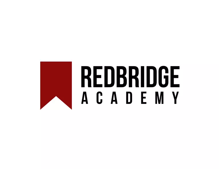
Illustrations can make your logo more vibrant and communicative. So, using the perfect illustration brings a visible change in the logo design. For educational logos, choose straighter and simpler illustrations that will depict your motives and mottos successfully. The logo of Redbridge Academy has a simple illustration along with the bold typeface in the design. It looks intelligent and thoughtful as an education logo.
Mark Sauter School Committee:
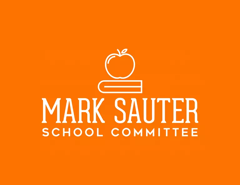
Education logos are not always dull and Lifeless. Rather, you can bring life into them through your creative ideas. Depending on your institution type, you can design the logo. The logo of the Mark Sauter School Committee has an illustration of an apple and a pencil, representing its approaches and motives symbolically. The fancy font has added a balanced look to the logo.
Book Education:
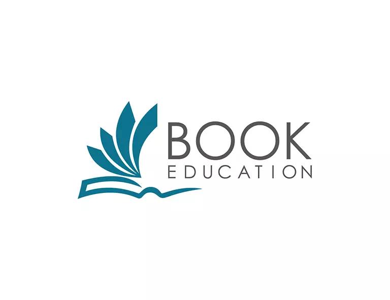
The logo of Book Education is fabulous with its combination design. There is an identical illustration of a half-open book that gives the hint about the purposes and perspectives of the logo. The blue color represents friendliness and warmth that makes the logo mood-lifting and recognizable. Overall, the design is minimal and modern. If you want a logo that will look straight but serves the purposes, you can create a design similar to this.
Lynda.com:

To create a logo for your personal educational platform, you can choose mascot logos. Mascots are fantastic for making any logo way too memorable and identical. A meaningful and relatable mascot can make the logo purposes successful. Besides, they help people to recognize your institution without any hassle. So to convey your approaches through the logo, choose a thoughtful mascot design.
Smartfun.co:

If you are about to start a kindergarten or kid’s learning center, a fun logo will represent the approach better. You can either go for an illustration or a mascot design. The logo of Smartfun. co has a mascot-based logo design that has a robot holding the bulb. This mascot makes the logo more lively and creative. Also, it’s a great attention-grabbing technique.
Mujo:
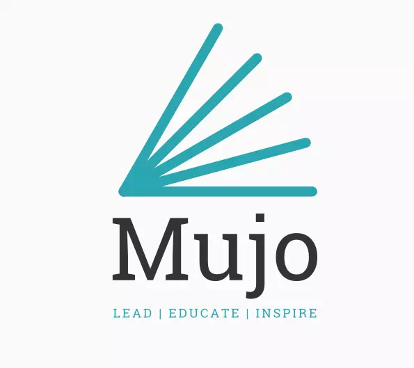
The logo of Mujo is another combination design that has added a tagline. The tagline helps people to know the institution better. It also makes a great first impression. Besides, the logo has a figurative illustration that says about the institution’s perspectives and motives. The color combination has played a pretty important role in making the logo lively and vibrant.
Educrib:
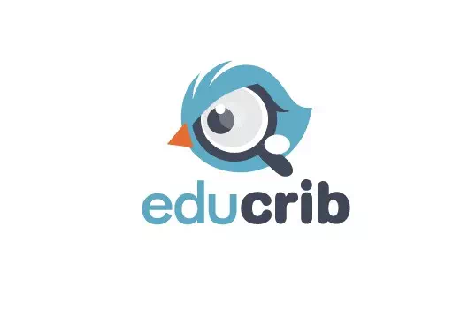
Apart from using a regular, basic font, a fancy one can bring a remarkable change in the logo design. The logo of Educrib has shown you the way. The designer has used a bubbly font to write the institution’s name. The illustration is a bird pattern with a magnifying glass in it. The blue-black-white combination has created an attractive look that is hard to ignore.
eTeacher Group:
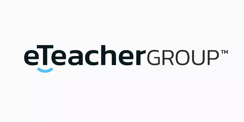
Wordmark style is the best choice if you want the logo simple and modern. There are ample fields of experimenting with this style as well. For example, the logo of eTeacher Group is a wordmark design. The letter T has a little curvy line under it which has formed a smiley look. It’s a great way to make the wordmark logo a bit much interesting and eye-catching.
Coppell Music Academy:
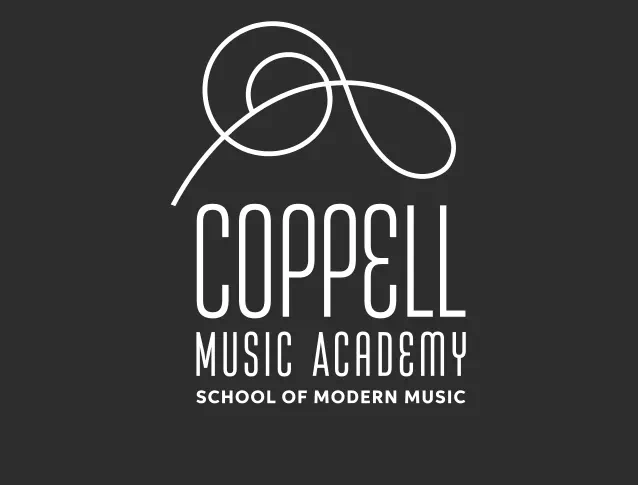
The logo of Coppell Music Academy is a line-art design in combination with typography. The line art has been used to draw a music note making the logo relatable with the institution’s purposes. Another experimental thing to notice- the combined style of the two fonts. The designer has used two different fonts to make a difference between the name and the tagline. This technique helps a lot, if you have a lot to say through the logo.
a2z Academy:
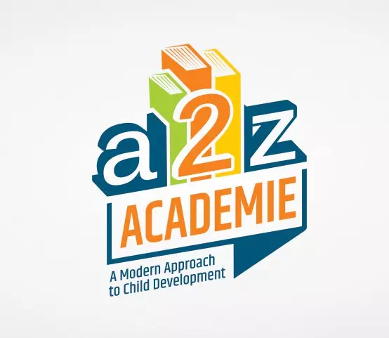
The logo of a2z Academie is a highly inspirational logo if you are looking for an idea to design a nursery or a kindergarten logo. It is a 3D design with lots of colors and customized font. The illustration shows three books that depict the institution’s type and its purpose. Depending on your institution type, you can experiment with different styles and patterns. It will help you to get an exclusive design for your cause that is not only unique but also creative.
Edoocate:
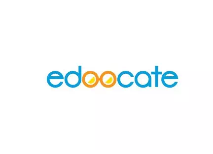
The logo of the Edoocate is another wordmark logo with creative approaches. The double O is changed in a form of a reading glass making the logo relatable and significant. The color is also different there to make a visible difference between the two parts. That is how you can experiment with a wordmark that will make the logo more fitting and suitable for your educational institution.
Sint Rombouts College:
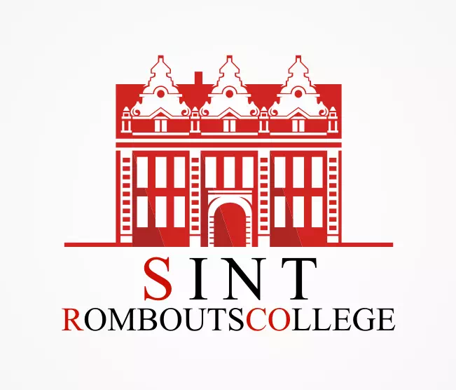
The logo of Sint Rombouts College is a classic college/university logo design with Victorian inspiration. The entire illustration is a red and white combination. It is a building shape, perfectly hinting at the institution’s type. The font is sans-serif that has balanced the look. All of the features have contributed to making the logo an outstanding design that can inspire others.
Cram The Exam.com:
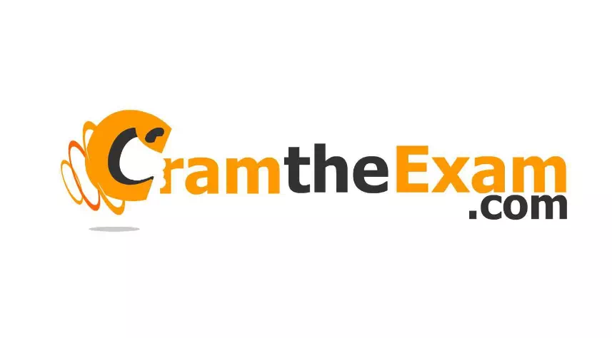
Cram the Exam.com is a fun logo design idea for you. If experimenting is your cup of tea, this design will inspire you to do more. The letter C and R are created in a funky style while the rest of the letters are normal. Despite being a wordmark style, the logo is on another level thanks to its unusual design. So, experiment with creative ideas can take the design to a new height.
Saigon Star International School:
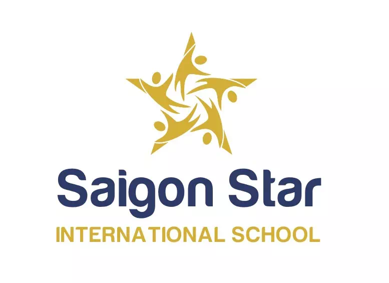
The logo of Saigon Star International School is a two-colored logo in a combination style. Using two complementary colors makes a contrast look that becomes eye-catching and impressive. Choosing a warm tone of color and combining it with a cool-toned color creates a successful color combination. The sample logo has a deep blue color with a pale golden combination that perfectly complements each other.
So you see, we have collected almost all types of logo designs that you may find useful for creating your education logo. From wordmark to line art, you have them all. Now it is your time to combine more creativity with your skills and ideas.