In the clothing industry, a logo is like a brand’s signature. It’s the special symbol that shows what the brand is all about. Whether it’s a big fashion company or a small one, the logo is the first thing people notice. Clothing brand logo tells a story about the brand and helps people remember it.
This article is all about why logos are so important in the clothing business and how they can help a brand succeed. We’ll also share 25 cool apparel logo design ideas to inspire and teach you how to create a logo that makes your brand stand out. So, if you want to make your clothing brand unique and awesome, keep reading!
What is Apparel Logo?
An apparel logo is like a special picture for clothing companies. It’s like the brand’s signature. You see it on clothes, tags, and in ads. logo of clothing brand helps people remember and recognize the brand. The logo is made to match the brand’s style and what it stands for. So, when you see the logo, you know what kind of clothes and style to expect from that brand.
25 Best Apparel Logo Design Ideas
Designing a logo for your clothing brand is important. Your logo should show what your brand is about and look interesting. In this collection, we present 25 of the best apparel logo design ideas. Whether you want a classic, simple or modern design, these ideas will give you inspiration for your clothing brand logo.
Thread and Needle
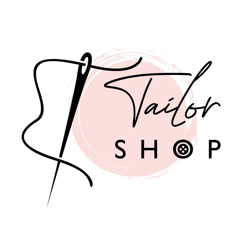
“Thread and Needle” means using a picture of a sewing needle and a piece of thread in your logo. It shows that your brand is good at making clothes carefully. This logo also represents how you sew things with a needle and thread. When people see this logo, they know your brand makes clothes with care and skill.
Fashionable Font
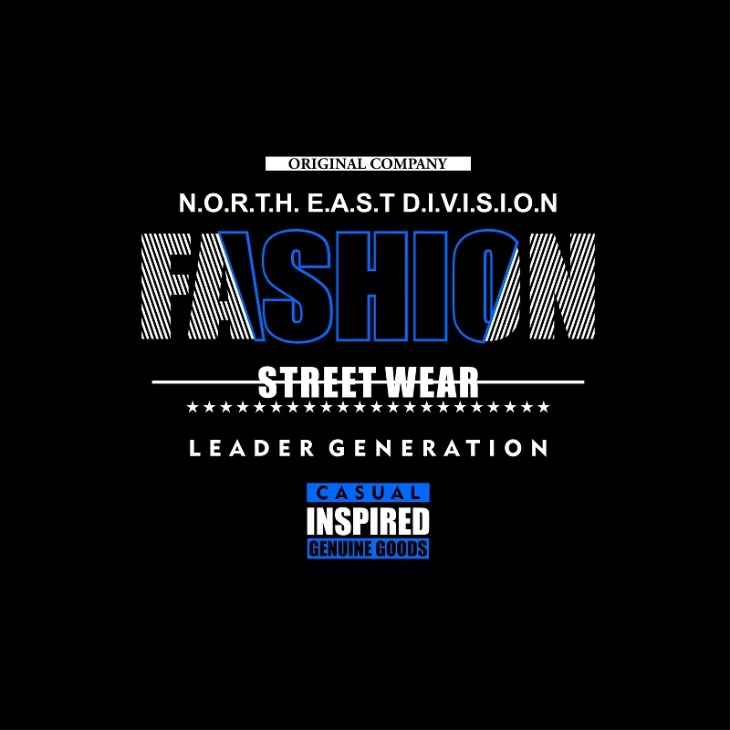
“Fashionable Font” is using a stylish and cool way to write your brand’s name in your logo. It’s like making your brand’s name look really nice and modern. This makes your logo catch people’s attention and gives it a fashionable and stylish feeling. With a “Fashionable Font” in your logo, people see your brand as trendy and stylish.
Abstract Clothing
“Abstract Clothing” means using creative shapes and patterns to show clothes in a unique and artistic way. Instead of showing real clothes, it uses interesting designs. This makes your logo look imaginative and special, like a piece of art. It shows your creative and unique fashion.
Minimalist Chic
“Minimalist Chic” in your logo is about keeping things stylishly simple. It’s like having just the essential elements that look really classy and modern. This style is all about simplicity. It makes your logo look elegant and fashionable. “Minimalist Chic” in your logo signals clean and classy style of your brand.
Vintage Retro
“Vintage retro” in your logo gives a nostalgic, old-fashioned feel, like styles from the past. It’s like going back in time to give your logo charming touch. This thing will add a classy touch to the logo.
Fashion Sketch
Imagine a simple drawing of stylish clothes in your logo. It shows that your brand is creative and knows about fashion. It’s like having a little fashion picture in your logo. This sketch tells people that your brand is good at picking out stylish looks.
Hanger Hook
Think of the hook where you hang your clothes in a closet. Using this in your logo says your brand is all about clothing. It’s like a small hint that says, “We really like clothes!”
Folded Fabric
Imagine a logo with a picture of neatly folded fabric. It shows your brand’s focus on quality materials and attention to detail. Customers will see your logo and think of quality and attention to detail. This makes them more likely to choose your brand for its dedication to excellence.
Clothing Tag
Think of a logo with a clothing label; it means your brand is all about clothes. This label is a clear way to say, “We make clothes.” It also adds an authentic touch to your logo. It makes logo look genuine and real. It’s a simple but powerful symbol of your brand’s identity and commitment to clothing.
High-Heel Glam
Using an image of a fancy high-heeled shoe in your logo can add glamour and sophistication. When people see this in your logo, they’ll think of style and grace. It attracts people who enjoy luxury and chic fashion.
Trendy Accessories
You can use stylish things like sunglasses, jewelry, or bags in your logo. It suggests your brand offers fashionable accessories, not just clothes. This apparel logo design idea is suitable for the customers looking for stylish products beyond clothing.
Fabric Roll
Think about a logo with a roll of fabric, like the ones you find in a tailor’s shop. This creative image represents that your brand deals with high-quality materials. It’s like saying, “We know fabrics well and use the best ones.” Fabric roll can reassure customers about the quality of your brand.
Button Detail
Buttons in logo can show that your brand cares a lot about the small details in fashion design. It represents you pay attention to the little things making clothes special. This attention to detail can make your brand stand out as a choice for quality.
Fashion Boutique
Picture a fancy, exclusive store for clothes as part of your logo. It suggests that your brand offers high-end, exclusive fashion. This thing makes customers feel special. Fashion Boutique logo can attract customers looking for premium fashion experiences and products.
Elegant Dress
A logo with a fancy dress tells people your brand is about dressing up and looking nice. This apparel logo design idea makes people think of dressing nicely for special occasions. It’s a guarantee of style that customers can rely on.
Scissor Detail
Imagine a logo with scissors as part of the design. This logo shows your carefulness about cutting and making clothes just right. Your care can attract people who want clothes that are well-made and high-quality. Your logo communicates precision in craftsmanship.
Clothing Rack
Create a logo with a rack full of hanging clothes. It tells people that your brand is all about clothes. Your logo becomes a visual representation of your brand’s core focus. This logo is a great choice for those looking for clothes and fashion.
Sunglasses Style
You can use a logo reflecting the essence of different sunglasses styles. This apparel logo design idea shows your brand’s commitment to fashionable eyewear choices. Customers will see it as a symbol of your dedication. They will see your logo as a sign of being up-to-date with the latest trends in eye fashion.
Textile Patterns
Imagine a logo with lovely fabric-like patterns. These patterns add a special touch to your brand. It makes your brand memorable. Customers will associate your brand with creativity and style.
Fashion Crown
Logo with a crown is a symbol of royalty and prestige. It’s like saying, “We offer fashion fit for kings and queens.” This regal touch adds a sense of luxury and exclusivity to your brand. Customers will associate your brand with high-end fashion and sophistication.
Couture Elegance
A logo with “couture elegance” implies your brand focuses on high-class, tasteful fashion. It signals sophistication and style. This blend of style and refinement attracts customers who like elegant clothing.
Fashion Forward Arrow
Create a logo with an arrow that points forward. Arrow symbolizing progress and staying ahead of the fashion curve. It shows your moving toward the latest trends. This forward-thinking approach appeals to fashion-forward customers. Your logo becomes a representation of staying ahead of the style game.
Trendy Palette Swatch
A swatch of colors in logo represents your work with the coolest color trends. This palette of trendy colors adds a modern and fashionable vibe to your brand. Customers will see your logo as a sign of staying current with color trends.
Sewing Machine
Envision a logo that incorporates a sewing machine. Sewing machine is a symbol of meticulous craftsmanship and attention to detail. This machine is the heart of clothing creation. It can attract customers who value well-crafted and thoughtfully designed clothing.
Fashioned Hat
A “Fashioned Hat” in a logo refers to the image of a stylish and well-designed hat. This hat can symbolize elegance and a focus on stylish accessories in your brand. When people see this hat in your logo, they may associate your brand with fashionable headwear and a sense of style.
Benefits of a Great Logo in the Apparel Sector
Welcome to our exploration of how a great apparel logo design benefits the clothing sector. Whether you’re a clothing logo creator or a fashion brand, the power of a strong logo cannot be underestimated. In this part, we will delve into the myriad benefits that a well-crafted logo can offer in the world of apparel.
- Easy to Recognize: A good fashion logo design helps people quickly know your clothing brand. When they see it often, they remember it easily.
- Looks Professional: It makes your clothing business seem serious and trustworthy. This logo shows that you’re good at what you do.
- Makes a Good First Impression: Your logo is usually the first thing people see from your brand. If it looks good, it can make people interested in your clothes right away.
- Stands Out: In a big market with lots of clothing brands, a unique and good-looking logo helps your brand be different and get noticed.
- Keeps Things Consistent: A great logo helps your brand look the same on everything, like labels and websites. This makes your brand stronger and easier to recognize.
- Connects Emotionally: A powerful logo can make people feel something special about your brand. fashion logo design can show what your brand values, making people feel connected to it.
Conclusion
A good logo is like a brand’s face. It’s the first thing people notice. Your unique clothing brand logo represents your brand’s style and values. It can make your brand stand out in the competitive clothing industry. These showcased apparel logo design ideas prove that a carefully made logo can have a big impact on clothing brands. Your logo is your brand’s visual ambassador. It can help build strong connections with your customers. So, embrace the power of a great logo for your apparel brand’s success.
FAQs
1. Why is a logo important for my apparel brand?
A logo represents your brand, helps it stand out, and leaves a lasting impression.
2. How can a well-designed logo benefit my clothing brand?
It builds recognition, showcases your style, and fosters trust and professionalism.
3. Are these logo ideas suitable for all apparel brands?
Yes, they’re versatile for casual, high fashion, or sportswear brands.
4. Can I customize these ideas to match my brand?
Absolutely, tailor them to your brand’s colors, fonts, and style.
5. Do I need a professional designer for these ideas?
While recommended, you can use these ideas as a starting point with design software or a logo maker.
6. How can I make my logo stand out in a competitive market?
Create a unique and memorable design that resonates with your audience and reflects your brand’s values and style.
Related Blog

