According to the world-famous designer Paul Rand, “A logo is rarely a description of a business. A logo derives meaning from the quality of the thing it symbolizes, not the other way around.” Creative logo design ideas give you the best way to highlight your business in this competitive world.
Logos are one of the most essential parts of a business. It is like a flag that represents identity along with purpose and goal.
Creative Logo Design Ideas
Anyway, designing logos are not very difficult. But when it comes to relevance and coherence with the subject, you must think need creativity and lots of ideas in your brain.
We are listing 100+ creative logo design ideas for you here. No matter if you are a pro-designer or just a beginner, we hope that this list will help you.
Movers:

You can show the purpose of your product through creative logos. Here, the Movers clearly show that they help in moving homes. The logo very well illustrates their purpose and what service they provide to people by their logo.
Databerry:

You can create an effective and engaging logo by targeting the image and its connotation. The logo of Databerry shows such an example. Their simplistic logo shows their organic approaches along with tech-related concepts.
Burj Khalifa:
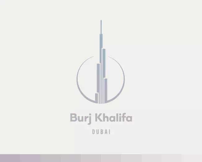
Sometimes you don’t need to brainstorm day and night to find a creative way to design the logo. Burj Khalifa has chosen to use the structure of the original establishment as its logo. The logo is simple yet very effective and attractive.
Yoga Australia:
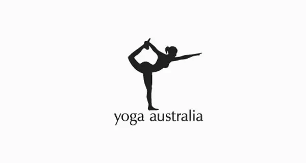
Yoga Australia is another creative logo design example. If you carefully look at the logo, you can see the woman’s hand and leg have made the map of Australia. Also, she has made a yoga pose. So the logo clearly shows the name and purpose of the company.
Lion Bird:
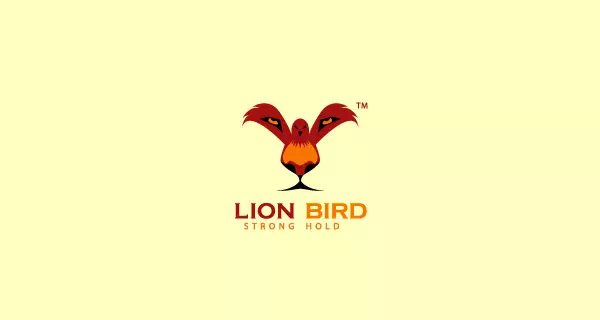
The logo of Lion Bird is the combination of a Lion and a bird. It is super energetic and eye-catching as a logo. This type of logo makes the brand feel strong and bold. This logo is designed by Nashifan.
Loveclip:
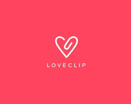
It is a minimalistic and cute logo design. The clip here has taken a shape of a ‘love’ sign. You can create such logos using two different things together creatively.
Motion Animated Studio:
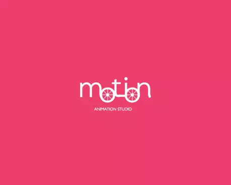
The logo of Motion Animated Studio presents an animated look through the design. When you will look at it, you may feel the dynamic vibe of the logo. Here lies the success of the logo’s whole purpose.
Open:
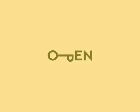
If you want to go a bit more creative while designing the logo, take inspiration from this logo. The designer has used the letter ‘p’ for the symbol of the key so that the visualization is meaningful and relatable with the name or the brand.
Lab:
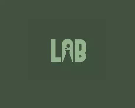
It is another example of creative logo design. The lab here shows a symbol of a laboratory item along with the name. The letter ‘A’ has taken a different look to show it. What can be more attractive than such a minimal yet meaningful logo?
Freelancer:
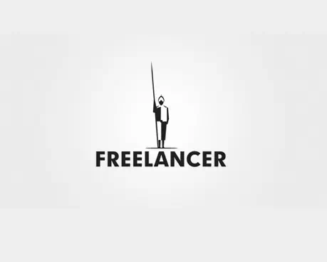
The logo of Freelancer has a ‘Lancer in its design. Though freelancer does not mean a man holding a lance still presents creative visualizations with the design. It is an intelligent way of making a relatable logo.
Bison:
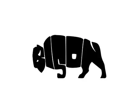
A super creative way to design an attractive logo is to combine words with a picture. For example, the logo of Bison here is designed with the words that spell it. And the words have taken the shape of a bison. Similarly, you can create more logos by combining words with the picture creatively.
Spartan Golf Club:
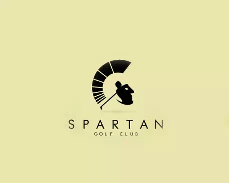
This logo is all about visualization. You can find a golfer here and the whole picture looks like a Spartan wearing helmet. It is as relatable as eye-catching for a viewer.
Human:
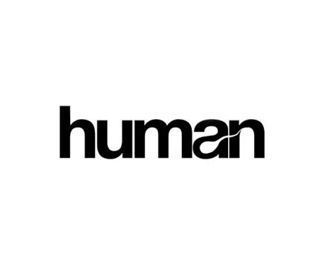
Can you find out why the logo is so creative and meaningful? Look carefully to find the little symbol of ‘life’ in the ‘human’. The logo is a perfect example of a minimalistic design that is relevant and noticeable.
Seven Sparrows:
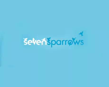
You can go quirky while designing the logo. For inspiration, look at this sample logo here. The name suggests seven sparrows and you can find 7 little sparrows here and there within the logo. It is as fun as relatable with the name.
Music Dog:
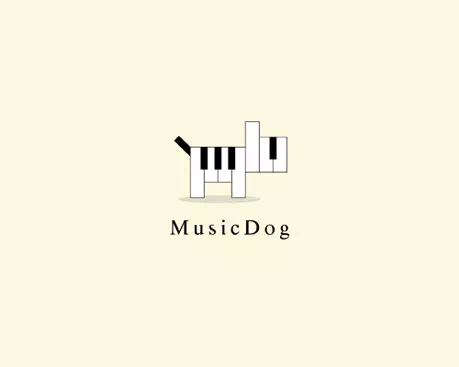
Here is another example of combining two pictures to present the meaning and purpose of the logo. The sample logo of Music Dog has the combination of a piano and a dog. The piano looks like a cute small dog that is catchy and creative.
Golf Eye:
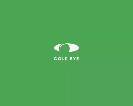
The golf-ball has looked like an eye in this logo. The name is ‘Golf Eye’ and you cannot ask for a more relatable logo other than this one. It gives you a new perspective on thinking about creative logo design.
Page Fold:
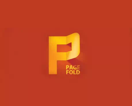
You can make 3D effects for designing creative logos. The logo of Page Fold shows the letter ‘P’ as a page getting folded. The 3D effect gives a nice visual illusion here. You can use the idea to design more creative logos.
Martini House:
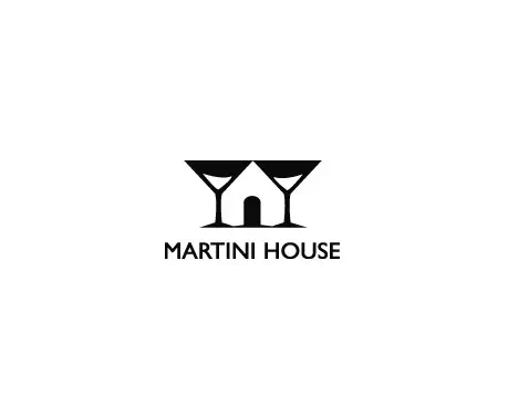
The logo of Martini House is designed with two different pictures which are relevant to the name. Here two martini glasses have formed a house-like shape presenting the name and meaning. Also, the design is super attractive and to the point.
Sushi:
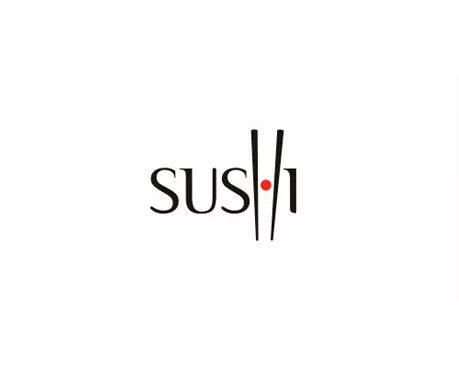
Sushi is a simplistic logo design that can be a perfect sample for those designers who do not want to make an elaborate logo. The sample here is very minimalistic. The designer has only changed one letter and given it a ‘chop-stick-like shape. Who does not immediately relate chopsticks with sushi?
Horror Films:
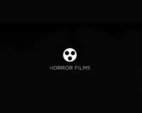
Here is one more minimalistic logo design idea for lazy designers. You do not need always need to present the logo with much detailed design. The logo of Horror Films has only used a little symbol that at the same time looks like a face and the film. It is not so much doing but you cannot deny the creativity of the designer.
Antarctica:
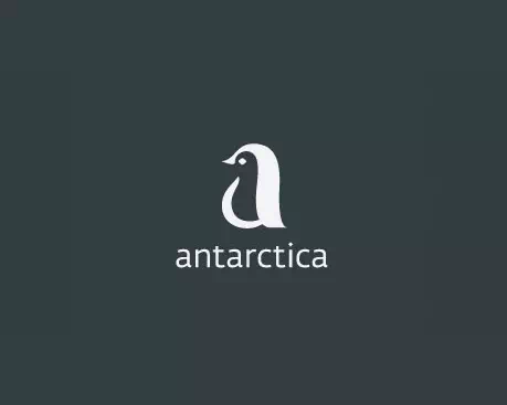
What is the most obvious thing that comes to your mind when you heard of Antarctica? Undoubtedly, those black and white Penguins. Keeping that in mind the logo of Antarctica presents a Penguin shape with the letter ‘a’. The color combination is also noticeable here.
Art Sharks:
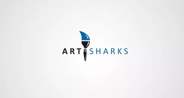
The logo of the Art Sharks is a perfect example of a creative logo design. Art is written in black along with a brush. Besides sharks is written in blue and there is a shark fin as well. the logo can be a good inspiration for those designers who want to take their logo designs to the next level.
Hope For African Children Initiative ( HACI)
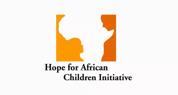
The logo of HACI has two different perspectives. If you look at it carefully, you can find the map of Africa. Also, there is a child and a woman which is relevant to the project name. The whole logo here is giving an optimistic vibe along with pointing at its purposes.
Sony VAIO:
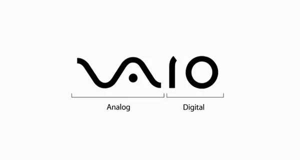
Sony VAIO is a famous and well-known logo design. You may have seen it countless times. But do you ever watch it to find the hidden meaning? Well, the front portion of the word “VAIO’ is designed like the analog symbol and the later portion is presenting a digital symbol. We all know digital is relatable with ‘1’ and ‘0’. That is how the logo is presenting the brand’s identity and perspective through the logo design.
Amazon:
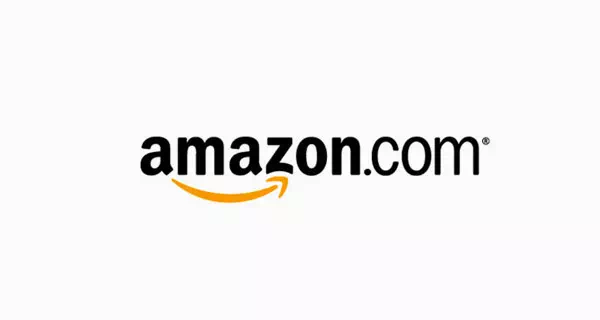
The logo of Amazon is another famous logo for its hidden meaning and creative design. At the first glance, the logo is nothing but only the name. But when you look at it carefully, you can see there is an arrow from the letter ‘a’ to ‘z’ suggesting everything that you need can be found here. Also, it presents a smiley face which sets an optimistic look and positive perspective.
Bear:
The logo of Bear is for those designers who want to design logos with a simple yet attractive look. This sample logo has a small simple bear head which goes perfectly with the writing. Nothing elaborate here still you cannot ignore the creative approach of the whole logo design.
Getfit Gym:

Another cool idea to create a creative logo is playing with the letters. For instance, the logo of Getfit Gym has used the first letters of the two words to create the look of a dumbbell. This is how it shows the purpose of the company clearly.
Paint:
The letter P here is looking like a paintbrush. This logo is well-designed with a minimal yet effective concept of creativity. Similarly, you can design one letter making it relevant to the subject.
Wine and Pepper:
The logo of Wine and Pepper is super cute and has a playful design. The upper portion of the logo is a wine bottle while the lower portion is a pepper. You can use the idea for creating food logos or restaurant name logos.
Coffee Night:
The logo of the coffee night is nothing of any clever design or visual illusion. It is all about an appealing picture of a coffee cup and the name. But there is no way of ignoring its charming look.
Barcode:
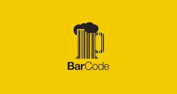
Now, this is a clever logo design. As the bar is related to bear glass, the designer has chosen to mix up the barcode with it. Together they have formed a meaningful and relevant logo that is attractive as well as productive.
FeDex:
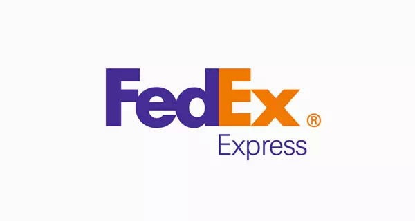
The logo of FedEx Express is straightforward and engaging. There is a hidden arrow between the letters E and X. This sample logo is for designers who want to keep some hidden meanings in their designs.
Kolner Zoo:
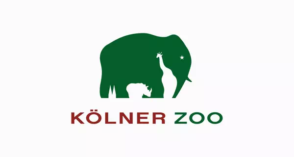
Zoo means a place for many animals in a certain place. So does the logo of Kolner Zoo. If you look carefully, you can find some animals in the logo. This is how the design perfectly represents the concept of a zoo.
Northwest Airlines:
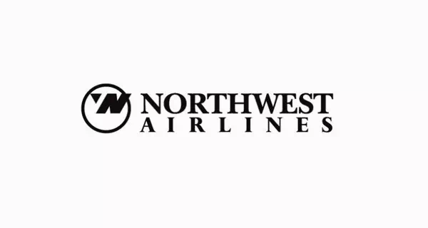
The logo of Northwest Airlines is another example of a pretty straightforward and minimalistic design. There is a little symbol designed with W and N. You can design creative logos using this idea with no hassle at all. Just make the name bold and design a symbol relating to the name.
Circus of Magazines:
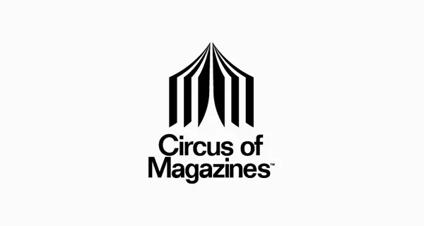
Circus of Magazines is an excellent example of a logo with a hidden meaning. The logo looks like a circus tent and the tent is made of magazine-like shapes. Combining the pictures to make the image of the name is probably the most creative way to design a logo.
Safari into Africa:
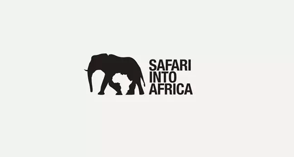
The logo of Safari to Africa is super creative and attractive. The elephant has made the map of Africa with its moving legs. Thus using the negative space cleverly, you can design creative logos which are meaningful and relevant.
Paint the City:
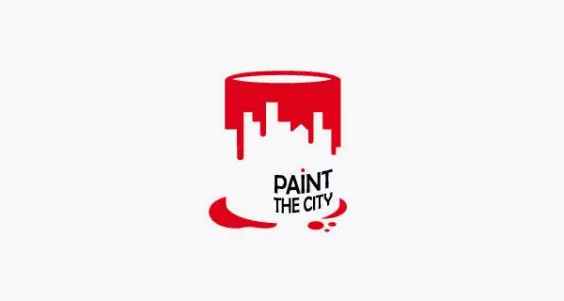
Here is another idea for using the negative space. The logo of Paint the City has shown it aptly. The whole picture is of a paint container that has a city-like look along with paintings. Using the negative space gives you room for applying lots of creative ideas.
The Bronx Zoo:
The logo of The Bronx Zoo has used the negative spaces creatively which can inspire you in designing logos. The legs of the animals have made the shape of NYC buildings which is relevant for the location of the zoo.
Piano forest:
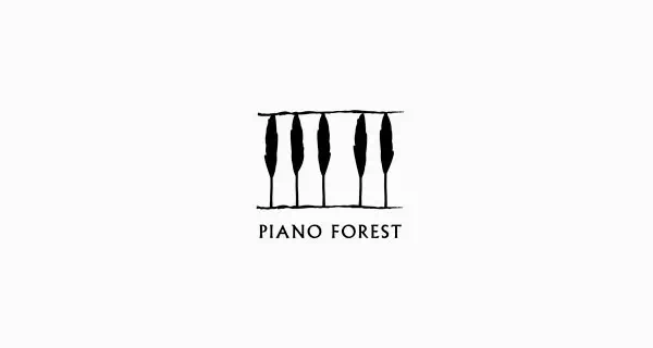
The logo of Piano Forest presents two different kinds of stuff in one picture. Look at the logo carefully to find out the shape of the piano at the same time some tress. Together they have made a creative logo that is brilliant and attractive.
Rocket Golf:
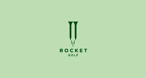
The logo of Rocket Golf inspires designers who are looking for some modern and creative logo design ideas. As we have said before, the negative space can dramatically change your design and enhance its appeal. The two golf bats here have created a rocket-like shape.
Hidden Bed:
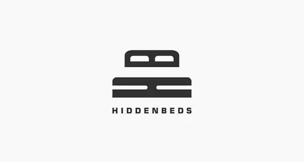
It is another example of clever logo design ideas. Can you find out the hidden H and B letters in the photo? Yes, together they have made a bed-like shape. The design is relevant to the name and clearly shows the perspective of the logo.
8 fish:
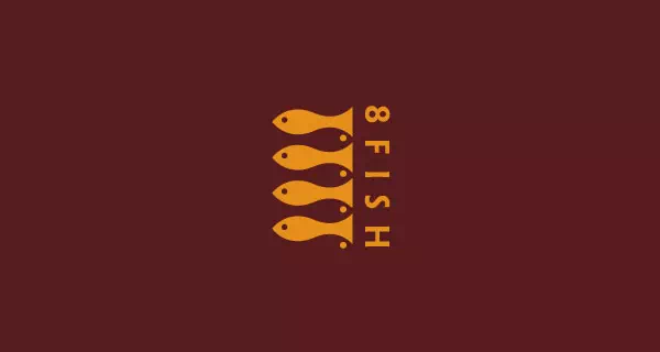
The logo of 8 fish is one of the most creative logo designs on this list. There are all 8 fishes hidden in the negative space. Such logos are adored for two reasons. First of all, they are thought-provoking and secondly, they are attention-grabbing.
Batbar:
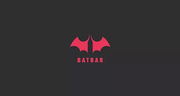
For making the logo design more coherent and memorable, nothing is like combining two objects. The logo of Babar has done it brilliantly. The wings of the two bats have made a wine bottle shape which is related to the bar.
Elewine:
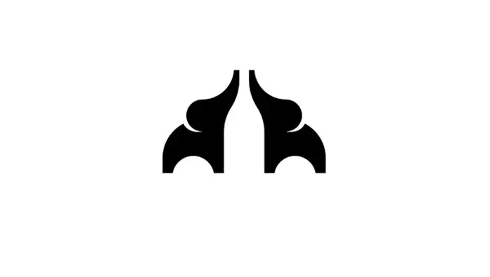
Here is another sample logo for designing unique and clever logo designs. The name suggests Erlewine- Elephant, and Wine. The logo is of two elephants and a wine bottle combined. Thus resembling the name you can create creative logos without thinking too much.
Dead Quote:
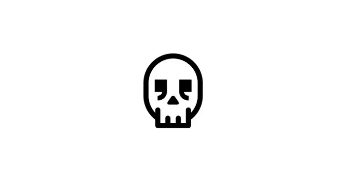
Try thinking something out of the box while designing creative logos. For example, the logo of Dead Quotes has assembled two concepts. One is the symbol of quotation and another one is a human skull that symbolizes death. Such logos deliver obvious and quick notions about the stuff intelligently.
Book Technology:
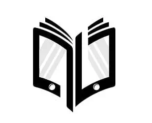
The logo of Book Technology is a combination of two objects. The book here is shown as a tab that is related to technology. Anyone can immediately interpret the meaning and purpose of the logo at the first glance from such a design.
Planet Candy:
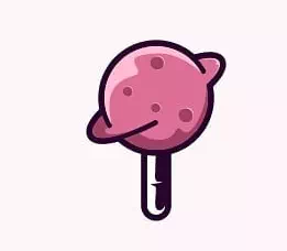
The logo of Planet Candy gives you inspiration for creating cute and playful designs. You have to keep in mind that one of the purposes of a logo is to grab attention. Through such a design you can do that thoroughly. The sample logo has a candy-like shape along with the globe shape.
90 percent:
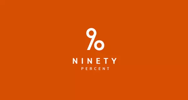
The logo of 90 percent is a pretty fair example of using numbers creatively. Look at the number 90 here; it looks like the % symbol. The designer has made it look like both 90 and %.
Frankenstein Films:
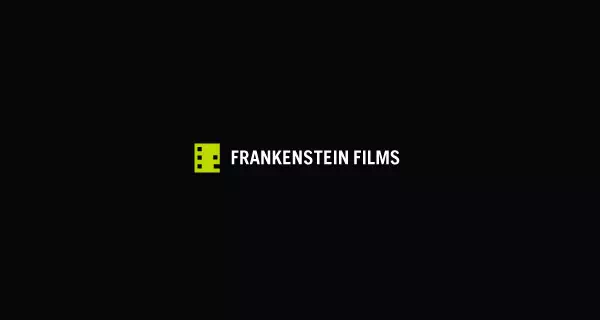
The logo of Frankenstein Films is a sample logo for a minimalistic and simple design. Though simple, it is not so plain to ignore. Notice the film symbol that looks like a human face. As Frankenstein stands for something awe-arising, the face looks a bit creepy which is completely relevant to the name.
Ed’s Electric:
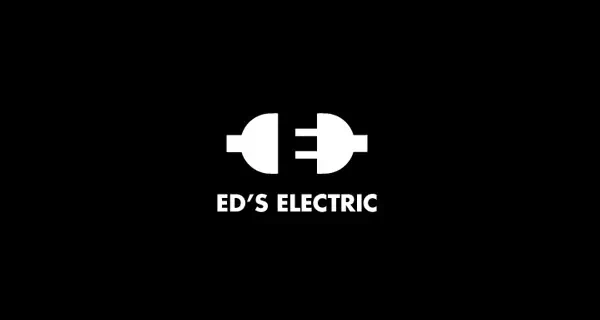
There is a hidden meaning in this logo. You can find there are the letters E and D which stand for the name of the company. Also, the entire picture is looking like a plug and a socket. This is how the logo is designed with complete relevance to the name.
Twins:
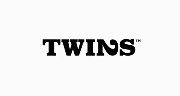
Another way of using the numbers creatively is to slightly change the look to give it a different look. For instance, the logo of Twins has the letter N looking like 2. So the logo is giving a hint of what twins mean.
Portrait Photos:
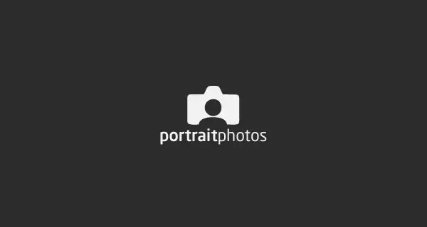
The logo of Portrait Photos has the picture of a camera that has the shape of a human head. As Portrait Photo means human face photos, the logo is a clear representation of that. Thus you can keep something hidden to make your viewers interpret the meaning. It is a fun way of engaging them with your design.
Hotnote:
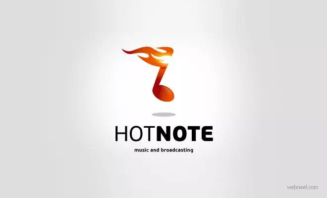
Hotnote Music and broadcasting have the logo of a fiery musical note. The designer has combined the image with relevance to fire and musical notes. It is another great idea of using the negative space.
Indie Tea:
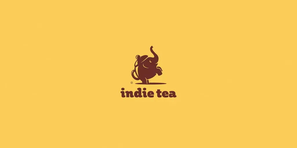
The logo of Indie Tea is a well-designed creative logo. If you want to keep a playful mood in your logo design, go for something like that. The kettle is looking like a joyful elephant which is symbolizing India.
Le Tour De France:
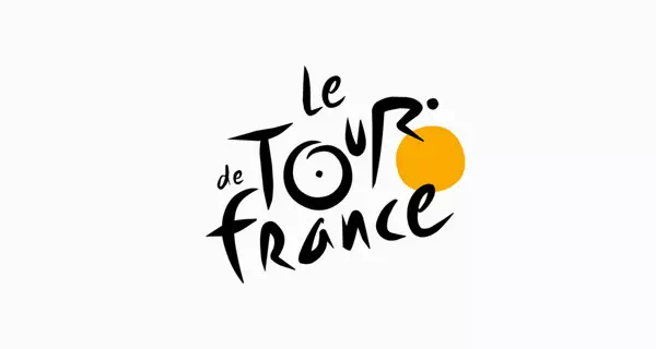
One of the finest examples of creative logo design which is as clever as meaningful is the logo of Le Tour De France. There are a cyclist and a cycle in this logo design. The ‘O’ here is one of the wheels of the cycle making the entire design eye-catching and memorable.
Code Fish:

The logo of Codefish is another excellent example of assembling two objects relevantly. Here, the symbols of coding have formed the bones of a fish that is looking like a fish altogether. The miniature design is as straightforward and purposeful as a logo.
Formula One:
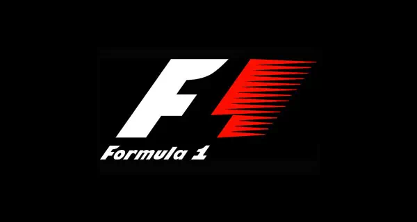
Formula One is another straightforward logo with a clever design. There are F and 1 hidden in the logo which stands for the name. If you want to keep the logo simple yet relevant to the name, try to use the idea.
Blade:
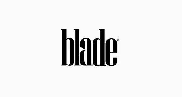
The logo of Blade may seem simple at the first glance but there is a hidden knife in the letters. Try using such ideas in your logo design which will present the meaning and purpose rightly.
Eagle Mountain Capital:
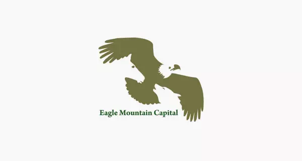
Eagle Mountain Capital is one more logo sample for you where the negative space has been used. The wings and head of the Eagle have formed the shapes of animals which is looking reasonable with the name. Likewise, you can use the space creatively to present the purpose and perspective of the object.
Newcastle Food and Wine Festival:
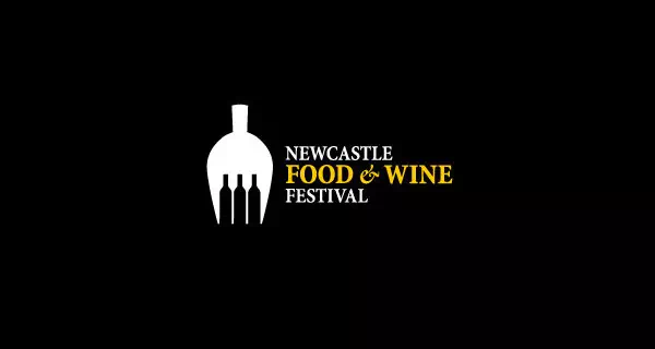
The logo of Newcastle Food and Wine Festival also uses the negative space in the design. Here a white fork has formed the shapes of three wine bottles. The entire picture is related to the restaurant name and its services.
Help:
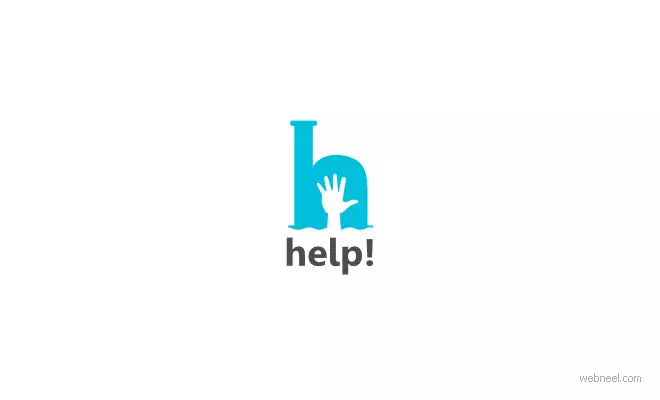
The logo of Help is a brilliant logo sample for designers who want to keep the design minimal yet creative. There is a hand that symbolizes danger and it is between the letter ‘h’.This is how you can design minimalistic as well as relevant logos.
See:
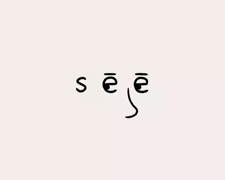
The logo of See is for inspiring you to create something different apart from all those boring designs. Such a logo grabs the viewer’s attention and also provides perspective and meaning. There are eyes pictured in the word ‘See’. For extra detailing and clarity, the designer has drawn some hand art.
Eat:
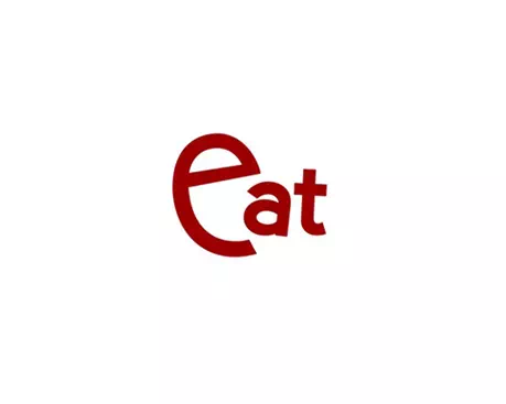
This is a sample logo for fun designs. The design is looking like eating something which has a resemblance to the name. The design is super clever and funky as a logo. Following the idea, you can try out designing fun logos with little change on the letter.
Cook Finder:
The logo is a chef hat which has made the ‘wonder’ sign. Without much effort, the logo has managed to show its purpose through the design. This is how you can create simple logos which can purposefully convey the desired message.
Impala:
The logo of Impala has the Impala head to show the perspective straightforwardly. If you want to design something effortlessly, go for this type of design. Such logos are powerful in conveying a straight message as well as it attracts the viewers’ attention.
Space Setting:
The logo of SpaceSetting is an example of combining two different objects to create something new. Here, the symbol of the space has been put into the symbol of settings. Together they have formed the desired image of the logo.
Water Drop:
The logo of Water Drop is as simple as the name suggests. But you cannot ignore the creativity of the design. There is a waterdrop drawn under the letter W which is almost hidden at first glance. Such minimalistic logos are super clever and very catchy.
Artists United:
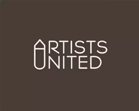
The logo of Artists United is another sample design for minimalistic and straight –forward logos. The A and U are simply drawn together which have matched the concept ‘United’. Also, they have got a pencil-like shape that symbolizes the artists.
Look:
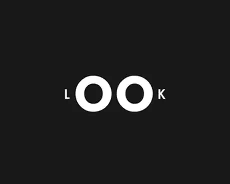
When it comes to logos, the first impression is the most important matter. Anyone who sees the logo of Look first does not need to seek further information. The whole logo is entirely related to the meaning and perspective of the subject.
Bread:
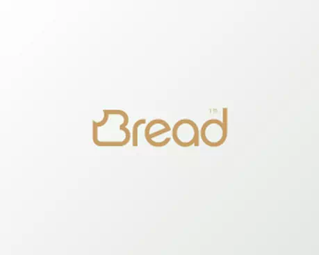
If you are one of those designers who like to design simple but creative logos, the logo of Bread can be a great inspiration for you. There is nothing elaborate in this logo. Only the letter B is designed like a bread shape which is the meaning of the logo. This is how through a very short effort you can design unique and meaningful logos.
Centro Books:
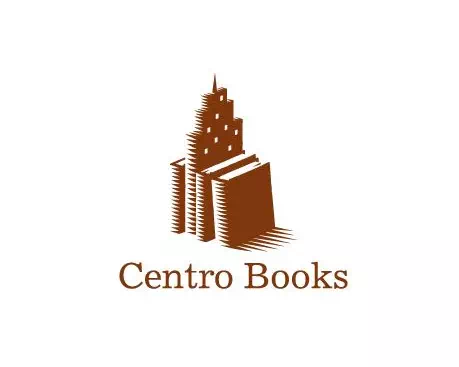
Here is another idea for those who want to use the negative space creatively. The logo of Centro Books has the shape of a library building. The shape is made with books that are utterly relevant to the whole concept of the logo.
Bullfish:
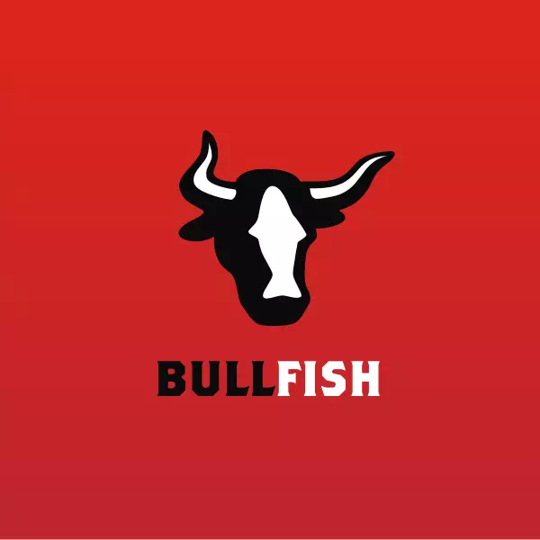
The head of the bull is designed like a fish shape. Such logos are not very extravagant yet they convey the messages successfully. If you are thinking of creating something like this, make sure to brainstorm for combining two objects together.
Blue Hare Marketing:
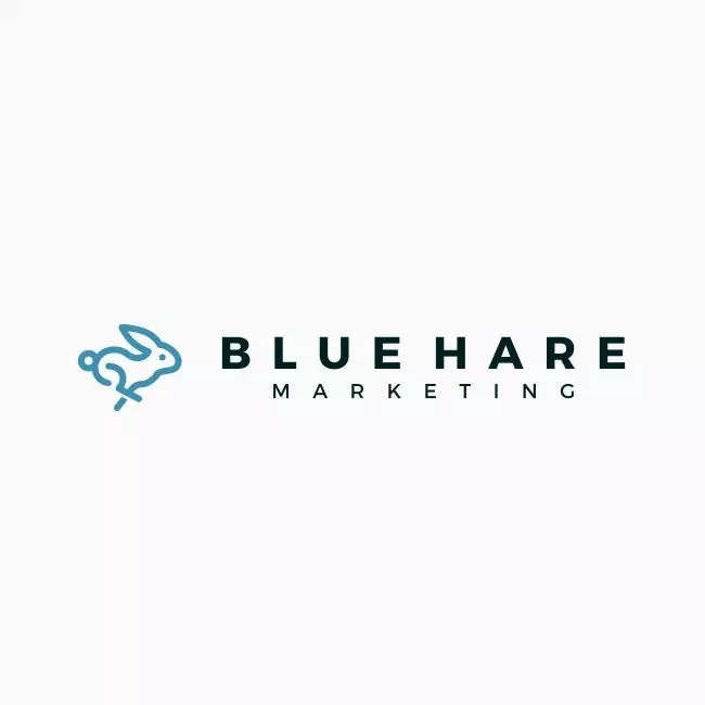
The logo of Blue Hare is simple yet eye-catching. The logo has nothing but the name and a small picture of the object. We have listed it here to show you how effortlessly you can create creative logos using the negative space.
Pause:

The logo of Pause is a design with a visual pun. There is a picture of Paw which is resembled the word pause. Likewise, you can create unique and striking logo designs with humor and pun.
Edge:

You can design your logos creatively with nothing but words solely. The way you write the word changes the view and brings new perspectives to it. That is why you can try playing with typography while designing creative logos.
Eighteen:

If you get any resemblance between your logo name and numbers, try using it creatively. It is no less supportive than texts or images. For instance, Eighteen Parkway has used the number 18 in the name.
Wineforest:

You can create creative and unique logos by repeating any element to give it a different shape. Wineforest has done it successfully. The uneven repetition of trees has formed some wine bottle shapes here. This is how the design gets more coherent and relevant to the subject.
Business Women Association:

The logo of the Business Women Association is another ideal example of combining two pictures together. Here you can find an image of women between the collars of the business suit. It wonderfully depicts the whole concept and motive of the association through its intelligent design.
Cinemacafé :

Cinemacafé is a superb example of using negative space and an image within an image. The film roll has formed a cup-like shape relating to the concept of a café. Similarly, you can create your own clear and unique logos using such ideas.
Turn:

Are you familiar with ambigram? When you can read a word from different directions, it is called an ambigram. If your logo name allows using it in the design, do not skip it. Look at the logo of Turn. It can be read from both straight and reverse directions. Following this style, you can design unique and memorable logos.
Athletic Yard:
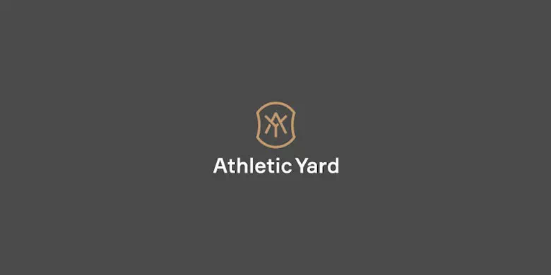
In the logo of Athletic Yard, there is the use of negative space. The design is not very complex as well. The letter A and Y has formed a symbol that represents the name thoroughly.
Investigation Discovery:
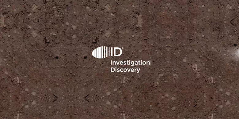
Investigation Discovery is a well-designed logo sample for creative designers. While designing logos, keep in mind that you have to find out the essence and hidden meaning of the subject. Using that you can design the logo. This sample logo here has used the concept of ‘investigation’ and shown it through the footmark. It is a brilliant way of presenting the meaning and perspective of the subject.
Quality Click:
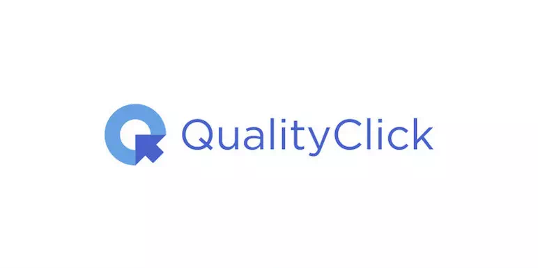
The logo of Quality Click is simply outstanding for its clever design. The designer has taken the first letters of the two words and created a unique symbol with them. The idea of using first letters is nothing new in trend. Yet it has a timeless value in the logo designing field.
Fence:
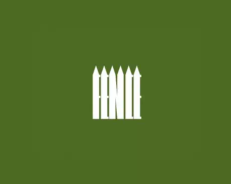
The logo of Fence is super attractive and excellent in its unique style. The whole image is like a fence which is the spelling of the word as well. The designer truly deserves our appreciation for such a brilliant logo design. Anyway, you can also execute this idea in your designing projects to create something memorable.
Louder:
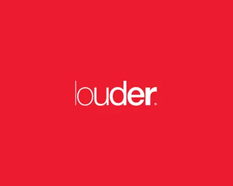
The logo of Louder is another example of a brilliantly designed logo. Can you feel the loudness of the logo? The letters have got bold to bolder to present the sound effect indirectly. It may look simple but the idea here is so powerful and praise-worthy.
Invisible:
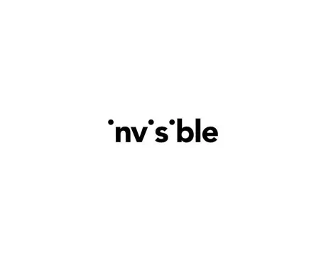
One more fantastic logo sample for creative logo designers is the logo of Invisible. Here, some letters have been kept invisible to present the concept of the logo. You, as a creative logo designer, should have such ideas in your mind to help you while brainstorming for creative logo designs.
Zip:
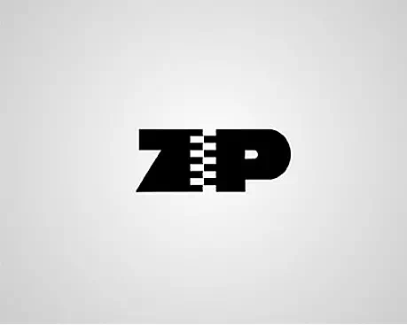
Zip is one of the ideal examples of simple and meaningful logo designs. The name is written creatively while depicting an image of a zipper. Such ideas do not require much-elaborated designs, yet they successfully provide the purpose of the logo.
Shoot My Dog:

For creating an outstanding logo that will be attention-grabbing as well as effective in conveying messages, you have to start experimenting with different styles. Here in the sample logo, a person is taking a picture. The whole structure is looking like a dog as well. It perfectly depicts the subject and its purposes.
Shift:
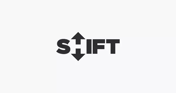
Using one of the letters creatively to make the logo outstanding is a common practice in the logo designing field. But it is not to grow old in trend. For instance, the logo of Shift has done it successfully. The letter H is kept hidden between the arrow sign. Following the style, you can create more creative logos related to your subjects.
Bearhanded:
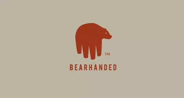
If you want to create memorable logo designs and those which strike the viewers at the first glance, nothing is more important than finding out different perspectives on the subject. The sample logo here is of Bearhanded. The logo has the picture of a bear which looks like a hand as well. Similarly, you can design outstanding logos using different unique ideas and your creativity.
Mister Cutts:
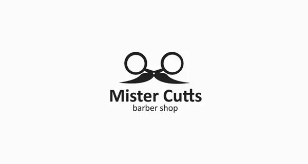
The logo of Mister Cutts is brilliant for its meaningful design. It has given all of the information about the shop in one simple logo. The image of the mustache shows that it is a shop for men. The scissors show that it is a barbershop. This is how a logo can serve different purposes if it is well designed and relevant.
Pittsburgh Zoo:
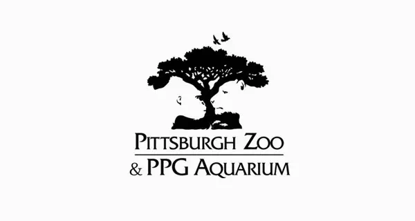
The logo of Pittsburgh Zoo is another brilliant logo design sample for creative logo designers. The big Elms tree is drawn here with two animal heads hidden within it. Such designs are great for depicting the whole concept of the logo subject. While designing, try to experiment with different directions and perspectives so that you can come up with the best designs.
Bullet:
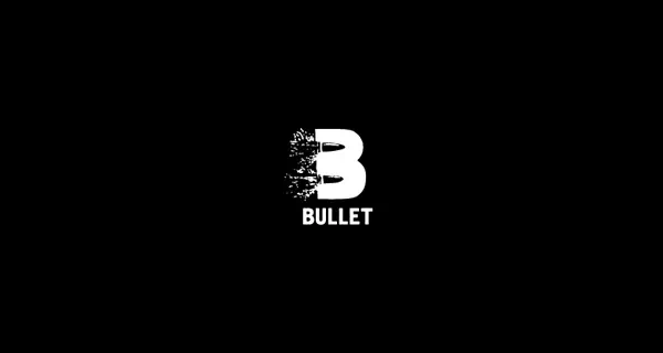
The logo of the Bullet has a dynamic and unique style in design. The letter B has two hidden bullets within it. The image of the bullets has given an energetic look to the logo. Such designs are powerful in conveying the message and engaging the viewers as well.
Three Nuts:
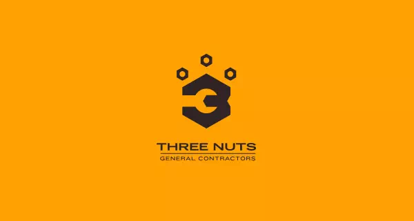
The logo of Three Nuts is super creative and relevant to the subject. In the logo, there are three nuts and a picture of a wrench. The whole picture is looking like the number 3. The logo gives a mechanical impression that perfectly goes with the subject of the logo.
One Design:
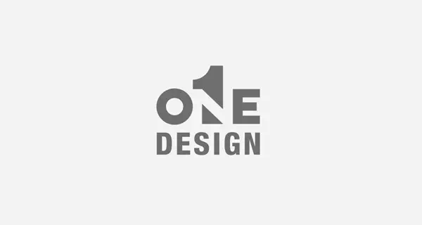
Here is one more example of using numbers creatively. The logo of One Designs has got the image of 1 in its way of writing N. though these types of logos are simple, they serve the purpose practically. Try out designing something like that when the subject requires such minimal styles.
Filmdog:
The logo of Film Dog is a clever design that requires interpreting its meaning. The Dog is written here with film rolls creatively. It is also a great idea for using negative space brilliantly. Try to keep coherence with the subject so that the logo design serves its purpose perfectly.
Space Secure:
It is a great way of presenting one picture within another picture. The logo of Space Secure has the image of a Lock that symbolizes security. Along with that, the keyhole is looking like a spaceship that stands for space. This is how the whole logo is meaningful and relevant to the subject.
Ziphug:
Ziphub is another sample logo where a letter has been designed differently. The letter H here is designed like a zipper that matches the subject. The name is written in uneven shape to create a charming appeal in its style.
Silkskin:
The logo of Silk skin is as luxurious as the name suggests. The letter S has the shape of two legs in its style of writing. There is a feather as well resembling the concept of the subject. The goal of designing logos is also like that. You have to present the concept and meaning creatively.
Mountainfox:
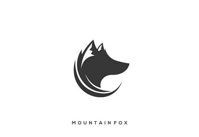
The logo of Mountain Fox is another example of an image-within-image. The logo is the picture of a fox head which has the shape of a mountain-peak also. Two pictures combined together have presented the subject successfully.
Hippo Gamer:
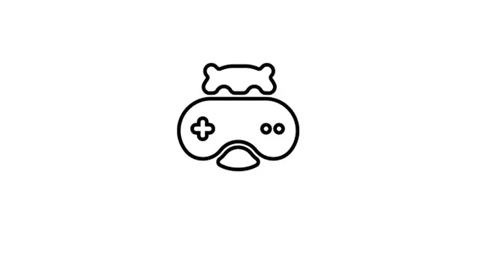
The logo of Hippo Gamer is fabulous for its unique design. There is a picture within picture format. By carefully looking at it, you can find the joystick and the entire logo is looking like a hippopotamus. Follow this idea to create more unique logos with different concepts and subjects.
Cargo get:

Another great idea for designing creative logos is to use the first letters of the name cleverly. For example, Cargo Gate has chosen to use the first letters of the two words and made a unique style with them. It is a simple yet effective way to give a modern look to the logos.
Doks:
The logo of the Doks is simple and meaningful with minimal design. There is only a symbolic image of documents along with the name. Similarly, with short detailing with the name, you can create stunning and modern logo designs.
Here is the end of our list. Now it is time for you to go as creative as your logo design requires.