Icons are like little pictures we see on phones, computers, and websites. They show us what to do or where to go. But how they look good and clear is because of something called vector graphics. Imagine icons like Lego blocks; vector graphics help make these blocks fit together perfectly, no matter how big or small they are. Vector graphics are like magic shapes that don’t get blurry when you make them bigger or smaller. This unique quality finds its pinnacle in the process of image to vector conversion. This is crucial for vector graphics and icon design because they need to look good on tiny screens and big screens. Vector graphics also let designers easily change how icons look without messing them up.
Creating icons is like drawing simple pictures that everyone can understand quickly. Designers make sure these pictures are easy to see, even if they’re really small. They also make sure all icons look similar and work well together, like a team. Icons need to be like friends, looking good and helping each other out on computer screens, phones, and everywhere else.
What is Vector Graphic?
Vector Graphics are like magic drawings that never get blurry. They use special math to make pictures with points and paths. You can make them big or small, and they always stay sharp, like superheroes that never lose their powers! Imagine a cat drawing that looks good no matter how tiny or huge it is!
These special drawings have points and paths that tell the computer where to put lines and colors. You can stretch or twist them, and they stay clear and cool. It’s like having drawings that can change their shapes easily. Vector drawings come in different types, like SVG or AI. They’re like superhero suits with special powers, making sure our clever drawings can be used everywhere and always look their best, whether on websites, in apps, or in cool illustrations.
Principles of Icon Design:
Icons are like tiny, visual superheroes that help us understand things quickly. Here are some simple rules for effective results in vector graphics and icon designs:
Simplicity and Clarity: Keeping Things Simple and Clear
Icons are like small, friendly pictures that tell a quick story. Making them simple means using just enough details, like telling a short story with a few easy words. When icons are simple, everyone can understand them right away. It’s like drawing a happy face that everyone recognizes, making things easy and clear for everyone.
Consistency in Style: Dressing Icons in the Same Outfits:

Think of icons like characters in a storybook. It’s important to dress them in similar outfits, just like a team wearing matching jerseys. When icons have the same style, they look like they belong together and make sense to everyone. It’s like having characters in a book all wearing the same cool costumes. It makes the story more enjoyable and easy to follow.
Scalability and Responsiveness: Icons Fit for Every Screen Size:
Icons need to be like superheroes that can fit into any adventure, whether it’s on a tiny phone screen or a big computer monitor. When icons are scalable, it means they always look clear and sharp, just like a superhero’s costume that fits perfectly no matter where they go. It’s like having icons that are ready for any size, making them super versatile and adaptable.
Color Palette Considerations: Picking Icon Outfits Wisely:
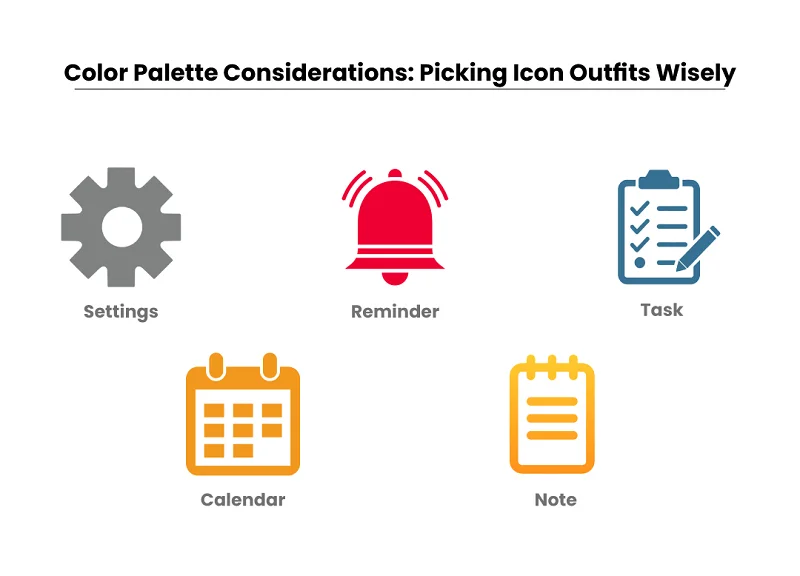
Choosing colors for icons is like selecting outfits. You want them to stand out and look good, but too many colors can be like having too many flavors of ice cream – it gets messy! So, picking a few nice colors for icons is like dressing them in tasty outfits. It makes them look appealing without being too overwhelming, creating a visual treat for everyone.
Symbolism and Metaphors: Icons Speak in Secret Codes:
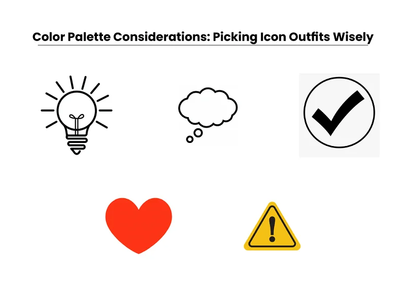
Icons are like secret messages told without words. Using symbols or metaphors is like having a secret code. For example, a heart might mean love, or a speech bubble could mean talk. It’s like telling a story without using many words, making icons a bit like secret agents, and communicating meanings in a language everyone can understand.
How to Create Icons in Vector Format?
Creating icons in vector format is like crafting mini masterpieces that can be resized without losing quality. Follow these steps to bring your vector graphics and icon design to life:
Sketching and Planning:
Begin by sketching your icon on paper or digitally to plan its structure and elements. Think about what message you want the icon to convey. It’s like drawing a roadmap before the journey.
Building Basic Shapes:
Use basic geometric shapes in your vector graphics software (like Adobe Illustrator or Inkscape) to create the foundation of your icon. Think of it as assembling pieces of a puzzle to form the main structure.
Incorporating Details:
Add details to bring your icon to life. Use tools like the Pen tool to draw specific features. Think of it as adding details to a story – making your icon unique and interesting.
Adding Color and Gradients:
Choose a color palette that suits your icon’s purpose. Fill in the shapes with colors and gradients to enhance its visual appeal. It’s like giving your icon a vibrant and eye-catching outfit.
Fine-Tuning and Refinement:
Review your icon and make small adjustments. Ensure lines are smooth, colors are balanced, and details are just right. It’s like polishing your icon to perfection, making sure it looks great in any size.
Advanced Techniques in Icon Design:
Creating cool icons means knowing some fancy tricks to make them look awesome and work well in different situations. Here are some special things you can do to make your icons stand out:
- Icon Grids and Alignment: Implementing icon grids ensures precision and consistency. Think of it as placing puzzle pieces on a grid – each element aligns perfectly, creating a cohesive and balanced design. It’s like building a structured foundation for your icons.
- Icon Variations for Different Sizes: Create variations of your icon tailored for various sizes. Think of it as adjusting your outfit for different occasions – icons need to look good whether they’re tiny on a mobile screen or more prominent on a desktop. It’s about adapting to different environments while maintaining clarity.
- Using Effects and Filters Sparingly: Apply effects and filters thoughtfully to enhance your icon. Less is often more – it’s like adding a pinch of spice to a dish. Subtle effects can add depth and interest without overwhelming the design. Use them sparingly for a polished and professional finish.
- Incorporating Motion and Animation: Explore motion and animation to bring your icons to life. Consider how your icon might move or change in different scenarios. It’s like adding a playful dance to your design, making it dynamic and engaging. Just ensure that the motion complements the icon’s purpose.
Exporting and Implementing Icons:
Creating awesome icons is just the first step. Now, let’s talk about getting them out there and making sure they look great wherever they go. Here’s what you need to know:
Export Formats for Icons
Icons can be exported in various formats like PNG, SVG, or ICO. Choosing the right format ensures your icons look good and work well in different places. Pay attention to whether your icon needs a transparent background and if it stays clear when it’s big or small.
Optimizing for Web and Mobile
Icons need to look good on all screens, from big desktops to tiny mobile phones. Create different versions for different screen sizes to keep your icons looking sharp. Keep your icon files light so they load quickly, especially on the web.
Implementing Icons in Design Software
Bring your icons into design software like Adobe Illustrator or Inkscape. Keep your icons in line with your overall design by using the same style. If you’re creating lots of icons, consider using symbol libraries for easy management and consistency.
Guidelines for Integration in Websites and Applications
Make sure all icons in your project have a similar style for a polished look. Add alternative text for icons so everyone, including those who use screen readers, can understand them. If your icons do something when you click or hover over them, make them clear and smooth.
Case Studies
Certainly! Let’s consider real-life examples for each case study category:
Analysis of Successful Icon Designs:
Example: The “Instagram” icon is a prime example. The camera symbol cleverly communicates the app’s focus on photo-sharing. Its simplicity, recognizable shape, and distinctive colors contribute to its success in representing the brand and its function.
Lessons Learned from Icon Redesigns:
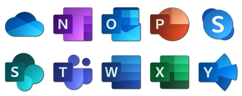
Example: The “Microsoft Office” icons underwent a redesign to embrace simplicity and consistency. The redesign lesson here is that unifying the style across icons creates visual harmony, making it easier for users to identify and use the various applications.
Trends in Modern Iconography:
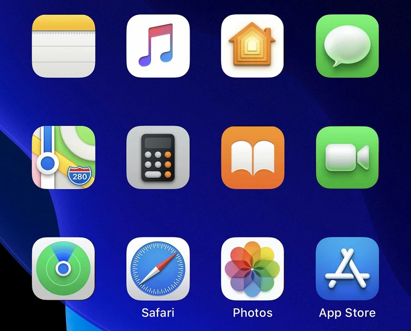
Example: The “Apple iOS” icons showcase modern trends. Over time, these icons evolved to be flatter, simpler, and more vibrant, aligning with contemporary design preferences. This evolution reflects the broader trend of minimalist and colorful iconography in the tech industry.
Tips and Best Practices:
Creating icons is a creative journey, and these tips will guide you to make the most out of your vector graphics and icon design process.
- Keeping File Organization: Imagine your icons are toys. Keep them in different toy boxes, so you always find what you need. Organized files make your work smoother, like finding your favorite toy when you want to play.
- Collaboration in Icon Design Teams: Designing icons is like playing on a team. Share your ideas and work together, just like passing a ball to score a goal. Teamwork makes your icons even better.
- Staying Updated on Design Trends: Think of design trends like cool clothes. Keep your icons stylish by knowing what’s in fashion. It’s like wearing the latest outfit to look awesome.
- Accessibility Considerations: Imagine you’re inviting everyone to your party. Make your icons friendly for everyone, like having games everyone can play. Consider different needs, so everyone can enjoy and understand your icons.
Conclusion
Creating icons is like drawing friendly pictures in a digital world. We use vector graphics, which are like magic drawings that stay clear at any size. Remember, simplicity and consistency are superhero tools, and trendy outfits (colors) make your icons stand out. Always keep your files organized, play well in design teams, stay fashionable with trends, and make your icons friendly for everyone. Designing icons is an exciting journey, and you’re the artist! Keep learning new tricks, like exploring new playgrounds. Don’t be afraid to try different styles and colors, just like mixing paint on your canvas. The more you experiment, the more amazing your icons become. It’s a creative adventure that never ends.
Remember, every icon tells a story, and you’re the storyteller. So, keep drawing, keep experimenting, and most importantly, enjoy the colorful world of vector graphics and icon design.


