In the field of architecture, a carefully designed architectural logo holds significant importance in expressing a firm’s identity and principles. It can represent innovation, accuracy and the distinct vision of a design company.
In this article, we embark on a visual journey through the realm of architectural branding. Our purpose is to inspire and enlighten by showcasing 25 creative architecture logo design ideas. These logos not only reflect the essence of architectural aesthetics but also demonstrate the power of imagery and symbolism in the field of design. Join us as we explore the fusion of artistry and structure in these remarkable architectural logos.
What is an Architecture Logo?
An architecture logo is like the signature of an architectural firm or professional. It’s a unique visual symbol that not only showcases their design style but also conveys the firm’s values and identity. This logo is an essential part of their brand. Their architectural logo helps clients and the public to recognize and remember their architectural work and services.
What to Consider When Designing a Logo for Architecture?
When designing a logo for an architectural firm, several crucial considerations come into play. In this guide, we’ll delve into essential considerations to ensure your architectural logo effectively reflects your firm’s identity and design philosophy.
Simplicity: Keep the design clean and uncluttered for easy recognition and versatility.
Relevance: Ensure the logo elements directly relate to architecture, establishing a clear connection to the industry.
Uniqueness: Strive for a distinctive design that sets your architectural firm apart from competitors.
Color and Typography: Select colors and fonts that align with your brand’s personality and values while reflecting architectural aesthetics.
Memorability: Create a memorable logo that leaves a lasting impression and is easy for clients to remember.
25 Best Architecture Logo Design Ideas
Welcome to our collection of the 25 Best Architecture Logo Design Ideas. Each concept reflects the unique identity and design philosophy of architectural firms.
Minimalistic Building Silhouette
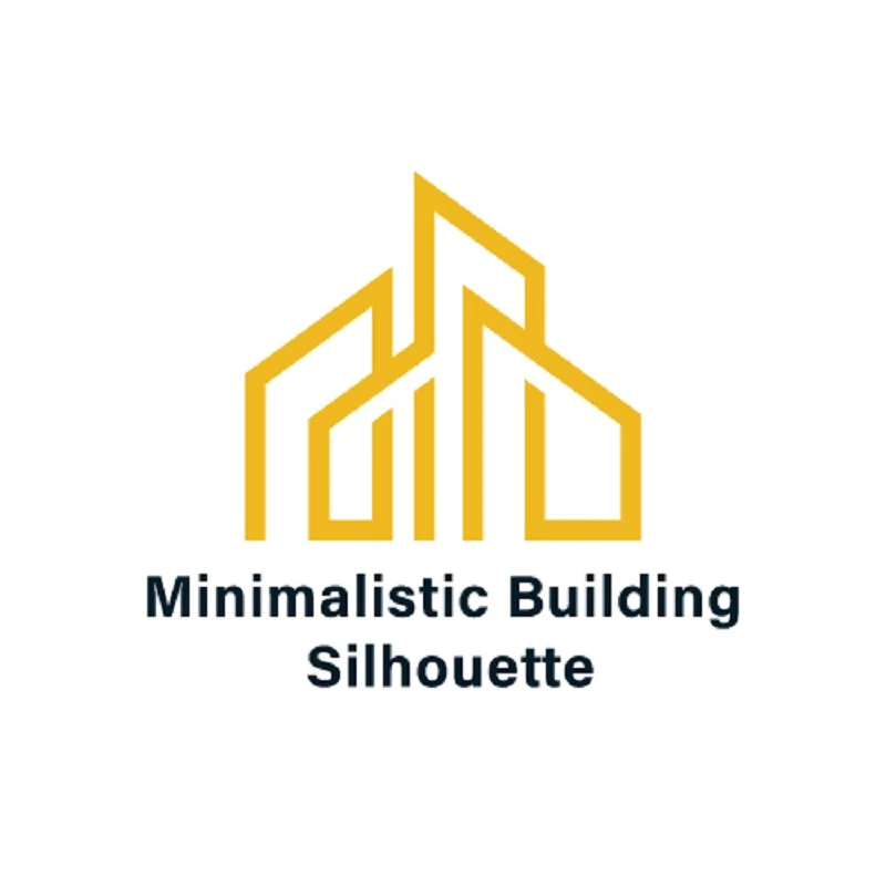
This logo concept focuses on a clean, uncluttered outline of a building or iconic architectural structure. It aims to convey the firm’s commitment to simplicity and modern design principles. This architect logo symbolizes elegance and professionalism.
Blueprint Sketch
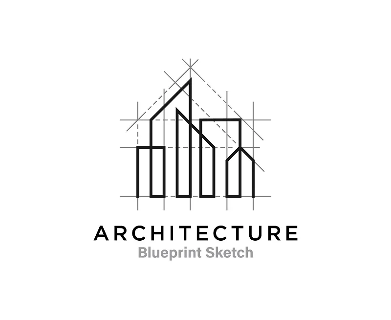
Emulate the appearance of an architectural blueprint or sketch in the logo. This logo features precise lines and intricate details. It communicates the firm’s dedication to careful planning and attention to detail.
Modern Monogram
The modern monogram design combines the initials of the firm’s name in a unique and visually appealing way. It strives to create a memorable and easily recognizable logo. This architecture logo design emphasizes the firm’s professionalism and contemporary approach.
Architect’s Tools
Incorporating tools such as compasses, rulers and drafting squares within the logo. These tools signify precision, expertise and the technical aspect of architectural work. This architecture logo idea symbolizes the firm’s commitment to meticulous planning and execution.
Geometric Shapes
Use creative geometric shapes and lines. This architectural logo design represents a design-focused approach. It highlights the firm’s innovative thinking and ability to use geometry as a foundation for architectural creativity.
Building Blocks
Playful and imaginative, this logo arranges colorful building blocks in a way that forms an architectural structure. It suggests versatility and the firm’s capability to construct unique and functional designs.
Column and Arch
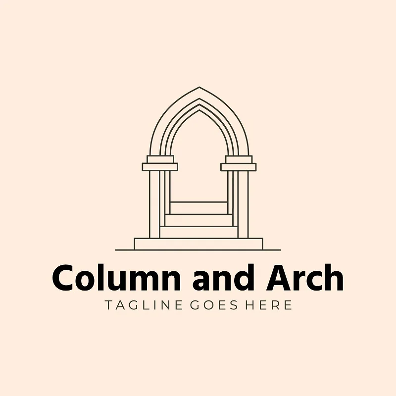
Incorporating classic architectural elements like columns and arches. They convey a sense of timelessness and expertise in traditional design principles. It underscores the firm’s understanding of architectural heritage.
Cityscape Silhouette

With a stylized city skyline, this logo symbolizes the firm’s involvement in urban projects. It underscores the impact of the firm’s work on a larger scale.
Negative Space
Creatively using negative space within the logo design hides architectural elements. This architecture logo design invites viewers to explore and discover hidden details. It communicates a sense of depth, intrigue and precision.
3D Perspective
A 3D perspective effect adds depth and dimension to the logo. 3D shapes suggest the firm’s ability to turn architectural plans into three-dimensional. It emphasizes the firm’s practical skills.
Nature Integration
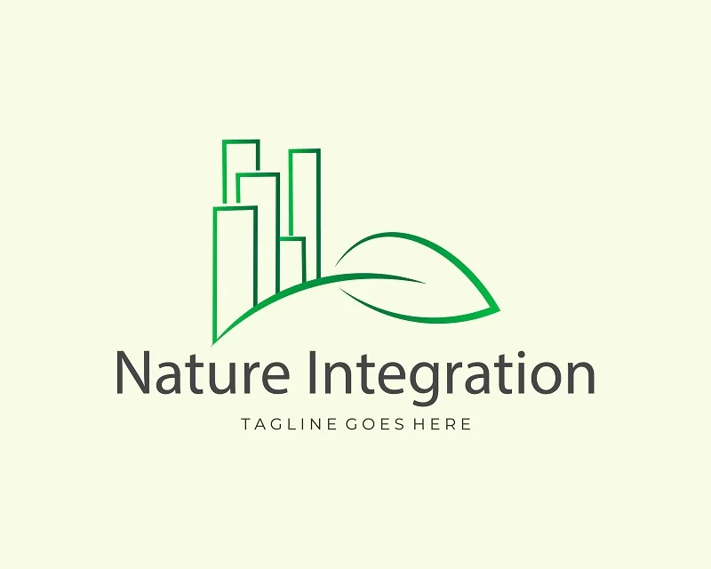
You can use architectural elements with natural motifs like trees or leaves in your logo. This architecture logo design idea signifies a commitment to sustainable and environmentally conscious design. It suggests harmony between man-made and natural environments.
Blue and Gray Palette
This logo concept utilizes a color palette dominated by cool blue and gray tones. These colors convey professionalism, reliability and a sense of tranquility. The combination suggests a calm and composed approach to architectural design.
Line Art
A logo designed with fine lines and detailed artwork falls into the category of line art. It symbolizes the firm’s meticulous attention to detail and artistic sensibility. This architect logo is ideal for firms that prioritize precision and craftsmanship in their work.
Futuristic Aesthetics
Embrace a futuristic look with sleek, metallic elements. This architecture logo design hints at the firm’s forward-thinking and innovative design concepts. It communicates a vision for the future of architecture. Futuristic look suggest that the firm is at the forefront of cutting-edge architectural technologies and ideas.
Iconic Bridges
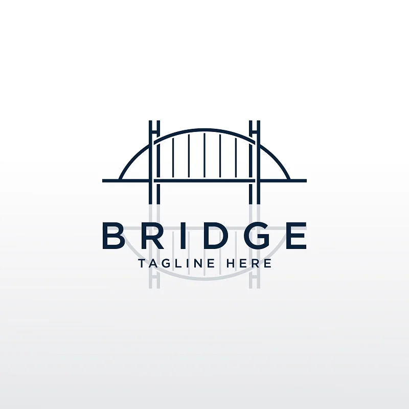
If the firm specializes in bridge design, use an iconic bridge in the logo. This logo emphasizes firm’s expertise in this specific area. It showcases the firm’s role in connecting communities and landscapes through remarkable bridge structures.
Abstract Shapes
Creative abstract shapes allow the logo to represent various architectural elements and concepts. This approach leaves room for interpretation, making it adaptable to a wide range of architectural styles. It invites viewers to explore the logo’s unique and imaginative shapes.
Negative Space Columns
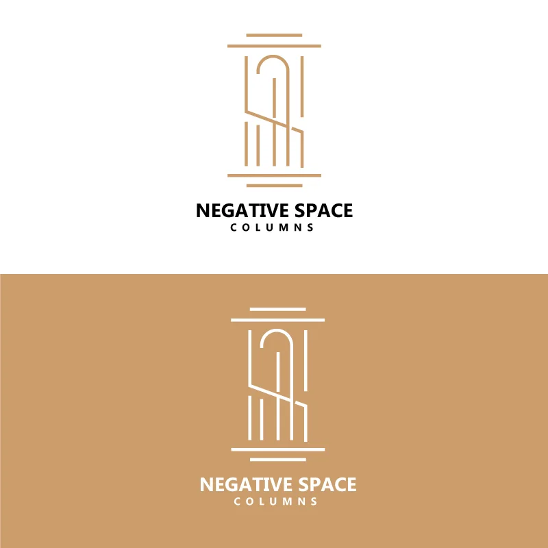
The logo creatively employs negative space to form columns within the design. This design choice symbolizes strength, support and stability in architectural design. It signifies the firm’s capability to provide a solid foundation for their clients’ projects.
Custom Font
Designing a custom font for the firm’s name adds distinctiveness to the logo. This unique typography becomes an integral part of the brand identity. It reflects the firm’s individuality and creativity in the field of architecture.
Tower
A Tower architect logo typically features a stylized representation of a tall tower or skyscraper. This architecture logo design symbolizes the firm’s expertise in designing and constructing impressive vertical structures. It conveys a sense of innovation and architectural prowess. This design is an ideal choice for firms specializing in high-rise building projects.
Urban Landscape

An urban landscape with skyscrapers, streets or city elements can give a unique look to your logo. It emphasizes the firm’s expertise in urban planning and development. This urban architect logo concept communicates a deep understanding of urban environment.
Palace
Using palace is another interesting and inspirational logo design for you. Such simple yet eye-catching designs do more than meaningless elaborate designs. So, while you are designing an architecture logo, focus on the meaning and perspective more than anything.
Vibrant Color Palette
A bold and vibrant color scheme makes the logo eye-catching and memorable. It suggests confidence, energy and a dynamic approach to architectural design. This architectural logo design is ideal for firms that want to stand out and project a vibrant image.
Roofline Profile
Featuring the profile of a roofline emphasizes the firm’s focus on architectural structures, particularly roofs. It highlights the expertise in designing functional and visually appealing rooflines.
Iconic Architectural Detail
Highlight a specific architectural detail, such as a window, door or other distinctive feature. This detail adds a unique and personalized touch to the logo. It underscores the firm’s dedication to perfecting the finer points of architectural design.
Mosaic Design
Making a mosaic with architectural elements shows the skill to put different things together in a way that works well. It represents the firm’s ability to mix design and function smoothly in their projects.
Benefits of a Great Logo in the Architecture Sector
A great logo in the architecture sector offers more than just visual appeal; it serves as a powerful tool for branding and communication. This article explores the significant benefits that a well-designed architecture logo design brings to architecture firms.
Professional Image: Your logo establishes credibility and trust, assuring clients of your architectural expertise.
Brand Recognition: It makes your firm easily identifiable. You can get chance of being chosen for projects.
Memorability: A memorable logo ensures your firm is remembered.
Differentiation: It sets you apart from competitors, attracting clients who resonate with your unique offerings.
Consistency: Your logo maintains a unified brand identity and enhances professionalism and trustworthiness.
Conclusion
Our architecture logo design ideas collection shows how logos can represent an architectural firm’s unique identity. These ideas include simple shapes, vibrant colors and intricate designs. It’s essential to choose a logo that matches the firm’s values and expertise. A well-made architecture logo leaves a strong impression, showing the firm’s skills and commitment to clients. It’s a powerful tool for creating a strong and recognizable architectural brand in the industry.
FAQs
1. Why is a logo important for an architecture firm?
A logo is essential for instant brand recognition and conveying the firm’s identity.
2. How do I choose the right logo?
Align it with your values and audience for maximum impact.
3. What do minimalist and abstract logos represent?
They symbolize modernity and creative thinking in architectural design.
4. How does a logo reflect architectural style?
It mirrors style through design elements and colors.
5. What role does color play in logos?
Colors evoke emotions and convey messages effectively.
6. Can a logo be customized for specialties?
Yes, customization highlights expertise in specific areas
Related Blog


