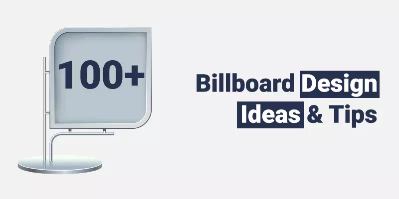
Billboards are an important and major component of the modern day. It serves the purposes of advertising for all types of commercials of the companies and organizations. Billboards are used as a medium to connect with new potential consumers on a daily basis, at all hours of the whole day. These billboard banner design ideas make your desire fulfill.
Consumers also take the same line to commute each day and they add great depth to a billboard design and their advertising campaign. A new era of digital billboards has made billboard advertising more effective and as well as cost-efficient for advertisers. It was more difficult before to change their message in such a frequent way.
Following the content you’ll find 100+ amazing billboard banner design ideas to specialize your billboard then you’ll find some basic designs and at last, guess what? We’ll introduce you to some of the super-creative billboard designs in the world.
And, if you are looking for designing a creative billboard for your business, Vector Design US, Inc. is always ready with its services. Let’s dive into the article.
Amazing billboard banner design ideas
Many people always think that designing a perfect billboard is all about creativity. But they’re totally wrong. Creativity is one of the most important features undoubtedly but not all.
Okay, now We’ve got your sole attention, this post will give you the best actionable and effective billboard design tips. Check it below.
Make Your Message Clear
If you are working on a billboard, you must keep it in mind and you need to make it sure that your billboard design should consist of a clear message. It may be literally or figuratively. First of all, you have to make your billboard legible. If people can’t find it easy to read, they might skip it and probably won’t ever read it at all.
Secondly, your marketing direction message has to make sense and also needs to be easily understandable. While it might happen that a person can find it fun to spark up in a mysterious way. If people can’t understand what your actual point is, they might not bother to try to find out.
Show, Don’t Tell
It is much better to show than say. The less you speak, the better result you’ll have. In some famous cases, the billboard designs only show and say nothing at all. Actually, nothing in writing form, anyway. A picture can utter a lot more than a word can do, so let the design of the billboard speak for itself. To be more effective, it’s also a safe way for comparing to billboards along with the roads that take drivers’ eyes off totally out of the road for too long. So they consume a message lately which is dangerous.
Meet the Needs of Your Audience
If we compared it to digital ads, it may seem that outdoor advertisements always lack a huge range of audience targeting processes. As It has got some targeting options itself, that doesn’t necessarily mean you should overlook the audience you’re reaching based on the area or the location of your advertisement. You never want to see a Porsche ad in a subway which is a clear example of that.
Nowadays research reveals that many New Yorkers use the subway and they can afford it. There’s a big reason. They’re acting against driving in it (e.g., gridlocked roads showed during rush hour or a lack of parking facilities in the city).
Use a Live Data Feed

When you added real-time data to make your billboard design more interesting—as well as it becomes more helpful—using a live data feed support. There are different variety of ways that businesses can do, from a countdown to the big event that happened, the current scores of a big game plan, or emergency security room wait times to current the air and quality the ratings or even the pollen count that stayed in the air. If there are many texts and numbers that are constantly changing the content that is related to your business plan and what you’re giving to the audience in the mood of advertising, a live data feed is worth considering for this.
Go Beyond the Billboard
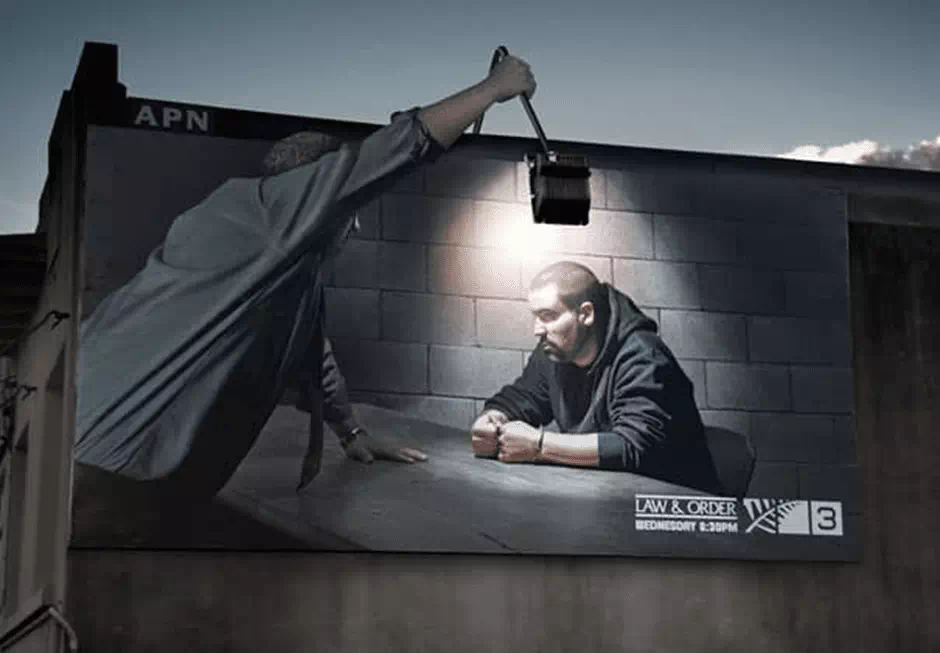
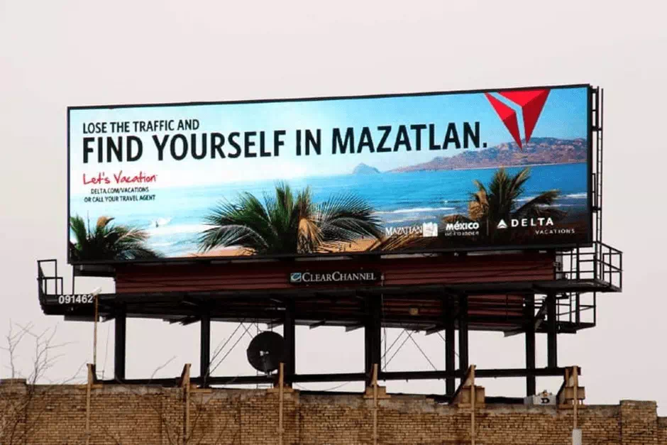
Never limit your design to the space of the billboard itself. You have to go outside of the lines and always additional elements. The example above here shows how a great billboard design promotes a television series called “Law & Order.” It incorporates a huge light to make the billboard evidently an interrogation. Then the billboard becomes more visible and amazing.
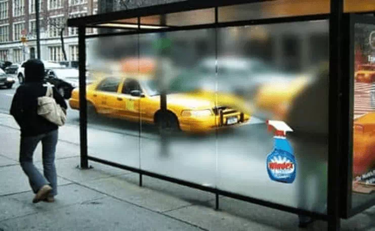
Reach Pedestrians With Billboards
We not only see the billboards on the highway but also it may cover some other places. You can use outdoor advertisement in several wonderful places like bus stops and subway stations on the sides of the walls or maybe in the street lamps. It should be considered that who you’re trying to get and how much time will they spend looking at your ad.
Stay Interesting & On-brand
As with the circulation of any form of advertising, you need to focus on the brand and it should be in an interesting way. There is a Swedish brand of vodka, Absolut, that transforms something as lowbrow and mundane just like a bus and made it a high-end marketing message which illustrates its brand amazingly.
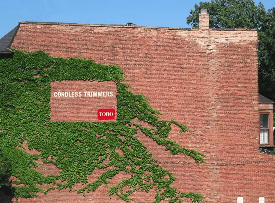
Incorporate the Natural Environment
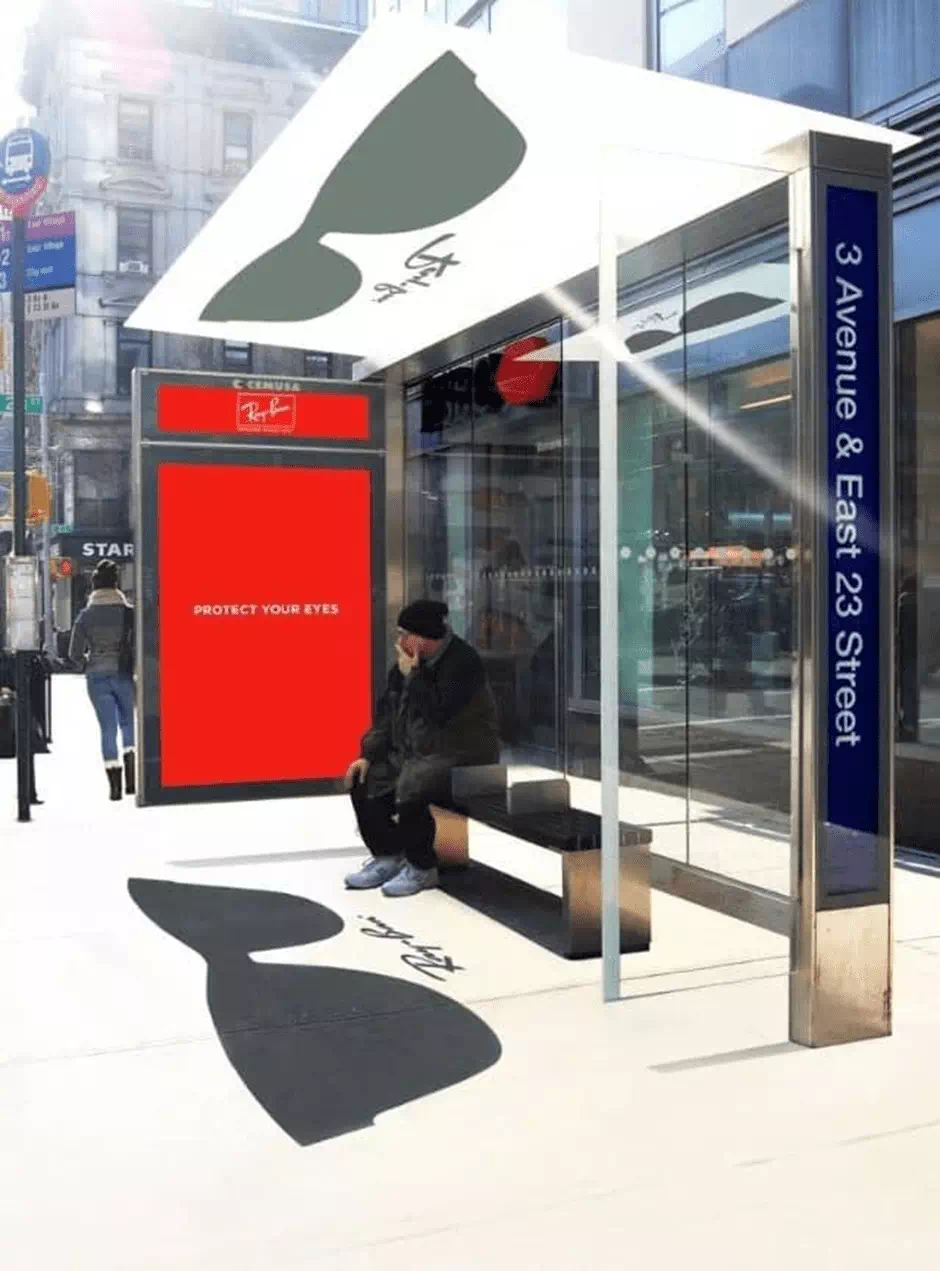
You have to tackle ad location very strategically by not only looking at its design from the perspective of the audience and of the ad space that is available but how you can utilize the proper surrounding elements. This design from a company called Ray-Ban is not only eye-catching, but it actually added a new dimension to the advertising space by leveraging the sun to project the reflection of its and that ad onto the ground becomes awesome. Isn’t it pretty nifty?
Design for Different Perspectives
No matter which kind of billboard or outdoor ad you may choose, people are going to see this from various angles, and also from different perspectives. As an advertiser, this gives you, the opportunity to craft different stories from each vantage point. This can make the billboard capable of telling a wonderful story and evolve people to see it from different angles.
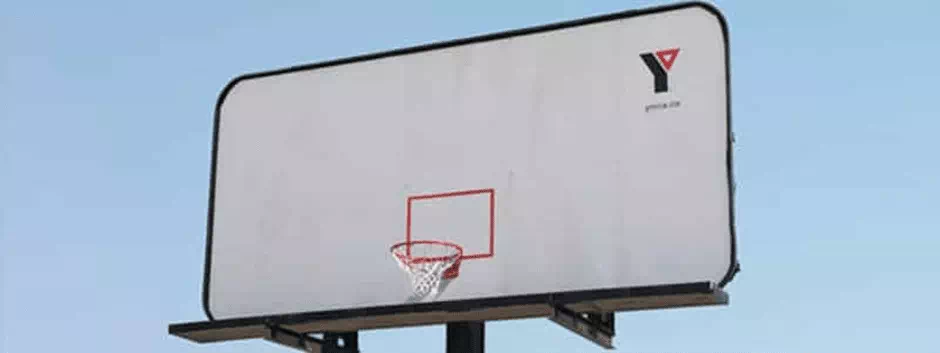
Incorporate Both Form & Function

The best designs always work in both form and function. It would be better if your billboard design method actually served an additional purpose besides sharing a marketing message? Perhaps your billboard design method can break through the noise and can offer something of which is useful for the people—ideally, one in which platform the design reinforces the same brand.
Make It Fun
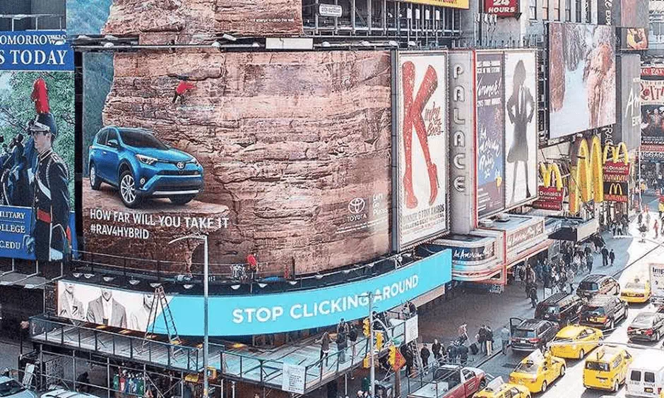
Taking about form and function at the same time, the next design will go a step further (or higher), Toyota created this amazing billboard design that didn’t just look like an actual rock wall. It was literally a functional rock wall where people can climb also. Isn’t it amazing?
Get Creative with Abstraction
It always bears a very important message in silence. It’s not about what you say actually, but what you really don’t say matters much. The power of abstraction is worth enough to portray a significant message. In many famous cases, they use abstract contents
Create Appeal by Getting Artsy
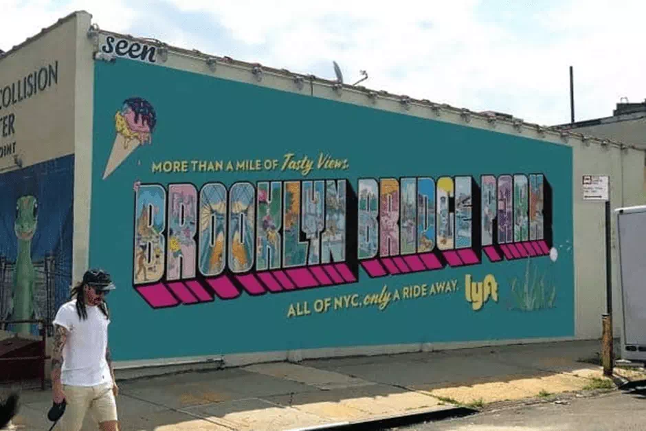
Billboard designs always don’t require to be printed or by digital ads. Nowadays murals throughout the city are getting famous day by day. It is an amazing feature that not only serves the purposes of beauty but also it creates user-generated content and made a very special appeal to passer-by.
Optimize Billboard Designs by Going Digital
You can’t even imagine people are going one step further in the field of digital ads. Many famous business commercials are now presented through digital billboards. It creates a massive awareness. Normal designs cannot be easily optimizable, where digital designs are very easy to optimize. It also reduces maintenance and cost.
Skip the Sales Pitch
The best marketing strategy is not to tell people what they need, but to make people realize what they need and what they offer for them. Maybe it might sound quite like a tongue twister game, but the fact is it is a really simple strategy. And the best thing that it makes your billboard sound less salesy, and psychologically people got a positive view of it.
Connect with Locals
A great billboard design reminds me how to connect with the locals and for this, you have to connect it to their native location. National companies are always inclined to design a few billboard designs in place throughout the whole country. If you tailor your ideas to local areas your message will resonate more. This way you can find attached with more audience and stay worthy.
Provide a Helpful Call to Action
You must think before that how people would perceive your design on the billboard. Is it offering a call to action? Is it providing a real solution? Actually, it is used with the driver’s stoppage notification. But that doesn’t mean your message will need a black and white effect. It can be informative and as well as catchy.
Use a Vanity Number
You need to drive people crazy about your design then don’t make them remember your number. But your business platform may need a mobile number. So don’t worry, you should use a vanity number for that. If people find this then they can order something easily.
Make a Joke
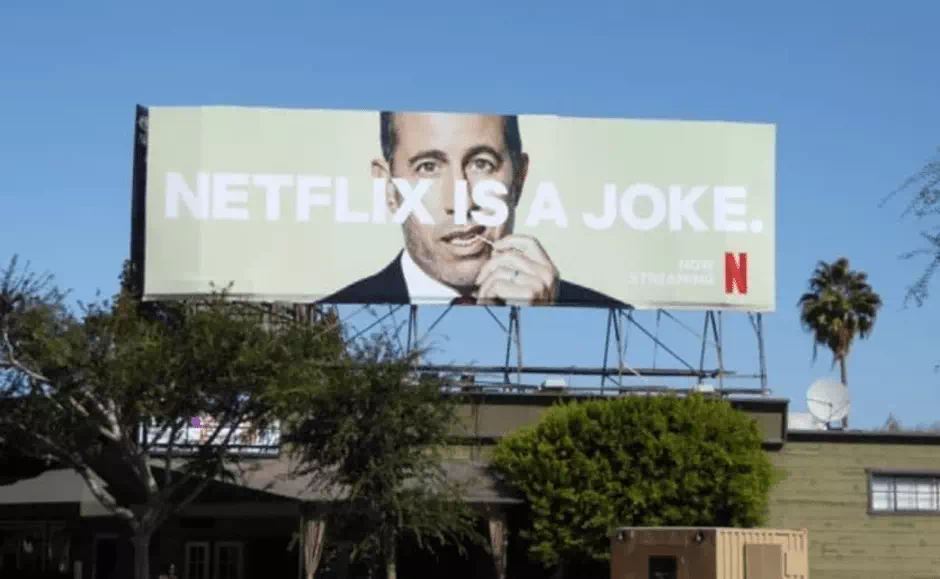
A very wide known company like Netflix paid a pretty smart amount to put up billboards where they quote “Netflix Is a Joke.” It’s a self-deprecating statement that is to catch the attention. Actually, this is reverse psychology to catch the attention of the people. You have to be very careful because this can be a sign that proves you’re a fool.
Select Your Billboard Location Wisely
There is something that cannot be controlled and will always be out of your hand. But if you are a smart fellow you definitely choose a perfect location for your design otherwise it may go in vain. You must choose your location in a very wise way.
Look at Your Design from All Angles to Prevent Design Flaws
A seemingly flawless design can also go down the drain rather quickly. You have to look at the environments of it and this is very important. The surrounding elements have a great effect on the billboards.
Build a story
The average person in your target who will see your billboard design always needs a reason to take action. So go for it. Make an amazing story and give it to them.
You can weave a wonderful story into all your message which adds a different continuity to your digital marketing ideas and which also affect a great impact on your business. This also breeds familiarity with your own business and breaks down all the barriers between prospects and consumers.
Strong imagery
Imagery does the work of heavy lifting when it comes to the design of an effective art called ooh advert. The right and the perfect image do the work of stirring emotions, and also inspires lost memories, and also creates an immediate response.
You can also create strong imagery to spread your message. You can also favor the simplicity but have to avoid anything too subtle to remain in the designs. By the time when your audience will work out, you’re meaning meanwhile the moment is gone.
Large typeface and simple Text
A large typeface is the main reason to convey a message and when they also saw the simple text it’ll create amazing supervision in the perspectives of the viewers. A large typeface also subtly ensures the design quality.
Inspire to take action
If you want that the billboard caught their eye, built a multidimensional and emotional response and now they strongly need a reason to take the next step aside. So you can help them make that best step with a strong call to action.
Making the Most of the awareness
For the online brands, that marketing strategy relies on aligning your digital strategy on a long surface and stay with the billboard campaign program.
Whatever call to action you may choose it won’t matter, you should do it so that its results will come in easy access to your website.
Get your story straight
If your billboard is situated on the side of a highway on which random people will be (literally) speeding up. Here your design without a simple story simply won’t be memorable to the audience.
To find your perfect story, think about the one thing that you want people to take away from your ad. Do you want them should remember your web address? To be able to clearly recognize your brand the next time when they see it in the supermarket? So you have to create a very simple story for the context.
Be loud
A larger-than-life-sized layout has no time to be meek! Make sure any text based on your design is printed in clean and bold font to ensure smooth readability. Also, the larger the font would be, the more time a driver needs to read and understand your main message at a distance. So go big!
Check your map
If you find you’re still searching for a fun story for your billboard, consider the current location where your design will be displayed and use that environment perfectly for a clever message. You must use the opportunity very wisely.
Some Basic Designs Tips
For designing a wonderful billboard, you need to follow those tips given below.
Simplicity is the key to creating great out-of-home design
A billboard’s sole purpose is to create an amazing function in the scene and perspective of the audience. If you want to create an effective digital billboard design your main purpose will remain mainly to make it read. The best design even becomes worthless if it is not a legible one from a good distance. It is only after the legibility that can only be mastered by a creative one which will be followed.
Make the Text Large
Outdoor designs need to be simple, clear, and as well as easy to read. Digital Bulletins also should be a stick in a way that they could be legible from 500 feet away.
Always stick to one message or idea. The key to effective outdoor design is always brevity. Because your audience is small, you need to decide what’s most important and worthy, then put that on your board design.
Use Bold, Non-Serif Fonts
Always use large and legible typefaces. At 500 feet, thin lines are optically getting fade or break up. Avoid fonts like decorative, italic, or serif. It is a general rule that the upper case and lower-case sans serif fonts are providing the best readability. At the time of designing for digital outdoor, we always highly recommend adding a thin dark stroke around the text to separate it from the background.
Stick to One Message or Idea
Simplify your every idea and everything. Never present a complex idea, message, or numerous images. Stick to one thing that you want to show your audience and to do or to recognize. The best outdoor media coverage reduces a complex and cozy message to its particularly essential elements.
Be Short and Sweet
Use not more than ten words in total on the entire design of the billboard – and that also includes the logo/product tagline. We again recommend a total of seven words or less for the entire headline. Always keep the words short for faster comprehension.
Color
Use only the RGB color for the files for digital displays. Design as you would for a website, TV, or computer monitor.
Avoid White Backgrounds
To achieve a white mood, a combination and mixture of all three colors must be turned on to their maximum brightness. Consequently, white backgrounds are silly and will wash out and compete with the remainder of your creativity.
Use bright, bold colors
Always stick with the fully saturated web-safe hues. There are some complementary colors like red and green which are not legible together because of their similar value. When you contrast color combinations, this will work best for viewing the outdoor designs from a very far distance.
Design with High Contrast
When it is a matter of great distance then subtlety does not work at all. In both hue and value, strong contrast is always essential for creating good digital design out-of-home.
Pick Your Image Wisely
It is recommended to get a small object and then make it large (like a mobile) rather than pick a large object and make it small (like a tall building). Using of landscapes or complex scenes should be avoided. We can recommend 3 visual elements or less, total.
For example:
1 image,
2 logo and
3 headlines.
Forget About White Space
It will be silly if you use white space Outdoor like printed material. It is now dead use. You can increase your logo, enlarge the font sizes and imagery! It is not recommended to
visual space at 300 – 500 feet.
Test Your Idea
A billboard design is not a print ad at all. A person’s average viewing time can only about 5 seconds. So, it will be better if you show this design to some random person and ask him what he perceived at a glance. Did they understand something? What do they think about what the advertiser wants them to show?
Poster (standard 12′ x 25′)
Aspect Ratio- 2:1:1, Dimensions- 400 H x 840 W, Resolution-72
Bulletin (standard 14′ x 48′)
Aspect Ratio- 3:5:1, Dimensions- 400 H x 1400 W, Resolution -72
You’ve got the flexibility so use it!
It hasn’t got any production charges and also no installation schedule. So, the digital advertising system gives you amazing freedom like never before. You can change your message weekly, daily, or even hourly.
Digital Capabilities:
Consumers are nowadays inundated with a huge variety of advertising throughout the whole day., One relevant way to reach the proper consumers is timely advertisements. Change your current content and digital advertisements to reflect the latest advertising messages and contents.
Digital dayparting capabilities allow the consumers and clients to get a plan ahead in a similar fashion that is related to an editorial calendar.
Countdowns:
Countdowns generate wonderful hype and excitement within a community very easily. A countdown is a very informative system that alerts consumers about upcoming events. It also reminds them to plan accordingly.
Social Media:
Digitals can be programmed to pull content submitted through social media – including Facebook, Twitter, and Instagram.
Score Display:
Allows an advertiser to show up-to-the-minute score updates for a chosen event to drivers passing their board.
Traffic:
Considering dinner options if you decide another way. You can think of traffic dictates which affect consumer decisions. U. S has over 200 million. So, it really makes sense for a witty businessman to get your business on the map and integrate traffic conditions into the advertising plan.
Weather Triggers:
When you decide weekend plans in considering the dinner options, the weather also dictates the consumer decisions. It also makes sense to suggest your institutional products and services integrate weather information into your next digital advertising campaign.
Short Copy
Always use short and simple words that have quick and easy comprehension in their main message. You should limit or eliminate your punctuation and edit them down to the interracial bare bones of your main message.
Viewing Time
You have to look over that if your message would communicate effectively within 5-10 seconds or not? REMEMBER: Your target audience is speedy and it is traveling very fast like 65 miles per hour.
Large fonts and text
Your goal should be for people that they read the message from as far away as possible. Be sure that the words must be large and the type of the words must be clear and easy to read
Contrasting Colors
A high range of color contrast is the main featuring key to a very good readable idea. Colors that always work best: white, black, and bold. You can add primary colors like red, blue, and yellow. Black text situated on yellow rates are the highest in readability and also looks awesome. Colors that you should avoid: brown, earth tones, pastels.
Single Image
When you use one large image it’ll definitely attract the viewer’s eye to the billboard. For example, a single image of a Pepsi can work better than 3/4. Always take a small object and make it large.
Simple Background
You use a very simple background and that does not interfere with your image, copy or logo is a perfect back. Again, remember too much blank space isn’t also a good thing.
Call to Action
Do you have to make it sure that Is the call to action of your image clearly found in the ad? Does your every target audience and viewers have got the necessary information with which they can respond to your ad?
Balanced Logo
The image and the logo. Should be balanced. The logo shouldn’t be typically not as large as the image. About 1/8 of the billboard size is a pretty good guideline for the smallest the logo should be.
Some Super-Creative Designs
Here you’ll find some super-creative billboard designs of different companies.
Dracula
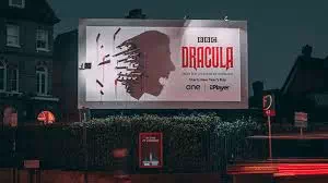
In this advert for it is the BBC’s adaptation of Dracula the bloody stakes which sticks out from this billboard during this day. But at nightlife, a light on the other side of the billboard means that the stakes created to form a haunting shadow of Dracula himself. It’s certainly a very clever way to get people’s attention.
IKEA Steps
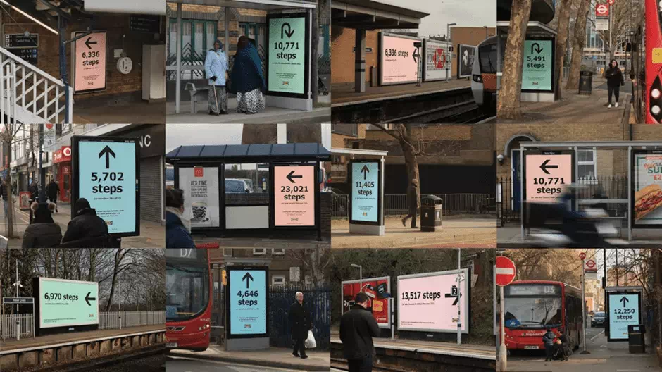
This intriguing and creative approach to a new era of billboard advertising was created by Mother. To promote IKEA’s brand-new Greenwich store – the most sustainable IKEA ever – the ad agency devised a campaign and they aimed at highlighting the store’s main eco-friendly credentials. Billboards and posters situated all over London are direct and would-be shoppers to the new store of their company.
Rust
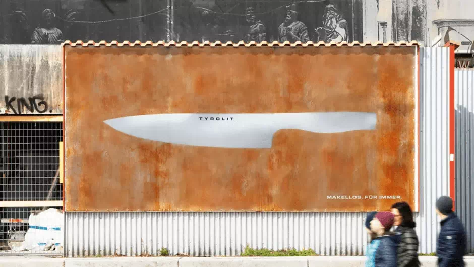
This billboard created by Heimat transformed over time. It also shows off Tyrolit’s Icelike knife that has a range’s USP. Initially, the passers-by were faced with a mysterious sheet of metal and it bears only the brand’s logo.
Wave of Waste
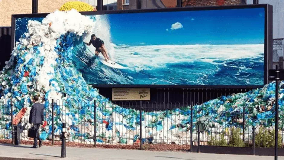
One of the world’s most amazing billboards that got a very wonderful feature which made the people amazed. It was created to mark World Oceans day in 2018. Corona also worked with Widen + Kennedy on this amazing project. There is the image of Chris Hemsworth surfing to this ocean.
Who is America?
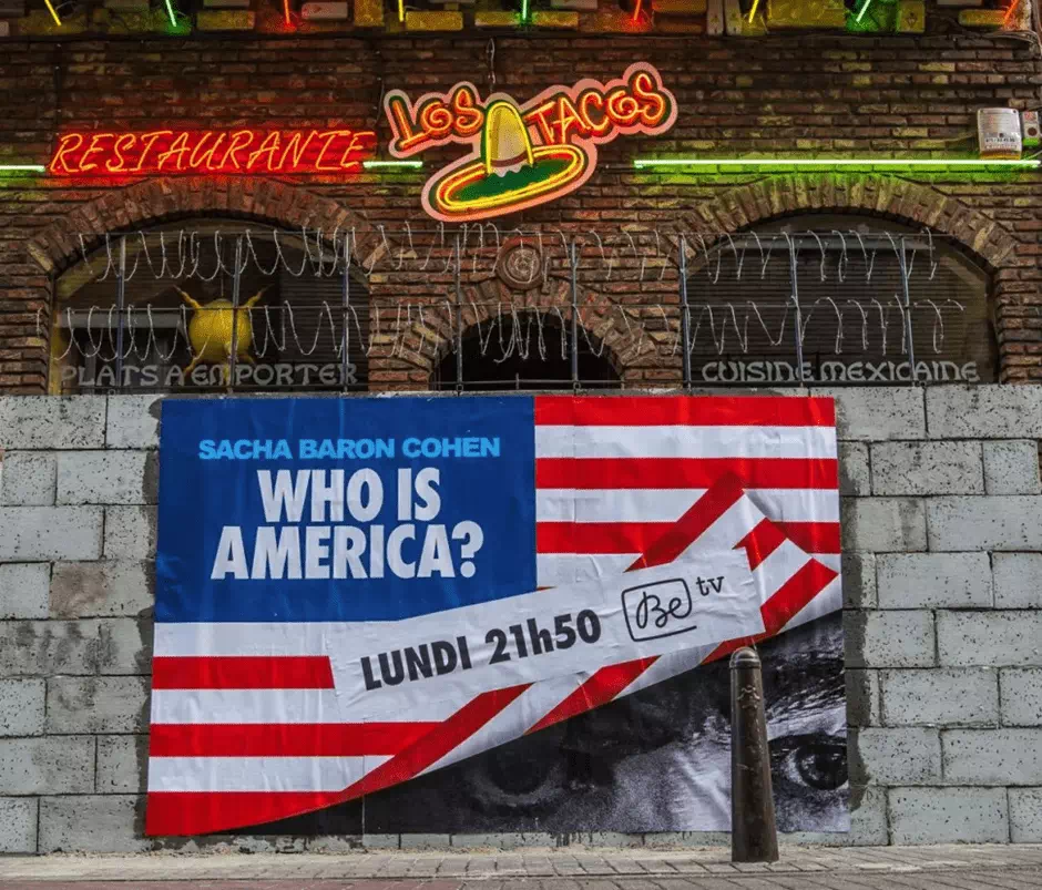
Another wonderful breakthrough with this billboard. Sacha Baron Cohen’s TV series called, “Who is America?” was an immense exercise in getting assorted American politicians and to humiliate themselves on camera with hit-and-miss results.
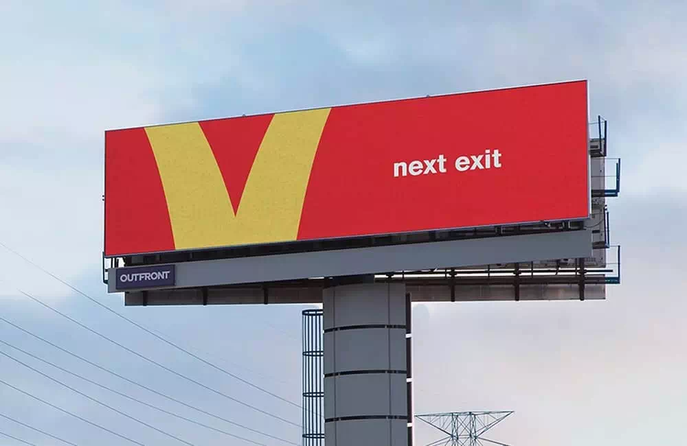
Follow the Arches
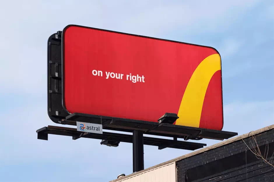
It always takes a lot of chutzpah to mess with a particular logo, but it’s what that Toronto agency Cossette done, along with the Spencer & Jordan. And they did this for McDonald’s campaign. This goes for the award-winning company and follows the Arches campaign. The team deconstructed the iconic golden arches into minimal directional billboards to help steer drivers.
Reebok ZPump 2.0
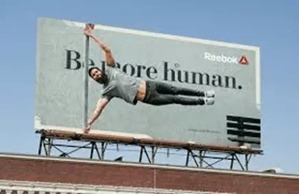
Swedish agency Animal came up with a very impressive idea for the publicity of Reebok’s new running shoes. It set up an outdoor billboard in central Stockholm. It challenges people to a human speed test. Anyone who can ran past the billboard faster than 17 km/h then it unlocked a brand-new pair of ZPump 2.0 shoes. Isn’t that amazing?
Coca-Cola: The Sign
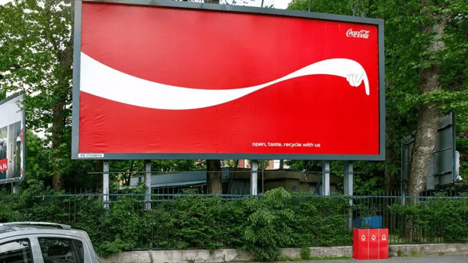
This way to recycle your bottle (Image credit: Publicis)
This billboard advertising expert Publicis Italia encouraged Coca-Cola drinkers to recycle their empty bottles. The agency very cleverly added Cola’s iconic ribbon design. They used it to literally point passers-by to the nearest recycling bin.
AIR-INK
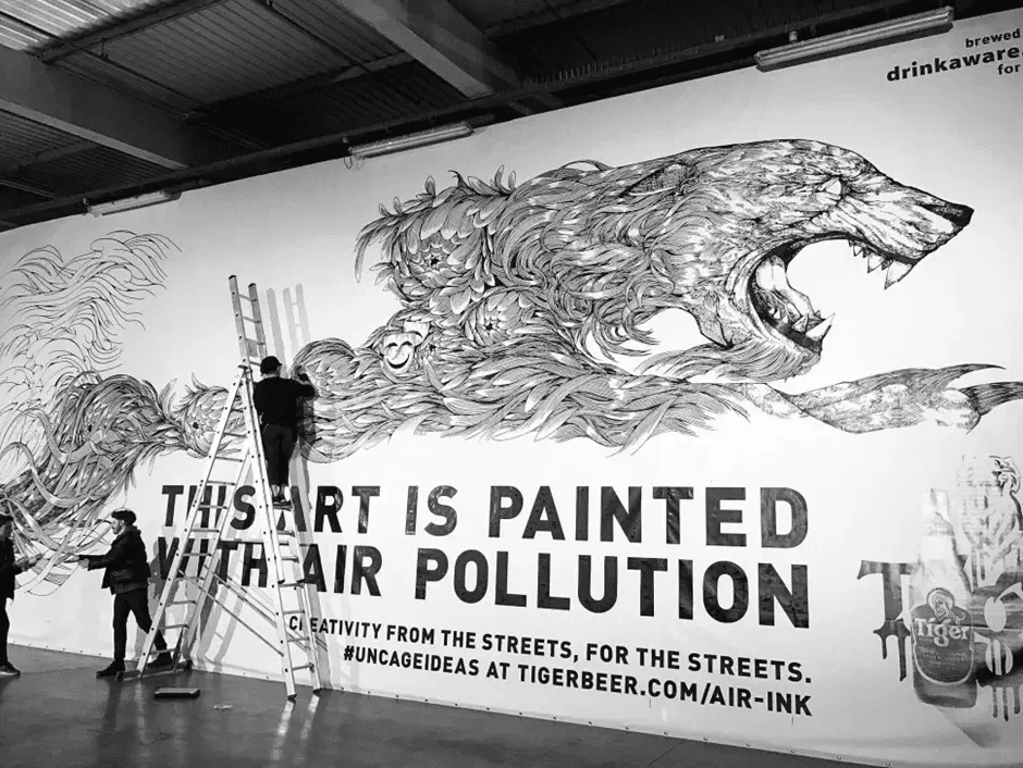
To promote the wonderful project, the team roped in with illustrator Kristopher Ho to paint a huge billboard for London’s Shaftesbury Avenue. It works effectively for ‘recycling’ the pollution into artwork.
McDrive
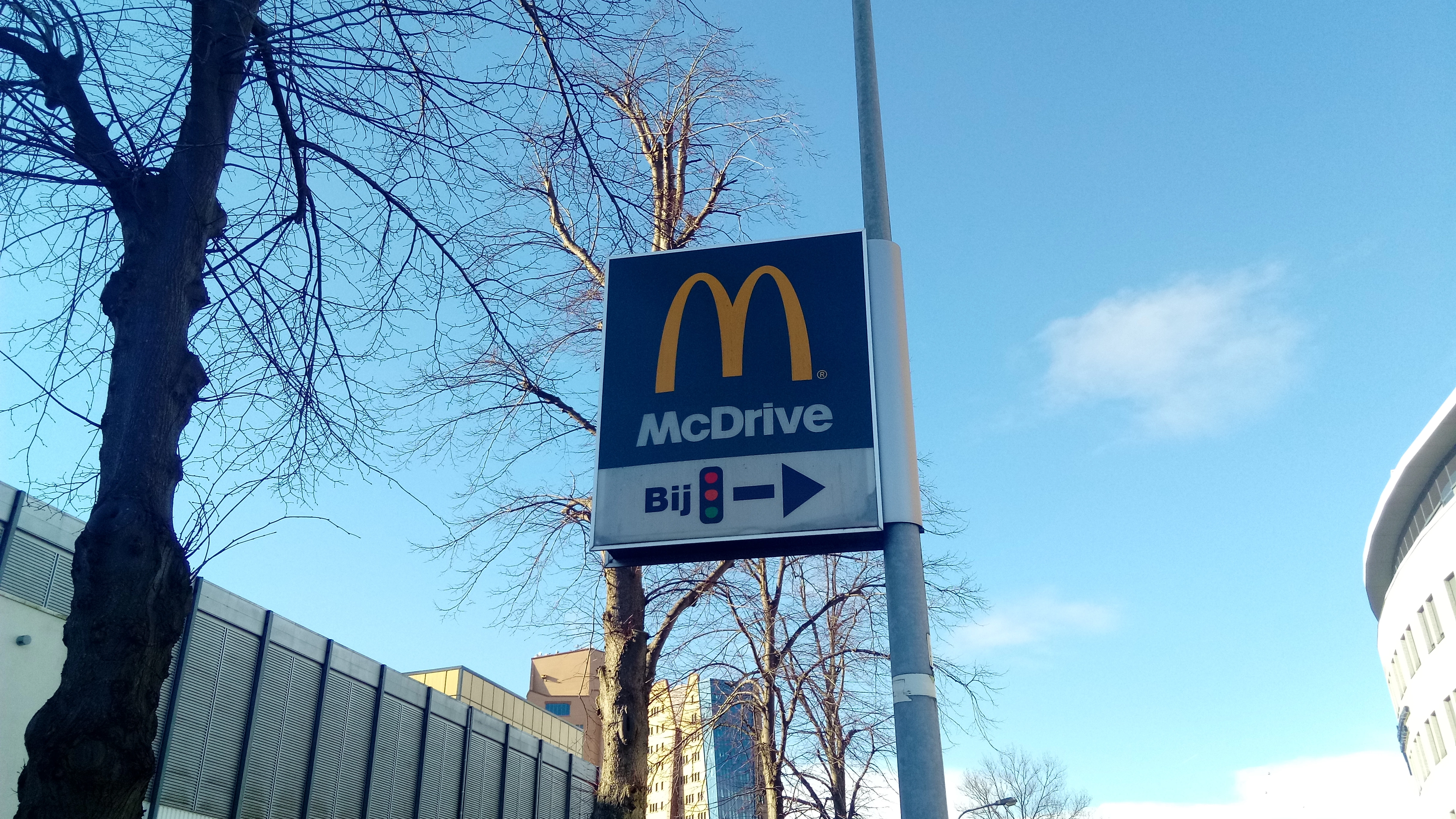
Taking advantage of this fact that, McDonald’s, operates creates a lot more drive-through restaurants in France, and this is known as McDrives. It was an amazing design to beat their main opponent burger king.
The Human Billboard
This journey is about racism. It reflects a protest through tattoos and humans themselves. It bears a great significance in the psychology of the people. People are also learning a lot from this kind of art.
Unitech
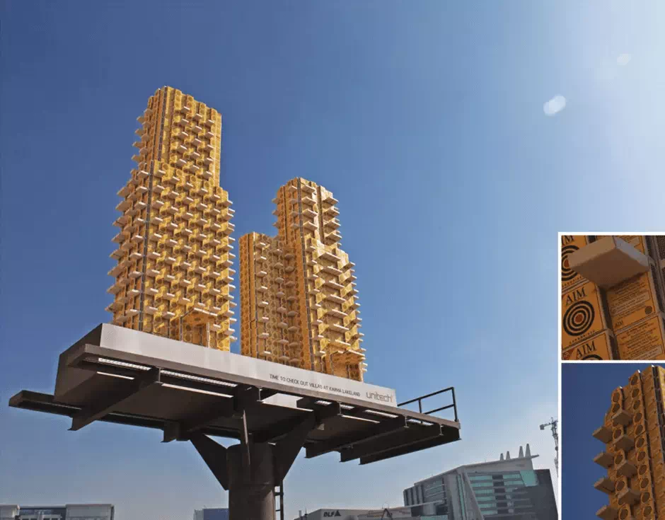
It is developed by the team of advertising agency JWT, New Delhi. This Unitech billboard design takes advertising to a new height. Here, we got hundreds of dummy matchboxes that were produced and stuck together. It looks like a Lego city and the high-rise structures promoting a brand-new villa gated community.
IBM
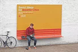
This kind of adds designed serves some purposes. Here adding a curve to create a rain shelter. It says “if cities were smarter then, the life in cities would be much better”.
The billboards work amazingly. it seamlessly blends modern design with functionality for helping people. It also reminds them of who is behind the act of generosity. Guess what, it’s a clever way to sell. Isn’t it?
Burt’s Bees
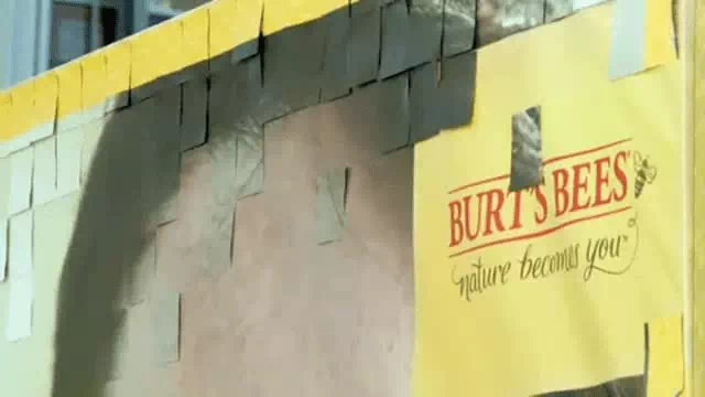
This clever use of such amazing design and construction meant that their ‘before’ image literally ‘flaked’ away and as viewers peeled off the total skin of coupons attached to the board. It may be redeemable at local stockists. Eventually, all the coupons were now removed and all that things were left here was a shiny one. It is an amazing process.
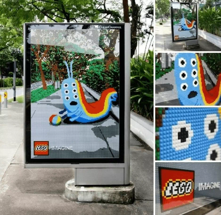
Lego
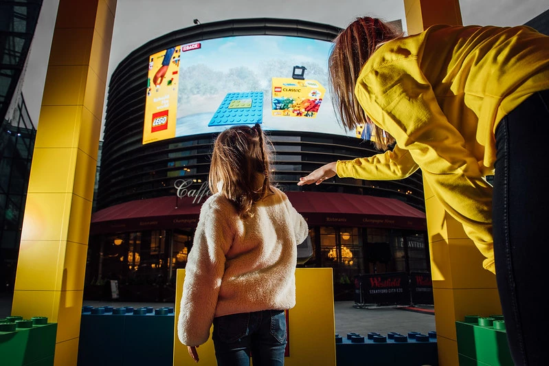
These bus stop billboards’ design and unique lego art are mindblowing. That blends seamlessly into the surroundings as well as in the surface area. Lego has a consistently brilliant idea and creative approach to its ad campaigns. It creates a craze in the scenario of the people’s sight.
Leica
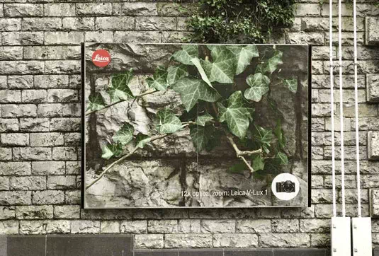
Imagine, A picture speaks 1,000 words, or in this case, it has got 12x optical zoom. These super-creative billboards are designed by the team at Advico Young & Rubicam in Switzerland. It depicts exactly how can simplicity often be the most and wonderful creativity.
OBI
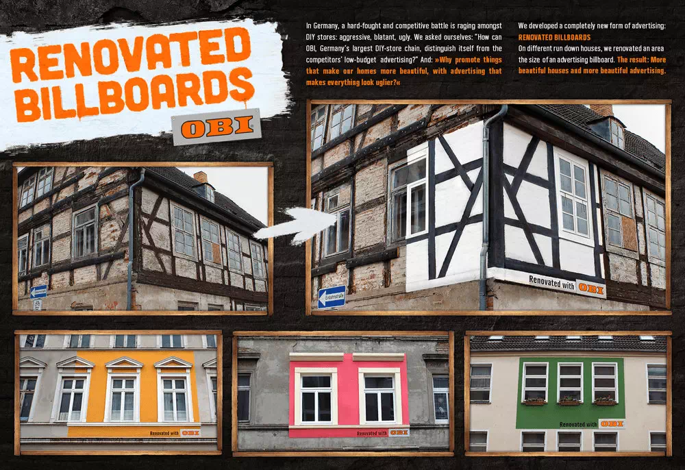
DIY chain store co-operation decided to do something different and they placing their billboards, not in the usual. They choose people’s homes themselves. Its thinking came from based on that question: Why promote things that make our homes more beautiful, with advertising that makes everything look uglier?
McDonald’s
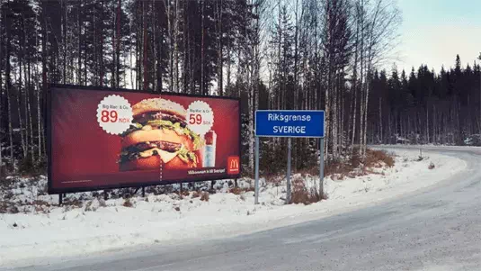
You may love it or hate it, McDonald’s has always managed to show inventive advertisements, which is why it’s made its position into this list once again. Created by one more amazing advertising agency DDB Stockholm, this billboard takes an innovative approach undoubtedly.
British Airways
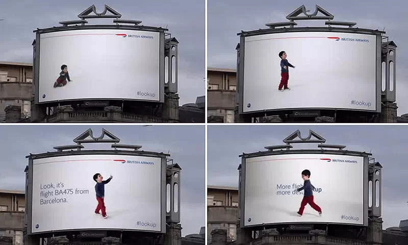
This design from British Airways certainly got our sole attention. Designed by the famous Ogilvy, the company track flights by using surveillance technology. They are also allowing a child to point to the overhead flights in real-time.
OREO
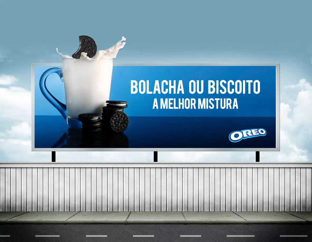
This name seems cute to me, isn’t it? One of America’s most favorite cookies, Oreo celebrated its 100th birthday with the ‘Wonder-filled’ campaign. The Martin Agency was tasked here with creating a series of inspiring animation designs. It then teamed up with a brand-new school to take over the largest advertising space in the United States – Times Square.
Formula Toothcare
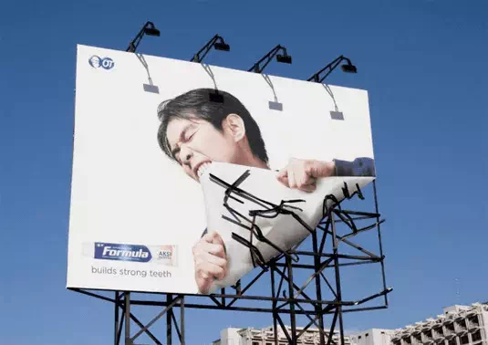
Look at it, you’ll be amazed to see how a billboard can touch the space of perfection. This utterly creative billboard Formula Toothcare takes its tag line ‘builds very strong teeth’ to the extremes.
BMW
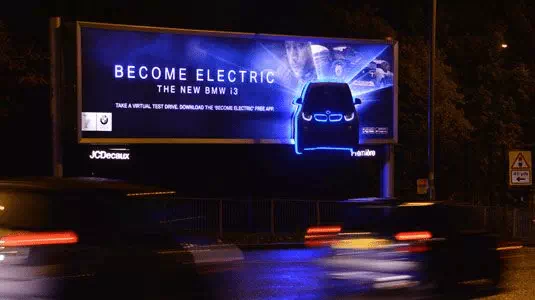
Out-of-home communications agency Posterscope developed an amazing illuminating outdoor advertising campaign to promote the BMW i3. It is claimed to be the world’s first premium fully electric car.
Orphea
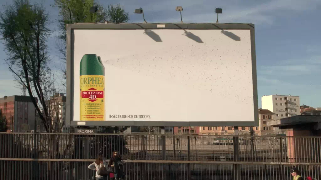
Orphea4D Protection is a very powerful insecticide spray for exteriors. This brilliant billboard campaign promotes the brand. They are transforming a normal billboard into a huge insect trap.
C.A.L.M.
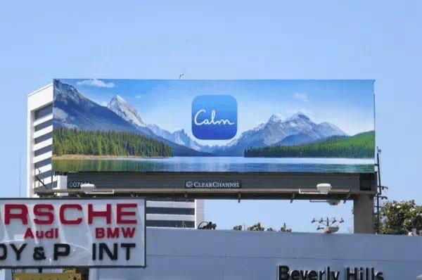
Street art can be a creative way to present a powerful message. To raise awareness to the charity C.A.L.M. graffiti artists Soulful Creative created these brilliant billboard designs. The posters here stayed aimed to highlight the statistic that three men who were under the age of 35 take their own lives every single day in the busy UK. The lighting effect is also a very nice touch – it is ensuring that passers-by will almost certainly take notice of the billboards.
Nike: Knitting
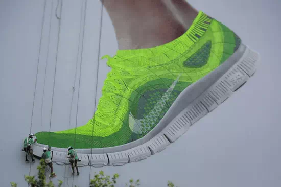
To promote the latest Free Flyknit sneakers, Nike got together with advertising giants Widen + Kennedy Shanghai to knit a wonderful humongous shoe onto a billboard design. With the help of three expert workers, strips of neon green gas were threaded together to create the shoe on top of a barefoot.
iPod and iTunes
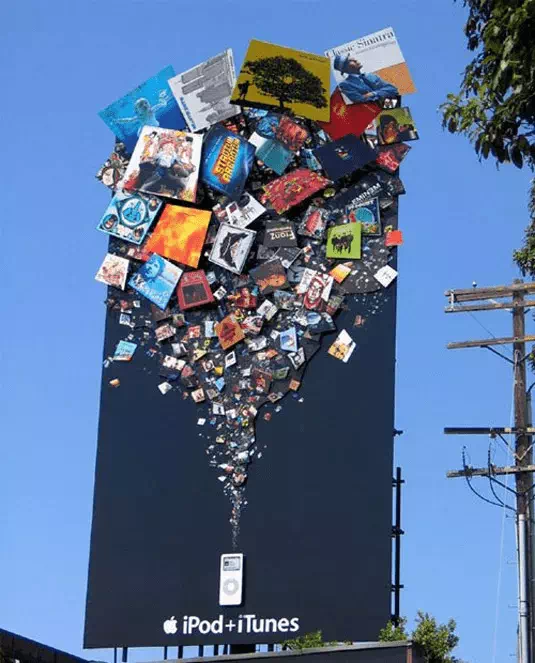
There’s absolutely no confusion that what Apple is trying to say with this billboard design. Apple made it sure there’d be no chance of missing this advertising campaign for its iTunes store and iPod.
Black Tower Home Security
In a campaign for the Black Tower security, advertising agency TBWA/Vancouver demonstrated that some people can take whatever they can get their hands on. It is one of my most favorite.
Sky Discovery Channel
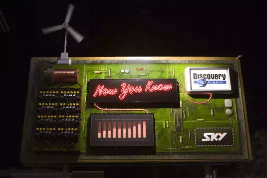
This original and wind-powered billboard design was created by DDB New Zealand. This eye-catching design for the Discovery Channel. It was developed by an advertising agency DDB New Zealand.
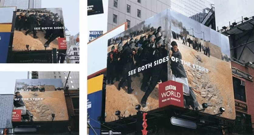
BBC World
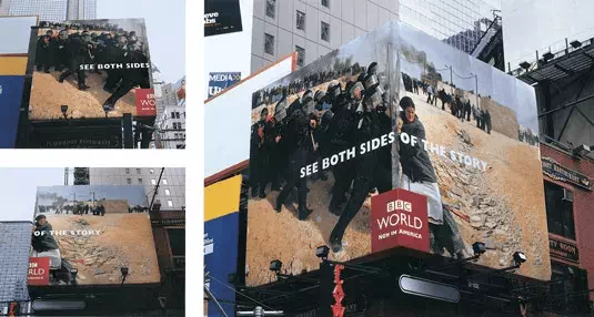
When BBC World became available in the US area, BBDO New York chose amazing photography and clever billboard design placement to tell the country that the international news channel had arrived in a big way. The imagery is taken from events around the world. It is enough to grab your attention alone.
Kill Bill
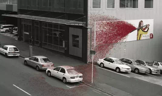
Saatchi & Saatchi New Zealand drenched the wall totally, pavement, and three shiny white cars in its promotion and it was for Tarantino movie Kill Bill, Vol 1. Advertising agency Saatchi & Saatchi from New Zealand.
The Economist
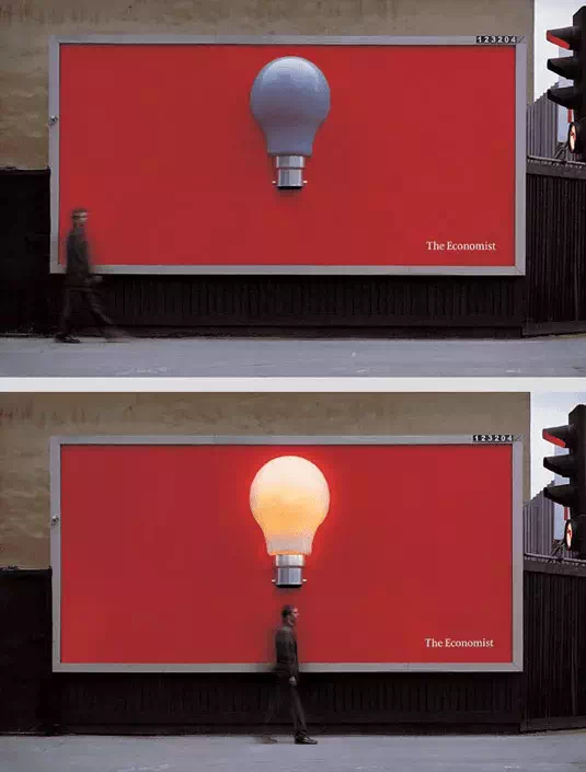
UK-based creative agency that Abbott Mead Vickers BBDO was the creative brains behind this ingenious light bulb billboard design
Using electronic motion with sensors, the bulb lit up whenever someone walked underneath it, which is a brilliant, effective way to get the message across.
Koleston Naturals: Change
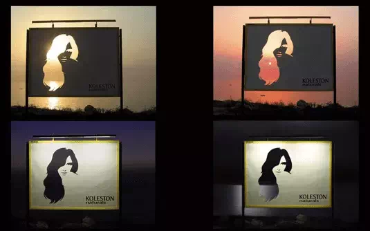
This billboard advertises for Koleston hair colorant and it uses the sun as a part of its design. Advertising agencyLeo Burnett likes incorporating the sun into their awesome designs, including this one for hair colorant Koleston Naturals.
Bleeding billboard
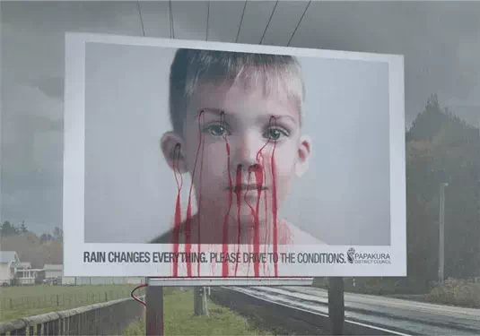
This billboard design ‘bleeds’ when it rains. Yes, that’s true. The concept for this wonderful and powerful billboard design came from the New Zealand-based creative agency Colenso BBDO.
Panasonic nose hair trimmer
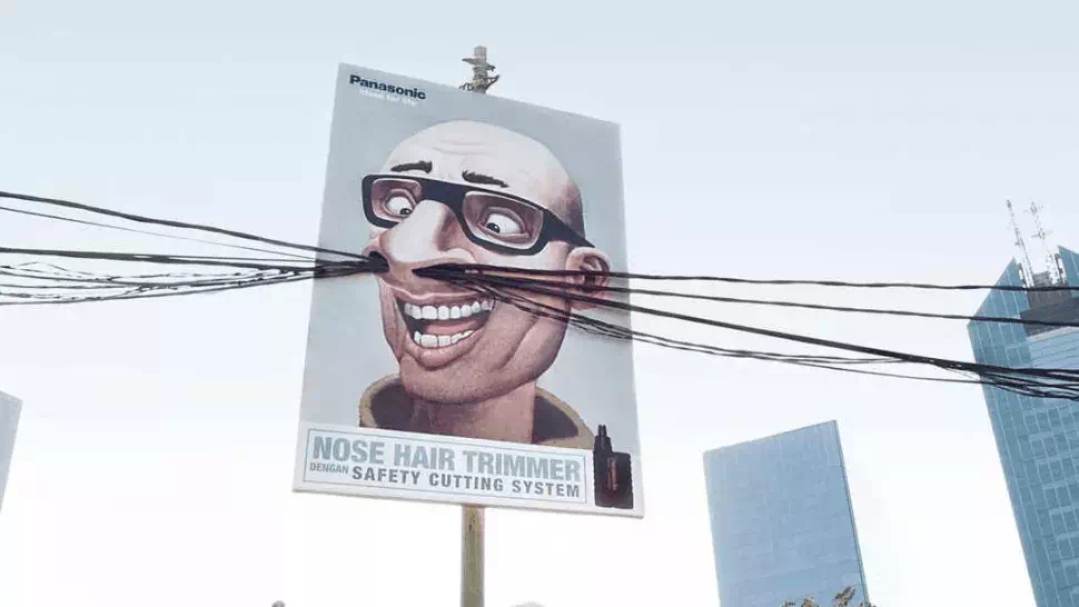
Again, it is Saatchi & Saatchi in Indonesia that incorporated real-world elements into its ad for Panasonic’s nose hair trimmer. We love this amazing comedic design by Saatchi & Saatchi.
Colorado State Patrol
Keep your eyes on the road, not this brilliant billboard by Amelie Company
Science World
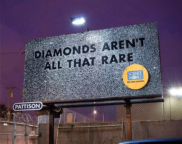
Do we wonder how long it took the Rethink team to glue 9,000 diamonds to this billboard? Other brilliant designs include a board covered in pure gold and a stick man-made from 9,000 pencils.
The Day After Tomorrow
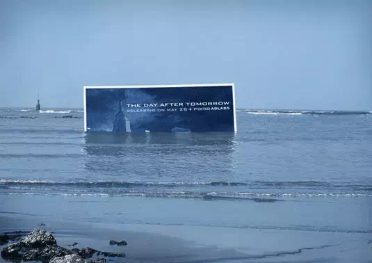
This innovative billboard promoted disaster movie The Day After Tomorrow
Smart: Little billboard
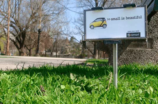
BBDO Toronto promoted Smart car’s low impact on the environment with these itty-bitty billboards
Levi’s
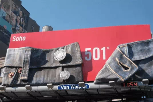
Levi’s lets its product do the talking in this billboard design
Heineken
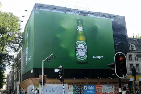
This eye-catching design was developed by advertising agency TBWA. The concept for the billboard, which graced the city of Amsterdam, was developed by the team at advertising agency TBWA.
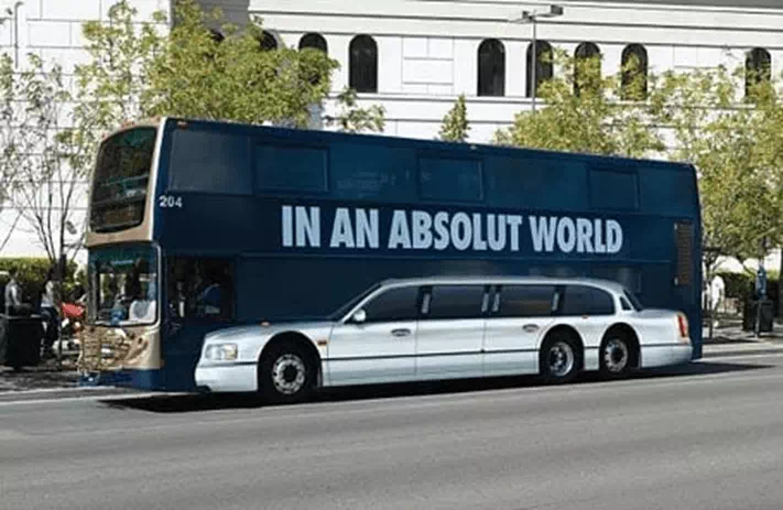
Absolut Vodka
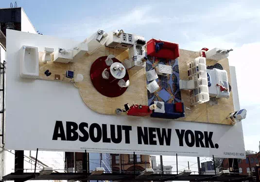
Absolut’s long-running ad campaign transformed an ordinary billboard into a stylish NYC apartment back in 2000
How are you feeling now? Creativity is not ending here. There are thousands of different ways to generate your billboard banner design ideas. Hope you’ll get a vast idea about how you should make and design an amazing billboard.