Starting a new company requires a lot of hard work and strategy. When you choose to work with energy like an electric energy company or solar energy company, a well-designed logo can make your works much easier. A creative energy company logo becomes your representative and speaks of your services and aspects. It goes everywhere and spreads your company name even more. Also, it brings you more clients by building a warm relationship with them.
Before designing a logo for your energy company, it is important to know which symbols, icons and illustrations are suitable for your type. You have to make a unique design out of the common elements with your creative ideas. That is why you need ideas with tips and techniques to design the exclusive logo for your energy company. Say no more, we know your needs. Here we have made a comprehensive list of 25 Best Energy Logo Design Ideas to inspire you
What is an Energy logo?
An energy logo is a visual representation that encapsulates the essence, values and expertise of an energy-related company or organization. It serves as a unique and recognizable emblem that conveys trust, sustainability, innovation and specialization within the energy sector. Energy logos play a crucial role in establishing a powerful visual identity. They leave a lasting impression on clients while reflecting the company’s commitment to providing energy solutions.
How to Create Best Energy Logo?
Creating the best energy logo involves careful consideration of design elements that capture the sector’s essence. Let’s explore five key steps to craft a compelling energy logo.
- Define Your Brand Identity: Clearly outline your company’s values and a
- Research and Inspiration: Investigate competitors and draw inspiration from successful energy logos to understand industry trends and possibilities.
- Concept Development: Brainstorm and sketch diverse logo concepts that convey your energy-related services effectively.
- Simplicity and Versatility: Choose a design that’s simple yet adaptable, ensuring your logo looks good on various platforms and materials.
- Feedback and Refinement: Collect feedback from peers and clients, then refine your logo based on their input to create the best energy logo possible.
What to consider when designing a logo for Energy
Designing a logo for an energy company requires careful consideration to convey the industry’s essence effectively. Explore these key factors to ensure your energy logo captures the right message and resonates with your audience.
- Symbolism and Elements: Incorporate symbols and elements that convey energy-related themes, such as lightning bolts, renewable energy icons or power-related imagery.
- Color Psychology: Choose colors that evoke energy and vitality to resonate with your target audience. Like: vibrant reds, bright yellows or eco-friendly greens,
- Typography: Select fonts that balance professionalism and innovation. It ensures legibility at various sizes and mediums.
- Sustainability Focus: If your company specializes in renewable energy, emphasize sustainability in your logo through eco-friendly color choices and symbols.
- Scalability: Ensure your logo is versatile and scalable to maintain its visual integrity across various applications, from small business cards to large billboards.
25 Best Energy Logo Design Ideas
Spark your creativity with our curated collection of the 25 unique energy logo design ideas. These logo design services are applicable for any energy company in the world, besides the company of USA.
Astrum Solar:
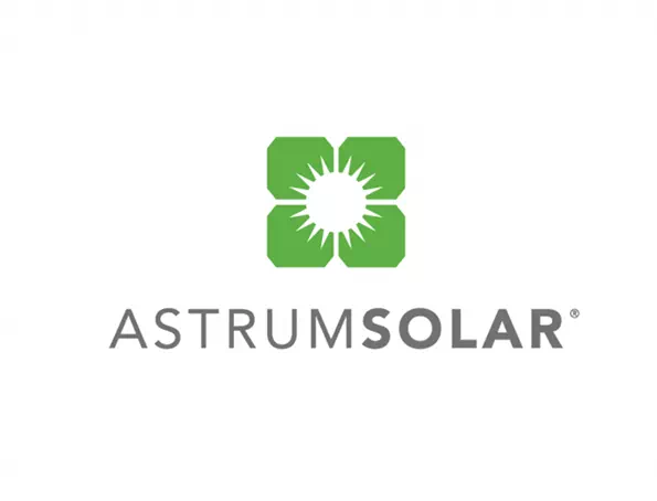
The logo of Astrum Solar is a combination design with a relatable illustration and typography. Maintaining a balanced look in the logo is something you can’t give up. And the sample logo shows you the way of a balanced look. It doesn’t seem overdone. Anyway, they have made a resemblance between the name and the design by creating a sun into the illustration. It complements the logo design even more.
Energreen:
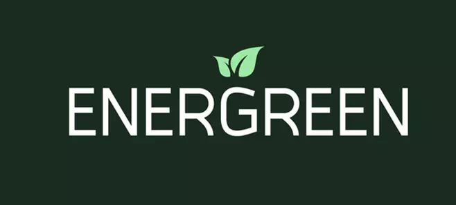
The logo of Energreen is a wordmark logo with a customized font. The font is minimalistic and attractive enough to give the logo a versatile look. If you want to design a wordmark logo, consider paying attention to fonts and their sizes. You can go for all uppercase like the sample logo. A mixture of uppercase and lower case is also suitable for wordmark logos.
David Energy:
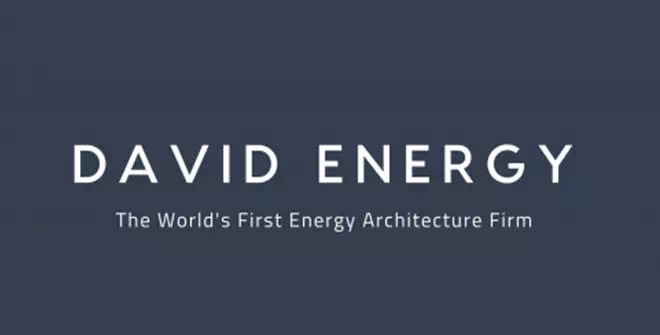
The logo of David Energy is another wordmark logo design idea. We were talking about the fonts. Here, the font is not so fancy yet still creates a sophisticated look with its simple style. Such designs are great for building a strong, reliable impression for an energy company. So, as an entrepreneur, you must need a trustworthy logo design that will be not only eye-catching but also communicative.
Es Solar:
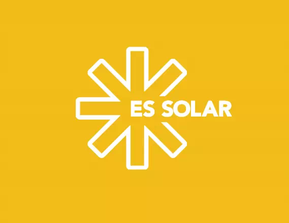
To show up your energy company’s inner strength and potency, you can design a vibrant and breathtaking logo. For instance, we have brought an energy company Es Solar’s logo design that is inspirational and motivating. It is a bright yellow-colored logo with a symbolic sun icon. It depicts the company type and the services. Such a logo serves a lot in setting up the positive first impression that you need with your clients.
Longrun Energy:
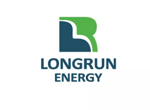
When you decide to use an illustration in your energy logo, bring out the most striking feature of your company and show it through the design. It will make your company values interpretable and expressive. Clients are most likely to catch them more than those companies who are open and clean in their policies.
The sample logo here is looking like a road which is for the namesake. If you look closely, you can find their initial letter L in the illustration which has made the logo even more brilliant.
HRE:
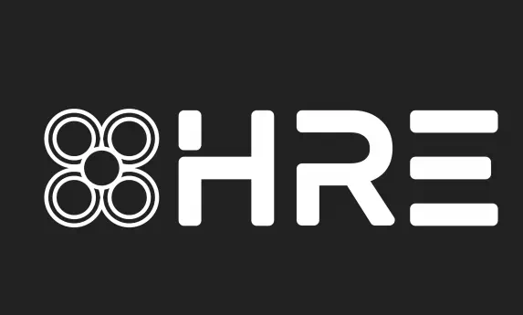
The logo of HRE is an inspiring logo design for those who want something out of the box. If you want to create a design that will be striking and completely unique, you must need creative ideas. Here you have the example to take inspiration.
It is a combination logo with extra bold and thick font and a complementary symbol. All of the features have made the energy logo intriguing and engaging.
Cube Hydro Carolinas:
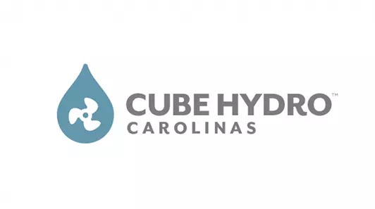
Cube Hydro Carolinas has got a logo of water drop shape that has a fan symbol in it. All of these depict the company’s name and its perspectives. Also, the blending of two colors is mesmerizing here. You can take inspiration from here to design your energy logo with two complementary colors. They will make the logo charming as well as thoughtful.
Suncore Energy:
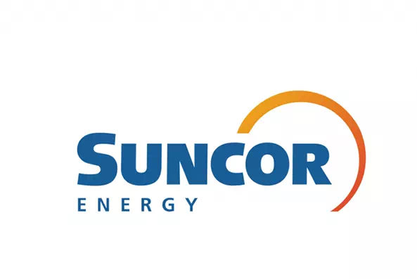
The size of the fonts makes a big difference in wordmark logos. The logo design of Suncore Energy has its initial letter bigger than the rest. It creates depth and balance in the design. Besides, the semi-rounded line is used to hint at the sun which is the company’s namesake. Anyway, if you want such a simple yet attractive logo for your energy company, here is your example.
Fresh Energy:
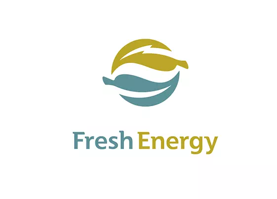
Fresh Energy is an eco-friendly energy company and its logo design is a visual representation of it. The logo consists of a symbolical illustration and typography. Using the negative space, the designer has made two leaves one is for representing energy and another one is for freshness.
Together they have shown the company’s mottos and purposes. It’s a great way to build a reliable relationship with the clients if you make your perspectives clear. And a logo like this can help you to a great extent.
BS Energy:
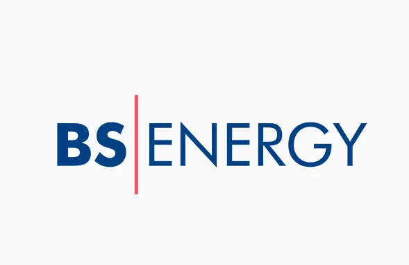
There is enough room to experiment and execute creative different creative ideas in wordmark style. It is utterly suitable for energy logos as well. Effortless and classy they are with their minimal features and simplistic look.
The logo of BS Energy is an example of wordmark design. All the letters are in deep blue while a red straight line has separated two words. This little trick has made the logo vibrant and lively.
Hydrogen Bank:
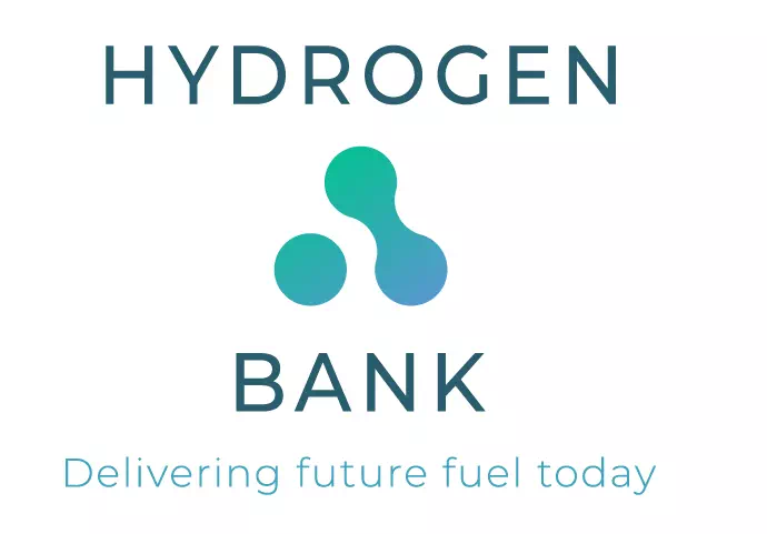
If you want the clients to know your energy company better through the logo, add a striking tagline in the design. It will help you to reveal the company’s inner strength and motivations. The logo of Hydrogen Bank has added a tagline in their design that makes the clients interested to work with them. Along with it, a minimal and smart design will pair up better.
Diverse Energy Group:
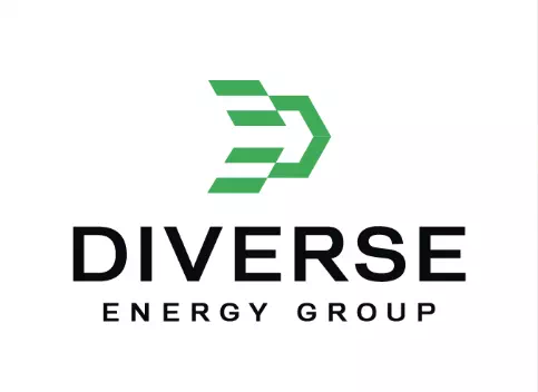
The logo of Diverse Energy Group shows you the way of using two colors brilliantly in the design. The black and green combination has brought a spirited look to the logo. Hence, it has become a fresh and worthy mouthpiece of the company.
The font used here is a basic serif font in an extra-large size. All of these have contributed to making the logo suitable for an energy company.
Fossilytics:
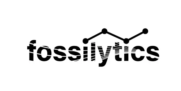
The logo of Fossilytics is a peculiar and unusual design that looks fun as well as worthy. The design is wordmark-based with some other elements to uplift its beauty. The fonts are designed in a way that it is looking like a hosepipe is watering them.
Also, it has a design of water molecules. Overall, the logo is simply striking. For a new energy company, such a logo design will be the Holy Grail.
Blue Planet energy:
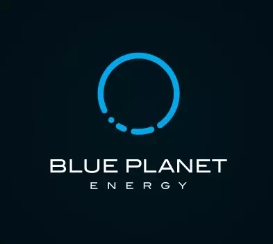
The logo of Blue Planet Energy is a simple, non-elaborate design. The negative space is used for an illustration of the planet-like shape that depicts the company name properly. A space font has been used as the perfect complementary element of the logo design.
Such designs may not require much of your time but the results they bring are amazing. So for your energy company logo, you can go for this idea.
Crosscut Energy:
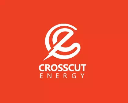
Using the initial letters as an element of designing saves you a day. The example is in the sample logo. Here, the letter C is used twice in the design for the namesake of the company. Also, a lightning sign has been used in the illustration to symbolize the company’s services. So, before designing your energy company logo, brainstorm on the name and follow the way it takes you.
Carnegie Clean Energy:
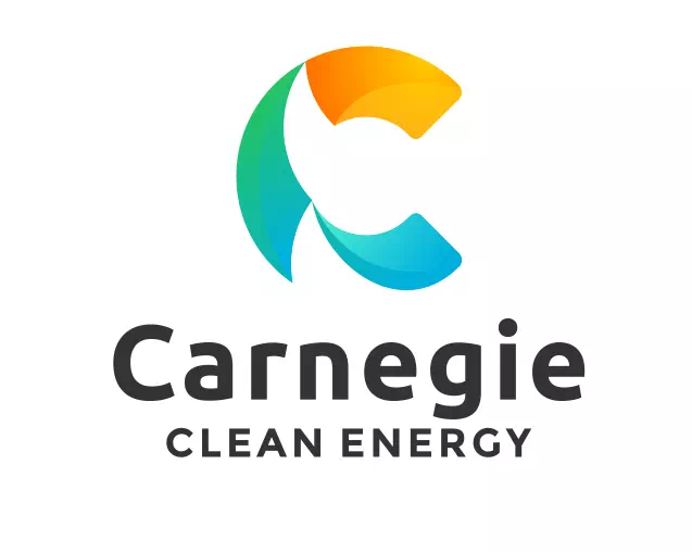
Using the initial letters as an element of designing saves you a day. The example is in the sample logo. Here, the letter C is used twice in the design for the namesake of the company. Also, a lightning sign has been used in the illustration to symbolize the company’s services. So, before designing your energy company logo, brainstorm on the name and follow the way it takes you.
Skycharge Energy:
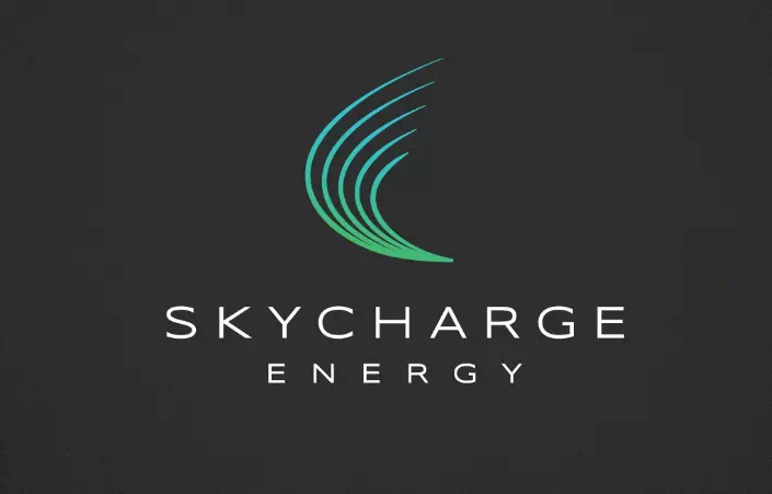
If you want a smart yet attractive design, you can go for modern logo design ideas. Here you have the logo of Skycharge Energy for your inspiration. It is a minimal design-based logo with a significant illustration and typography.
The neon color has given the illustration an unavoidable look. Such designs serve more than you expect. So, to get an exclusive energy logo for your company, take inspiration from this sample logo.
Handled:
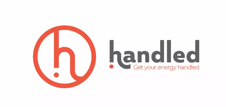
The logo of Handled is an interesting and inspiring design. The initial letter h is designed with a surprising mark that has made it outstanding and meaningful. The bright red color gives the perfect optimistic and trustworthy vibe to the logo. Also, there is a tagline to add more definition to the design. So, if you want to make a point through your energy logo, go for these techniques.
Avocado Energy:
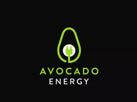
The logo of Avocado Energy is another fun design that can inspire you. If you want to go for a dull design, you can consider designing a logo like this. It has a vibrant illustration of avocado and a plug that points at the company’s name. Also, the neon color has added a more dazzling look to the logo design. Such designs attract the eyes and remain memorable for a long time.
Three Arrows Energy:
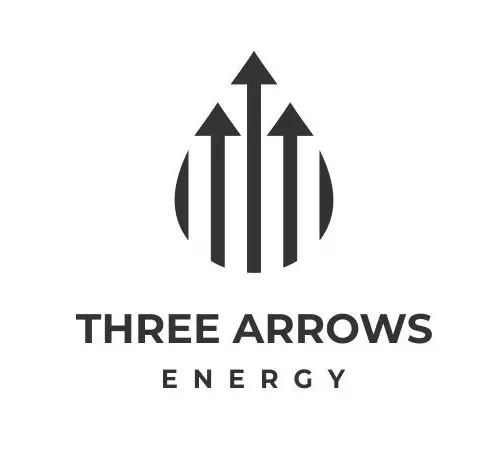
To make the logo unique and extravagant from all the competitors, you just need to think out of the box. A good way can be experimenting with the company’s name in the first place. For instance, the logo of Three Arrows Energy is a black and white logo with an illustration of three arrows in a water drop shape. It is a well-designed logo that engages the clients and builds a strong brand identity.
Puffin Mechanical Energy Services:
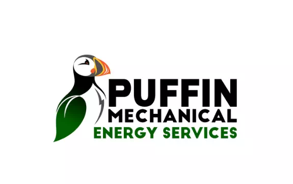
The logo of Puffin mechanical Energy Services is an inspiring bird logo with some hidden elements in it. There is a green leaf that represents the company’s eco-friendly approach. Also, there’s a lightning sign to show the company’s services with energy-related things. A bold gothic font is used along with the illustration to balance the design. All of the elements have made the logo relatable and meaningful.
Phoenix:
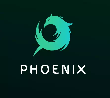
Abstract patterns make your logo a lot more attractive and memorable. The logo of Phoenix has used such an abstract phoenix pattern to keep the logo relevant with the company’s name. The monochrome color of the illustration has created a depth in the logo design. Also, the customized font has been used to complement the design even more. To make your energy logo catchy and suitable, you can follow this style.
Plus Power:
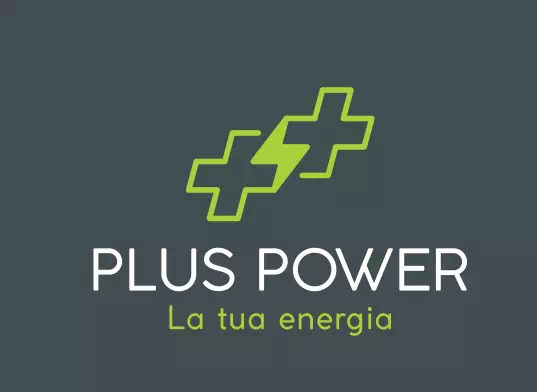
The logo of Plus Power is another interesting design that can inspire you to experiment more. Here, the illustration consists of two plus signs along with a power sign. That is how the illustration becomes absolutely relatable with the company’s name. The two-color combination has created a perfect balance in the logo design. To make your energy logo as worthy as this one, follow these techniques.
Energy Swan:
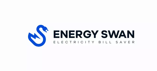
Here is another inspirational logo design idea with minimal features. The logo of Energy swan is a simple logo of combination style containing a relevant illustration and the typography. The illustration is a plug with a cord that has the shape of a sawn. It represents the company’s name and perspective perfectly. To make your energy logo fitting for the company, try to use illustrations mindfully.
Peak Shaver:
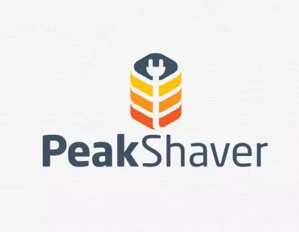
Last but not least- the logo of Peak Shaver is a visual representation of the company’s services and aspects. The illustration has a plug that depicts the company thoroughly. Besides, the two different sized fonts have made the design more powerful and lively. So, instead of going for a boring design, go for such extraordinary ones for your energy company’s logo.
So, now you got the list. We made this list as holistic as possible so that you can get a realistic idea of designing the exclusive and unique logo for your energy company. It is now your turn to transform these ideas into a design that will serve you to a great extent.
Benefits of a Great Logo in the Energy Sector
A well-crafted logo in the energy sector can be a powerful tool. It goes beyond aesthetics, offering several advantages that enhance a company’s image and influence. Explore the compelling benefits of having a great energy logo.
- Establish Trust and Credibility: A well-designed energy logo instantly conveys professionalism and reliability. It fosters trust with clients and partners.
- Boost Brand Recognition: An effective energy logo creates a distinct visual identity. This type of logo increases brand recognition and customer loyalty in a competitive market.
- Streamline Marketing: A strong energy logo simplifies marketing efforts by providing a visual focal point.
- Long-Term Brand Consistency: A great energy logo remains a consistent symbol of excellence, contributing to long-term branding success and recognition in the energy sector.
- Competitive Edge: A compelling energy logo sets you apart from competitors. It helps you stand out and influence clients’ choices in a crowded market.
Conclusion
Energy logos are not mere symbols but powerful assets. Investing in a well-designed logo is a strategic move that sets businesses apart in a competitive sector and leaves a lasting impression on clients and partners. A well-designed energy logo can significantly impact how these companies are perceived in the market.
FAQs
What’s the purpose of these design ideas?
They’re for inspiring energy companies and logo design services to create unique logos.
Can I use these ideas as-is for my company?
It’s better to customize them with a professional designer for a unique logo.
How can I include sustainability in my logo design?
Consider eco-friendly elements like leaves or renewable energy symbols.
Are there common color schemes for energy logos?
Blues, greens, and yellows often symbolize energy and sustainability.
Can I trademark a logo inspired by these ideas?
It depends on uniqueness and legal considerations; consult a legal expert.
Where can I find a professional logo designer for energy logos?
Look on freelancing platforms, at design agencies, or seek recommendations from peers.