Color is of utmost importance in design as it holds the ability to capture attention, convey messages and evoke emotions. Colors have the power to create visual impact. It helps to establish brand identity and shape the overall perception of a design. In design, color is a powerful tool that can greatly enhance the effectiveness and success of a visual composition. Color theory enables designers to strategically select and combine colors to evoke specific emotions. By studying this concept, designers gain a foundation for making informed color choices.
You may also read– How to Blend Colors in Photoshop.
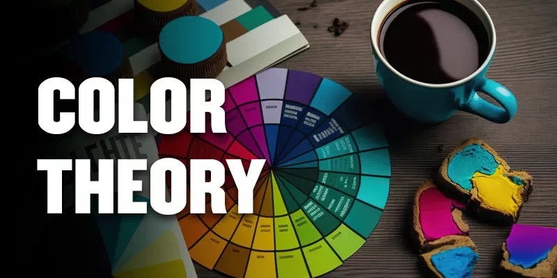
What is Color Theory?
Color theory is a field of study that explores how colors interact, evoke emotions and communicate messages. It examines the principles and relationships between colors. The color wheel, color harmony and the psychological effects of colors on human perception are greatly discussed in this theory. Understanding color theory helps designers make informed decisions when selecting and combining colors in various visual mediums.
They can create harmonious, visually appealing and impactful designs. It provides a framework for exploring the symbolic, cultural and psychological aspects of colors, enhancing the overall effectiveness of visual communication.
Additive & Subtractive Color Theory (RGB, CMYK)
")
Additive and subtractive color theories, represented by RGB and CMYK respectively. They are the models used to understand and work with colors in different contexts. Additive color refers to the process of creating colors by combining different intensities of colored light. Subtractive color is the creation of colors by combining pigments or inks that absorb or subtract certain wavelengths of light from white light.
Here’s a table summarizing the differences between additive and subtractive color theory (RGB and CMYK):
| Aspect | Additive Color Theory (RGB) | Subtractive Color Theory (CMYK) |
| Primary Colors | Red, Green, Blue (RGB) | Cyan, Magenta, Yellow, Black (CMYK) |
| Color Creation | Colors are created by combining light | Colors are created by subtracting light |
| Application | Digital displays (screens, monitors, TVs) | Printing processes (inkjet, offset printing) |
| Color Mixing | Colors are added together to create new colors | Colors are subtracted to create new colors |
| Resulting Colors | Resulting colors are brighter and lighter | Resulting colors are darker and absorb light |
| Color Representation | Uses the RGB color model for digital design | Uses the CMYK color model for print production |
| Usage | Digital graphics, web design, screen-based projects | Print materials, physical color mixing |
The Basics of Color
Color is a fundamental aspect of design. The basics of color involve understanding the color wheel. This knowledge enables designers to select and combine colors strategically. They can create visually pleasing and harmonious compositions that effectively communicate messages and evoke emotions.
The Color Wheel
The color wheel is a fundamental tool in understanding and working with colors. It consists of three main categories of colors:
Primary Colors

Primary colors are the foundation of all other colors in the color spectrum. They cannot be created by mixing other colors together. Red, blue and yellow are the primary colors. These colors are essential in color theory as they serve as the starting point for creating all other colors through mixing and combination. Primary colors play a fundamental role in design and art. It allows endless possibilities of color variations and harmonies.
Secondary Colors

Secondary colors are the result of mixing two primary colors together. Orange, green and purple are the example of secondary colors. Orange is the combination of red and yellow. Green is a blend of yellow and blue. While purple is a fusion of blue and red. Secondary colors offer a vibrant and diverse palette for design. They play a pivotal role in creating harmonious color schemes, adding depth and variety to compositions. This colors section conveys a sense of energy and balance in visual creations.
Tertiary Colors

Tertiary colors are the result of mixing a primary color with an adjacent secondary color on the color wheel. These colors offer a wide range of hues and tones. This type of colors lie between the primary and secondary colors. Shades like yellow-green, blue-green, red-orange and more are called Tertiary colors. They help designers to create complex color palettes. Tertiary colors enable artists and designers to achieve subtle variations and balance in their compositions.
Color Properties
Color properties refer to the characteristics and attributes that define a color. The three primary color properties are:
Hue

Hue is a fundamental color property that refers to the specific color or shade on the color spectrum. It enables us to understand the differences among the red, blue or green colors. Hue allows designers to select colors that evoke specific emotions, convey messages and create visual impact. By manipulating the hue, designers can explore endless possibilities and create unique color combinations that enhance the overall aesthetic and communicative power of their designs.
Saturation

Saturation is also known as chroma or intensity. It is a color property that determines the purity or strength of a color. Highly saturated colors are vibrant, vivid and intense. On the other hand, desaturated colors appear more muted or washed out. Designers can use saturation to control the level of energy, emphasis and mood within their designs. It helps them to create dynamic and engaging visual compositions.
Brightness

Brightness, is a color property that describes the relative lightness or darkness of a color. Brightness determines how much light is reflected from a color. Brighter colors reflecting more light and appearing lighter. On the other hand, darker colors absorb more light and appear darker. This property is essential in design as it influences the overall contrast, visibility and mood of a composition.
Warm and Cool Colors
Warm and cool colors are two different categories of colors. They provide different psychological responses and emotions. Let’s explore them:
Warm Colors

Warm colors include shades of red, orange and yellow. These colors are associated with warmth, energy and stimulation. Warm colors tend to evoke feelings of passion, excitement and intensity. A sense of coziness can be created by them. These colors can draw attention to specific elements in a design. Warm colors are often used to create a lively and inviting atmosphere.
Cool Colors

Cool colors encompass shades of blue, green and purple. These colors represent calmness and serenity. Cool colors have a soothing and tranquil effect. You can get the feelings of peace and harmony from these colors. They add depth in a design. Cool colors promote a serene and refreshing ambiance.
The Psychology of Colors
The psychology of colors explores how different colors evoke specific emotions and convey symbolic meanings. Here’s a brief overview of the psychological associations of various colors:
1. Red: Red is often associated with passion, energy and intensity. It provides a feeling of excitement. Red is also symbol of Love and power. It is commonly used to grab attention.
2. Blue: Blue is known for its soothing qualities. It represents tranquility, trust and reliability. This color enables designers to create a sense of professionalism in their designs.
3. Yellow: Yellow represents happiness. It can evoke feelings of joy, energy and warmth. Yellow is commonly used to create a positive and uplifting atmosphere.
4. Green: Green represents nature, growth and harmony. It symbolizes freshness, balance and renewal. Green is often used in environmental or health-related contexts.
5. Purple: Purple is often associated with royalty, luxury and creativity. It represents elegance, mystery and spirituality. Purple is commonly used to convey a sense of sophistication and creativity.
6. Orange: Orange is a color that signifies vitality, enthusiasm and excitement. It provides a feeling of warmth and creativity. Orange is often used to create a sense of enthusiasm.
7. Pink: Pink is often associated with romance. It represents love, tenderness and nurturing. Pink is commonly used in designs targeting a female audience or to convey a sense of gentleness.
8. Black: Black is a color that represents power, elegance and sophistication. It symbolizes strength, formality and authority. Black is often used in high-end branding and designs that aim to create a sense of luxury.
9. White: White represents purity, innocence and simplicity. It symbolizes cleanliness, clarity and new beginnings. White is often used to create a sense of space, purity and neutrality in design.
Color in Branding and Logo Design
Color plays an important role in branding and logo design. It helps to create a visual identity of a brand.
You may also read – colorful badge logo.
Choosing Colors that Reflect Brand Identity
Choosing colors that reflect brand identity is a crucial aspect of effective branding. It involves understanding the personality and values of the brand and aligning them with the psychological and cultural associations of colors. By selecting colors that resonate with the target audience, convey the desired brand attributes. It helps to differentiate the brand from competitors. Designers can create a visual identity that effectively communicates the essence of the brand and engages with consumers on an emotional level.
Iconic Examples of Successful Brand Colors
Iconic brands have successfully utilized specific colors to establish strong brand recognition and create memorable identities. Some examples are given below:
- Apple: Apple’s logo features a simple, iconic design in grayscale or silver. It represents simplicity, sophistication and innovation. This representation making it instantly recognizable and synonymous with the brand.
- Coca-Cola: The Coca-Cola brand is closely associated with the color red. This bold and energetic color choice embodies the brand’s passion, excitement and timeless appeal. The use of red has contributed to Coca-Cola’s strong brand recognition worldwide.
- Facebook: Facebook’s logo prominently features the color blue. This choice evokes feelings of trust, reliability and social connectivity.
Color in Web Design and User Experience
The Role of Color in Website Aesthetics
The role of color in website Design aesthetics is paramount, as it greatly influences the overall visual appeal and user experience. Color choices can convey the personality and branding of a website. It evokes specific emotions, and create a memorable impression on visitors. By selecting a harmonious color palette designers can enhance the aesthetics and create a visually appealing experience that captures and retains the attention of users.
Color Psychology in User Interface Design
Color psychology in user interface design explores the influence of colors on human emotions, behavior and perception. By understanding the psychological and emotional responses associated with different colors, designers can strategically use color to shape user experiences. For example, warm colors like red and orange can create a sense of urgency or excitement. While cool colors like blue and green can evoke feelings of calmness or trust. Designers leverage color psychology to enhance the usability, engagement and overall user experience of interfaces.
Color in Print Design and Marketing Materials
Color plays a crucial role in print design and marketing materials, creating visual impact, conveying messages and influencing consumer perception. Here’s an outline for discussing color in print design and marketing materials:
Effective Use of Colors in Print Advertising
Effective use of colors in print advertising is crucial for capturing attention and creating memorable advertisements. Colors can evoke specific emotions, convey brand identity and attract the target audience. By strategically selecting colors that align with the message and desired response, designers can create impactful print ads. Considerations such as color combinations, contrast and readability are essential in creating visually appealing and effective print advertising campaigns.
Color Considerations in Brochures and Flyers
Color considerations in brochures and flyers are essential for creating visually compelling and effective marketing materials. Colors should be chosen carefully to align with the purpose of the brochure or flyer and the target audience. Strategic color placement helps guide the reader’s eye and create a visual hierarchy that highlights key information. Balancing color usage with text and imagery ensures a harmonious design. By understanding color psychology and its impact on reader behavior, designers can select colors that elicit the desired response and create impactful brochures and flyers.
Color Psychology in Packaging Design
Color psychology in packaging design involves using colors strategically to evoke specific emotions and create a memorable brand experience. Each color carries its own psychological associations and can convey different messages. Packaging designers consider the target audience, cultural context and desired brand positioning when selecting colors for packaging. By leveraging color psychology, designers can create packaging designs that capture attention, communicate brand attributes and make a lasting impact on consumer behavior and purchasing decisions.
Color Theory in Digital Design Tools
Color theory is a fundamental aspect of digital graphic design, and it plays a crucial role in various digital design tools. Here’s an outline for discussing color theory in digital design tools:
Color Selection and Palettes in Graphic Design Software
Color selection and palettes in graphic design software are essential tools for creating visually appealing and cohesive designs. They offer various features and tools for choosing and managing colors, such as color pickers, swatches and color libraries. Designers can create custom color palettes to maintain brand consistency or explore pre-designed color schemes for inspiration. The ability to select and manipulate colors within graphic design software allows designers to create harmonious compositions, balance color combinations and convey the desired mood and message in their designs.
Color Management for Web Development
Color management in web development involves ensuring accurate and consistent color representation across different devices and screens. It includes techniques and considerations to optimize color for web, such as using color profiles, managing color spaces and addressing issues like gamut and contrast ratios. By implementing color management practices, web developers can ensure that the intended colors of a website are displayed correctly.
They can maintain brand consistency and provide a visually pleasing experience for users across various devices, browsers and operating systems. Additionally, adhering to accessibility guidelines by considering color contrast helps to create a more inclusive and user-friendly web environment.
Applying Color Theory in Real-World Projects
Applying color theory in real-world projects allows designers to create visually appealing and effective designs. Two examples of applying color theory in real-world projects are given below:
Airbnb
The use of a vibrant and diverse color palette in Airbnb’s website and app reflects the brand’s inclusive and global nature. The combination of warm and cool colors creates a sense of excitement and trust. Also promoting a welcoming and inviting atmosphere.
National Geographic
National Geographic’s iconic yellow border instantly grabs attention and creates a strong brand recognition. The bold and vibrant yellow color evokes curiosity, adventure and exploration, aligning perfectly with the brand’s mission and identity.
Step-by-Step Guide: Creating a Harmonious Color Palette
Creating a harmonious color palette is essential for visually appealing and balanced designs. Here’s a step-by-step guide to help you create your own harmonious color palette:
Define the Mood and Purpose
Determine the mood and purpose of your design project. Consider the emotions and associations you want to evoke in your audience. Are you aiming for a calm and serene palette or a vibrant and energetic one?
Choose a Dominant Color
Start by selecting a dominant color that represents the main theme or message of your design. Consider color psychology and the emotions associated with different hues.
Explore Color Harmonies
Explore different color harmonies to create a balanced palette. Common harmonies include complementary, analogous and triadic.
Adjust Saturation and Brightness
Experiment with adjusting the saturation and brightness of your chosen colors. Increase or decrease saturation to create more vibrant or muted tones. Adjust brightness to achieve a range of light and dark values.
Test Color Contrast
Ensure adequate contrast between text and background colors to maintain readability. Use color contrast tools to check if your color choices meet accessibility standards.
Consider Color Relationships
Pay attention to how colors interact with one another. Aim for a balanced mix of warm and cool tones or experiment with monochromatic or gradient effects.
Use Color Tools and Resources
Utilize color tools and resources like color pickers, online color palette generators, and design software’s built-in color libraries to assist you in selecting and managing colors effectively.
Test and Refine
Test your color palette in various contexts and applications. Evaluate how it works with different design elements and ensure consistency across your project.
Innovations and Trends in Color Theory
Innovations and trends in color theory are constantly evolving, influenced by advancements in design and technology.
Exploring New Color Trends in Design
Exploring new color trends in design is an exciting and dynamic process that involves staying up-to-date with emerging color palettes, combinations and schemes. Designers can explore social media platforms and design communities to discover fresh and innovative approaches to color usage. By embracing new color trends, designers can resonate with audiences and keeps their designs on the cutting edge.
Impact of Technology on Color Perception
The impact of technology on color perception has transformed the way we experience and interact with colors. Advancements in digital displays and high-resolution have enhanced color fidelity and realism. It provides more immersive and vibrant visual experiences. However, it also presents challenges as color reproduction can vary across devices.
Designers must adapt to these technological advancements by considering color management and calibration techniques to ensure accurate and consistent color representation across different platforms and devices. By understanding the impact of technology on color perception, designers can create visually captivating and engaging experiences that harness the full potential of digital advancements.
Conclusion
In recap, color theory principles provide a framework for understanding how colors interact, evoke emotions and communicate messages. By mastering these principles, designers can create visually compelling and harmonious designs that effectively communicate and engage viewers. Color is a powerful tool that should never be underestimated in the design process.
Designers should apply color theory principles in their work to create effective and impactful designs. Applying color theory not only adds depth and meaning to designs but also helps establish brand identity, create visual harmony and engage viewers on an emotional level. So, embrace color theory as a powerful tool and let it guide your design decisions to create designs that truly resonate and leave a lasting impression.