A well-designed catering logo is the visual cornerstone of any catering business. It serves as a powerful tool for establishing brand identity, professionalism and trust with clients. A thoughtfully crafted logo not only distinguishes a catering business in a competitive market but also leaves a lasting impression and sets the stage for memorable dining experiences.
As a new entrepreneur in the catering industry, you need people’s attention and good reviews of your service. But before anything else, you need to present your business positively to the world. And this is the job a catering business logo does through its meaningful design.
As you happen to be here for ideas and tips, check out our list of best catering logo design ideas.
What is a Catering Logo?
A catering logo is a unique visual symbol that represents a catering company. It’s the primary element of the brand’s identity, showing what the business is about and its culinary expertise. Catering companies use these logos on different materials to create a professional and memorable image for their clients.
What to Consider When Designing a Logo for Catering
Designing a logo for a catering business involves thoughtful consideration of various elements. Let’s explore the key factors, which are needed for crafting a unique catering logo that leaves a lasting impression.
- Brand Identity: Your logo should represent your catering business’s unique style and identity.
- Simplicity: Keep the design clear and straightforward for easy recognition.
- Color and Typography: Choose colors and fonts that match your brand’s message and tone.
- Versatility: Ensure the logo works well in various sizes and across different media.
- Professional Design: Consider hiring a professional logo designer for a polished and impactful result.
Best 15 Catering Logo Design Ideas
Discover a collection of the best catering company that blend creativity and culinary excellence. These concepts showcase innovative branding possibilities for your catering business, leaving a delectable mark in the minds of your clients.
Gourmet Fork & Knife

This elegant catering logo merges a fork and knife, artfully forming the shape of a heart. It symbolizes a deep passion for culinary excellence, making it an ideal choice for catering services that prioritize gourmet dining experiences. The graceful design conveys sophistication and a commitment to exceptional food.
Vintage Chef’s Hat

A classic chef’s hat takes on a modern twist in this logo. It combines vintage aesthetics with timeless typography. This catering logo idea evokes a sense of tradition and expertise. This design is perfect for catering businesses that want to convey a sense of craftsmanship.
Catering Crown

In this unique catering logo, a crown is skillfully crafted from various kitchen utensils. It signifies the superior quality and royal treatment clients can expect from your catering service. This logo radiates elegance and authority. This catering design idea can be an excellent choice for upscale catering companies seeking to establish themselves as the leaders in their industry.
Spoonful of Flavors

Playful and creative, this logo features a spoon that transforms into a dynamic swirl of flavors. It effectively showcases the versatility of your catering service, highlighting your ability to craft a diverse range of delicious dishes. This logo is ideal for businesses that want to emphasize their innovative and imaginative approach to food.
Taste the World

A globe formed from a vibrant array of spices and herbs symbolizes expertise in international cuisine. This logo is a perfect choice for catering services specializing in global flavors. It communicates a world of culinary possibilities and culinary journeys.
Culinary Palette
Vibrant food colors splashed across a palette, accompanied by a paintbrush, illustrate the artistry of food preparation. This logo is a fantastic representation of your catering service’s creativity and attention to visual appeal. It’s an excellent preference for businesses that prioritize aesthetics and presentation
Farm-to-Table

This logo prominently features a farm scene, complete with a fork and table. It emphasizes your commitment to using fresh, locally sourced ingredients. This catering logo design resonates with customers who value sustainability, quality and a connection to the source of their food. It communicates a sense of authenticity and transparency in your catering approach.
Gastronomic Lettermark

Combining initials with culinary elements, this unique letter mark creates a memorable monogram. It adds a personalized touch to your brand, making it easily recognizable and distinctive. This catering company logo is perfect for catering businesses that want to blend sophistication with individuality.
Elegant Cake Slice

A luxurious slice of cake with intricate detailing exudes opulence and sophistication. It’s an ideal logo for high-end bakeries and catering services specializing in premium desserts. This design showcases your commitment to the art of pastry and confectionery.
Chef’s Toque

A stylized chef’s toque with a modern twist communicates expertise in fine dining. It’s a symbol of professionalism and culinary mastery. chef’s toque logo idea is suitable for upscale catering services that want to convey a sense of refinement and skill.
Sizzling Grill

In this logo, a sizzling grill with flames creates a sense of excitement and energy. It’s an excellent choice for barbecue and outdoor catering businesses, as it captures the essence of grilling and the thrill of outdoor cooking. This logo appeals to clients who love the flavors of the grill.
Delicious Droplets

Playful droplets falling into a bowl symbolize the use of fresh ingredients and a delightful culinary experience. This logo communicates a sense of freshness and quality. Any catering businesses that prioritize farm-fresh and seasonal ingredients will like it.
Chop & Roll

This clever logo combines a chef’s knife and a sushi roll, making it a perfect fit for sushi catering businesses. It effectively communicates your specialization in sushi and Japanese cuisine.
Food Truck Fiesta

A fun and vibrant food truck logo captures the spirit of mobile catering services. The colorful palette and whimsical design evoke a sense of joy and excitement. food truck logo is an excellent choice for businesses that offer on-the-go culinary experiences.
Golden Platter

A luxurious platter with a touch of gold signifies premium catering services and high-quality dining experiences. This logo communicates a sense of elegance, opulence and exclusivity. This catering services logo is preferable for businesses that cater to upscale clientele and special events.
Benefits of a Great Logo in the Catering Sector
In the competitive catering sector, a great logo is more than just a symbol—it’s a recipe for success. Explore the significant advantages of a well-crafted catering logo:
- Instant Recognition: A memorable logo helps customers quickly identify your catering brand, fostering trust and loyalty.
- Professionalism: A well-designed logo conveys professionalism and competence, enhancing your reputation in the competitive catering industry.
- Brand Consistency: It ensures consistent branding across all materials, reinforcing your unique identity and message.
- Marketing Power: A great logo is a powerful marketing tool, attracting potential clients and setting you apart from competitors.
- Unforgettable Impression: It leaves a lasting impression, making your catering business the first choice for clients planning events and special occasions.
Catering Logo Design Inspiration
Explore a realm of culinary creativity with Catering Logo Design inspiration. Here logos serve as delectable examples of exceptional branding.
Big pig:

The logo of Big pig Barbeque & Catering is an emblem design with a digitized calligraphy font. Customized fonts bring a remarkable change to your catering logo designs. They are versatile and make the logo unique. So, you can consider using a new font depending on the design you are going to create. Also, choose a certain pattern to make the logo more impressive.
Cast Iron Catering:

The logo of Cast Iron Catering is an ideal example for designers who want their logos a bit out of the box. Here, the logo has a circular design, but instead of an ordinary circle, the designer has used an iron pan. It relates to the company’s name and perspectives. Similarly, you can make the logo more relevant to the company through creative ideas. And this sample logo can surely help you with that.
Chat twon Catering:

The logo of Chattwon Catering makes us nostalgic with its vintage, old-school design. If you want your catering logo in the traditional old-styled design, take inspiration from this one. No use of bold color has made the logo more intriguing and intense. Also, the patterns are familiar yet still relevant to modern styles. Besides, the font choice has given the logo a new height.
Chef Emme:

The logo of Chef Emme is super adorable and charming for its unique customized font. To make it relatable with catering companies, they have used a rolling pin and a fork as the illustration. It also has eye-soothing colors. All of those elements have made the catering logo more enchanting and pleasant. So if you want to make your catering logo outstanding with only a few steps, you can follow such ideas.
Cocos Catering:

The logo of Cocos Catering may seem very ordinary at first glance. But look closely and you will find its amazing design. The designer has changed the look of two ‘O’ and the look of the entire logo has got a new dimension. It is a common practice in logo designs to change a letter’s look and making it relatable to the company. The font used here is sleek and clean which is another great feature of the logo design.
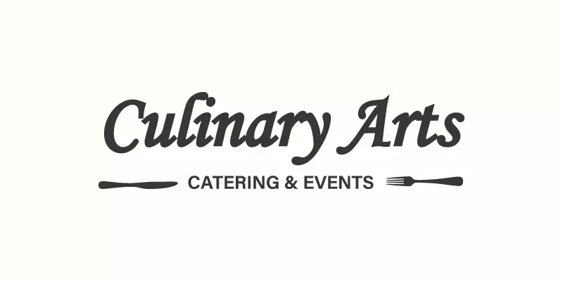
Culinary Arts:

The logo of Culinary Art is a basic typography-based design. Still, it does not fail to attract the eyes as well as serve as a successful logo design. The soft-rounded font has made the logo super classy and catchy. If you don’t want to use any illustrations or symbols in the logo design, you can go for such styles. Make the font of the name bigger than the rest and it will get more emphasis from the people.
Curly Girls Café & Catering:
If you want your logo to look professional and unique, go for image-based logos. They are great for all sorts of business companies. You can use cartoons, illustrations, or vector images. Vector images are the best choice for using in a logo as they look perfect wherever you use them. The logo of Curly Girls Café and Catering is a nice example of image-based logo designs. It is super versatile for its colorful look and playful vibe.
Delicia Event Catering:
Here is a great example of mascot logo design ideas for you. Depending on the type of your business and services, choose a representative mascot to engage the customers. The logo of Delicia Event Catering is a bright, lively, and colorful one. Such logo designs are super effective in making people interested in your catering business. So, choose the side that you want to show through the logo and create the exclusive catering logo.
Fig & Pickle Catering
Creating an influential logo is a super effective strategy for communicating with the customers. As it is the first thing they notice about your business, it is important to make the logo as lively as possible. The logo of Fig & Pickle is a single-colored logo that looks phenomenal and incredible. As colors are influential and deeply psychological, choose them carefully. If you don’t make a mess, the result will be amazing.
Fox & Spoon:

The logo of Fox & Spoon is a well-designed catering logo for good reasons. The designer has made an illustration by combining two concepts- ‘fox’ and ‘spoon’. Thus, the logo has got related to the business name and its purposes through the design. Also, the two-toned colors have given the logo another height of excellence. If you want to make your logo as fascinating and attractive as the sample logo, keep it minimal yet thoughtful.
Fresh and Sage:

Logos are not only for attention-grabbing. They speak on the company’s behalf. So, it is important to focus on its style as well as the meaning it is providing. The logo of Fresh and Sage is an emblem-styled logo with a single color. Emblem style is super effective in logo designs as it looks great wherever you use it. Also, the emblem style shows your care for the old-good things that can potentially attract customers who believe in trustworthiness more than modernism.
Kalo Catering:

The logo of Kalo Catering is an example of a combination mark logo design. These types of logos are a combination of both pictures and text. This style is super versatile and great for making people engaged and interested in it. The sample logo has a tagline I the logo which is another good element to put in logos. Taglines make it clear what you provide and promise. So, the logo makes more sense than ever with an intriguing tagline.
Little Spoon:

The logo of Little Spoon is mostly text based with a digitized calligraphy typeface. But there is a little detail along with the typography that adds a lot considering its influence. Those colorful spoons make the logo design super delightful and charming. The effort for designing such a logo is not much. Another good idea is to keep two types of fonts in the design for visibly separating two concepts- the name and the type of the company.
Mary’s Kitchen Table:

Colors play a great role in making any logos more intensive and appealing. The logo of Mary’s Kitchen Table has two different colors each to say a different thing. The black color is used to say the name and the purple is for the rest. This clever idea can bring a remarkable change in the way your logo looks. It makes people see things differently and understand the company’s purposes and perspectives better.
Movable feast:

It is a significant feature of the logo to make the perfect sense. So it should have relevancy and meaning in its design. The logo of Movable Feast focuses on ‘Farm to Table’ idea. So, they have shown the salient feature through the logo so that people can notice it before anything else. That is why there you can see a beautiful image of country side that tells us about the company’s specialty.
Ray’s Bar & Grill:

The logo of Ray’s Bar and Grill stands apart for its color combination and font choice. The fiery red color along with the bold typeface has brought an outstanding look to the logo design. Also, it has an illustration to make the logo more relatable to the company. It is simple and minimal yet super effective as a catering logo. And you can consider giving this idea a try when you are creating the exclusive logo for your catering business.
Saucy Lito’s:
There are uncountable ways you can arrange texts and images into a logo design. Choose the one that will look more professional and attractive. Logo designs require being meaningful and relatable more than being only beautiful. To make the logo worthy of the catering company, you have to bring out the specialty of it and show that through the design. The logo of Saucy Lito’s Catering & Food Truck has a half-rounded pattern with a semi- brushed font. The Chicken in the illustration speaks for the company’s perspectives.
Shaken And Stirred:
The logo of Shaken And Stirred Catered Events has a unique style in its design that can inspire you to go for creative ways. The designer has used the illustration keeping it entirely true to the name. Also, the color grading has given the logo a vintage look. This style is minimal and effortless. But the creative thought is the ultimate game-changer for this logo. So, when you are creating a logo for your catering company, consider going creative and thoughtful.
Smartbites:

Using a unique font in logo design is always appreciated and expected. It shows your effort in making the logo a lot more charming. But for being a successful logo, it has to be constructive along with being beautiful. So you must put something influential in the logo to make it sensible and thoughtful. The logo of Smartbites has an illustration that shows its relevance to the food industry. Such little effort can bring a huge difference in the logo designing sector.
Southern Jubilee Catering:

The logo of Southern Jubilee is an excellent example of combining modern style with the old one. Here the designer has used the emblem style with a modern touch in it. The vegetables are there to point at its relation with the catering industry. On the other hand, they have created a garland to give the logo a more charming look. That is how creative ideas serve two purposes successfully.
The Hungry Gnome
The logo design of The Hungry Gnome is as interesting as the company’s name. The designer has gone very literal putting a gnome with a big spoon in the logo design. There is no way we can deny its relevance to the catering company’s name. So, you see, sometimes the name gives you the perfect idea on how to design the logo that will make the most sense. Follow this trick and the result will be amazing.
The Pickle Barrel:

The logo of The Pickle Barrel is a good example of a wordmark logo design. Wordmark logos mean it will only have words and nothing else. There are no pictures, no illustrations, or not even any symbol. This simple logo design suits a large variety of industries and catering is one of them. So you can choose it for your catering company without concerning much. We promise you this style will never become boring or unappealing.
The Seafood Shop Catering:

Typography logos are not boring or common if you can design them rightly. Using different types of patterns to arrange the letters can make the logo exclusive and meaningful. The good old logo design of The Seafood Shop shows you the amazing way of using typography to make the logo more professional-looking. As the logo design belongs to the ’90s, you would love it if you care for traditional beauties. Such vintage designs attract the eyes and show your aesthetic approaches.
Urban Eaters:

A logo is much more than a mere design. If you believe it, then you know how important it is for a logo to make sense. Here colors and fonts are the tools that you play with to make a logo that will be memorable and communicative. The logo of Urban Eaters has used only one color which is bold and bright. It also has a little illustration along with the typography to hint at the company’s services which are catering.
Wild Hare Catering:
A meaningful illustration can make your catering logo timeless, memorable, and relevant. The logo design of Wild Hare has used an illustration of hair representing the company’s promise to be swift and speedy. So, you see the illustration has not only made the logo more attractive but also conveyed its messages. That is how you can make functional logos that will be appealing as well as productive.
Conclusion
The significance of a catering logo in brand identity cannot be overstated. By investing in a well-crafted logo, catering business owners have the opportunity to create a lasting impression and build trust with their audience. It’s an invitation to explore various catering logo design options and a call to invest in the branding journey.
A catering logo serves as the visual ambassador of any catering business. It’s a symbol that can leave a lasting impression and foster trust. We hope that the owners of the catering business will benefit from this catering company logo design services.
FAQs
Q1: Why is a well-designed logo essential for a catering business?
A well-designed logo instantly conveys your brand’s identity, professionalism, and culinary style to clients.
Q2: How can I ensure my catering logo stands out among competitors?
Focus on uniqueness and relevance to your specific culinary style to stand out from the competition.
Q3: Can I create my catering logo on my own or should I hire a professional designer?
While DIY is an option, a professional designer brings expertise in branding and logo design.
Q4: What are the key elements of a successful catering logo design?
A successful logo includes relevant symbols, suitable colors, readable typography, and a design that reflects your brand identity.
Q5: How do I ensure my catering logo remains relevant over time?
Choose classic design elements over trendy ones and periodically assess its relevance as your business evolves.
Q6: Can I trademark my catering logo design?
Yes, you can trademark your logo to protect it from unauthorized use; consult a legal professional for guidance on the process.