When you are on the way to start a new basketball club or about to arrange a tournament, you definitely need a suitable logo to show the world your purposes and perspectives. For a club, it is necessary to show up its personality and identity more clearly to the public. To serve all these purposes, you need a good basketball logo design undoubtedly.
What makes a good logo? A logo that defines your club spirit and complements it positively, that can be taken as a good logo. Also, it has to be interpretable, meaningful, memorable and attractive. If you can creatively put together all these things, you will get your exclusive and unique logo for your basketball club.
Need ideas? Check out our list of 25 best logo design ideas.
The Basketball Club:

As a training club, The Basketball Club has a simple logo design to represent their inner motivation for one goal and one focus. That is what makes the logo fitting for a club or organization. The white circle is designed as a basketball that perfectly hints at the purposes of the club. At the same time, the design has made the logo engaging and intriguing enough for the people.
looka.com/logo-ideas/sports-logo-design/
Rams Basketball Organizations:
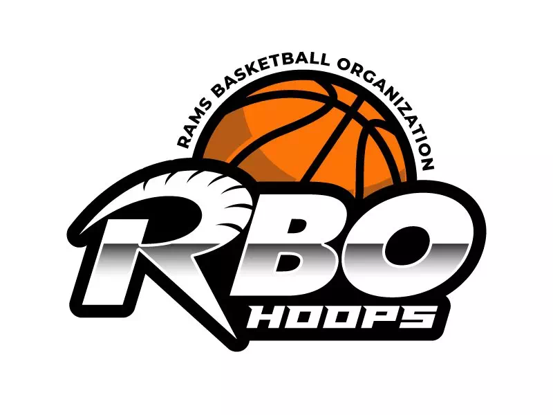
The logo of the Rams Basketball Organization aka RBO Hoops reminds us of traditional basketball or sports logos that we see commonly. If you are interested in creating new designs out of old ideas, this one is for you. The extra-large letters are there to attract the eyes from any distance with the orange basketball. Even the color combination is well-chosen to present the logo more vibrantly. Anyway, have you noticed the shadowy white color on RBO?
48hourslogo.com/logo/basketball
Tulsa Basketball Academy:
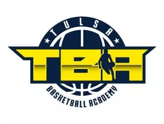
Here is a typography-based logo design idea with the emblem pattern and silhouette design. The name is written in bold fonts at the center of the logo with a little silhouette design. Anyone can immediately figure out the perspectives and purposes behind the logo by looking at it. The bright yellow color has made the logo more lively and cheerful. These techniques help a lot when you want the logo to convey messages as well as grab the attention of the public.
48hourslogo.com/logo/basketball
Tribe: basketball logo design
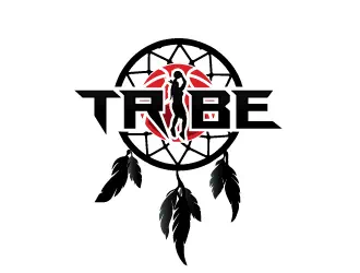
When you want a little extra from the logo along with its usual goals, this idea is for you. The logo design of the Tribe has a dream catcher like shape pointing at its focus on touching the peak of success. Also, it has a tribal vibe that represents the club name. That is how you can design the exclusive logo for your club that will be not only memorable but also recognizable for all.
48hourslogo.com/logo/basketball
Dream Catchers Basketball:
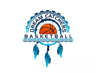
Here is another creative and colorful basketball logo design idea. The designer has worked with the name turning it into a design. Such techniques help to create outstanding logos without any big effort. There is a warm tone of blue color to make the logo more friendly and harmless. Similar to this, depending on the messages you want to convey through the logo, you have to choose colors. The wrong choice of colors can change the meaning of the entire design.
48hourslogo.com/logo/basketball
East County Bulls:
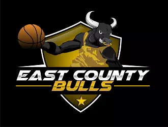
The logo of East County Bulls focuses on strength and fury that is the main motto of the basketball club. A logo is called successful when it can spread the club’s spirit and essence more clearly and recognizably. The sample logo has an avatar of Bull that speaks for the inner spirit of the club. The basketball is also there to clear out the purpose of the logo to the people. Also, the shield shape has made the logo more zealous and spirited for a basketball logo.
48hourslogo.com/logo/basketball
BBTCA:
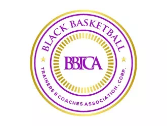
The emblem style is one of the most popular styles for logos. It makes the logo like a batch and gives it a totally new height. When the club name is a bit wordy, you can choose this style. The logo of the Black Basketball Trainers and Coaches Association has used the technique to place the entire name perfectly making the logo more interesting and attractive. The golden-purple color combination has given it a cordial and elegant look.
48hourslogo.com/logo/basketball
Universal Basketball Academy:
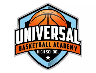
The Shield shape is used in logos to present the club’s inner strength and potential in the particular field. It helps in gaining public trust and attention. The logo of Universal Basketball Academy has used the same trick to present its motivation and purposes. The logo has a shield along with the name that is written in an uppercase font. The design is not peculiar or unfamiliar to the eyes yet it serves the logo’s purposes perfectly.
48hourslogo.com/logo/basketball
Puyallup Basketball League:
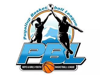
The use of a meaningful avatar makes the logo more realistic and lively. Many clubs prefer using an avatar in their basketball logos. This technique is most helpful when you are using it for creating a tournament or league logo. It catches people’s eyes and provokes them to pay attention to it. The logo design of Puyallup Basketball League has used an avatar of a boy and a girl pointing on its subject ‘Boys & Girls Youth Basketball League.’
48hourslogo.com/logo/basketball
Top View Hawks:

If you are a bit familiar with logotypes, then you must know about the bird pattern in logo design. It makes the logo more vigorous and expressive. The basketball club Top View Hawks has used it n their logo design. Though the designer has chosen the pattern for the name but still it is not about the name only. Depending on the logo subject, you may choose different bird patterns to make the messages more interpretable and trustworthy.
48hourslogo.com/logo/basketball
Champions Club Basketball:
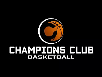
The first letter of your basketball club name gives you ample chances to create exclusive designs effortlessly. For instance, Champions Club Basketball has used the letter ‘c’ in its logo design. The staple Orange basketball is designed with the letter. This way the logo becomes unique and recognizable to everyone. You may choose the letter to highlight the entire logo or as a center for the whole design. Both ways it is going to look fabulous and impressive.
48hourslogo.com/logo/basketball
The Lab:
The logo design of The Lab is a perfect example of simple and minimal design. The designer has created it with a mixture of typography and a basketball picture. Anyone can recognize the logo purposes without any trouble. The extra-large bold font is there to grab public attention from distance. So, you see- simple designs are worth every bit of an elaborate logo design.
48hourslogo.com/logo/basketball
BegiNow Basketball:
You can bring a big difference in the look of the basketball logo by changing one letter creatively. The logo of BegiNow shows you the way to do so. The letter ‘O’ is replaced with a basketball making the logo more suitable and compatible for the club. The color combination has taken the logo to the next level as well. So, if your goal is to create a logo worthy and unique for your basketball club, you can follow a similar style.
48hourslogo.com/logo/basketball
Battle in Tacoma:
If you want to design a logo for a basketball tournament, this idea is for your cause. The tournament location is Tacoma and the designer has chosen to highlight the famous Mount Rainier through the logo. This trick has made the logo more suitable and perfect for the tournament in Tacoma. Also, the logo needs to be more enthusiastic and energetic when it is for any league or tournament.
48hourslogo.com/logo/basketball
Hoops and Skillz Basketball Club:
If you like to play with different colors and patterns, logo design will be like a fun to you. The logo of North Hills Hoops and Skillz has got an outstanding look for its two shaded color in the name- text. Such a small change can bring a huge difference in the look of the logo. So never stop applying your creative thoughts on the logos to make them more catchy and memorable.
48hourslogo.com/logo/basketball
Carolina Thunder:
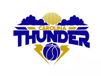
Only one bold color can make the logo more impressive than you think. The logo of Carolina Thunder has done it successfully. The bold blue color along with pale golden in contrast has given the logo a vibrant and intense vibe. The sign of lightning and the sun has added more level to it. Such elements work great in making the logo unique and exclusive for the basketball club of camp.
48hourslogo.com/logo/basketball
Southbelt Lady Storm:
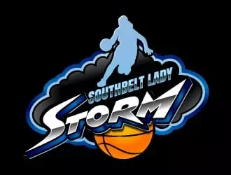
If you want to highlight one particular perspective of your basketball club, you can do it through the logo design. This way, you can make sure people know about the matter. For example, if your club is only for girls, the logo design can carry the information to people. Southbelt Lady Storm has done it with an avatar. There are many other creative options you can choose to use for conveying the information.
48hourslogo.com/logo/basketball
EBTA:
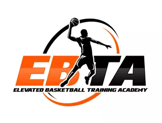
The typography along with an avatar can make your basketball logo a lot more recognizable and engaging. The process is not so complex as well. The logo of Elevated Basketball Training Academy has a player avatar that defines the logo purpose perfectly. The orange and black color hints at the staple basketball color making the logo more sensible and meaningful.
48hourslogo.com/logo/basketball
939 Hoops Academy:
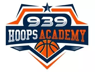
The logo of 939 Hoops Academy is another example of experimenting g with different shapes and colors. Such designs are familiar yet effective in communication with the people. The slight change in the sizes of the letters has brought a remarkable difference in the look of the logo. Such shapes look great in jerseys and badges as well. It does not even require any fancy skills.
48hourslogo.com/logo/basketball
Prospects Academy:
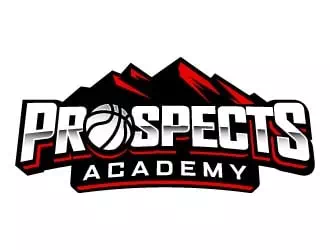
The logo of Prospects Academy is another example of changing one letter to bring a big difference. An image of basketball has taken the place of the letter ‘O’. Besides, the designer decided to go a bit out of the box and created the logo with Red and White color instead of typical orange and black. These little changes make the logo more engaging and intriguing to the people.
48hourslogo.com/logo/basketball
Division One Basketball:
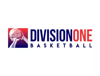
The logo of the Division One Basketball can be a good inspiration for those who like their logos minimal and simple. From any familiar pattern or style, you can bring uniqueness to the logo. Just add a meaningful image or illustration to the design and you are good to go. Pick colours mindfully so that they define the concept completely. Even using a fancy font in the logo design can make it more appealing.
48hourslogo.com/logo/basketball
Winners Circle:

Talking about the font, here we got the perfect example of it. Instead of choosing familiar fonts in the logo design, choose something more charming and engaging. You can use more and one font in the design as well. The logo of the Winners Circle Skills Training has used two different fonts that have added another height to the look of the logo. So, experiment with different fonts to get the perfect one for your basketball logo.
48hourslogo.com/logo/basketball
Jc Moore Basketball:
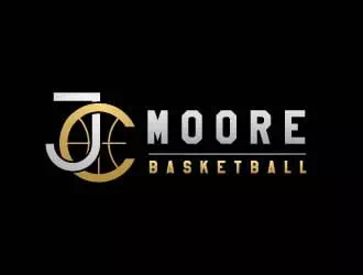
The logo of Jc Moore Basketball is an example of unconventional logos for the basketball club. The designer chooses not to go with the flow and make a new style for basketball logos. If your goal is something similar, you can take this sample logo as an inspiration. The letter ‘C’ has a basketball like design making the logo fit for the purpose.
48hourslogo.com/logo/basketball
Level Up Basketball Academy:
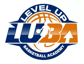
Any sort of logo design gives you adequate chances to execute creative ideas and thoughts. You just need to figure out the particular feature you want to show the people. The logo of the Level Up Basketball Academy has used its motto of levelling up to show through the logo. That is why the designer has created an arrow shape in the letter ‘A’. Also, the emblem style has added more beauty to the logo.
48hourslogo.com/logo/basketball
Missouri River Elite:
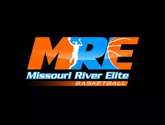
With only two colors, the logo of Missouri River Elite is quite impressive and appealing to the eyes. The contrast of blue and orange color has given the logo a balanced look making it fit for a basketball logo. Also, there is a white silhouette in the text that speaks for the perspectives of the logo. These creative ideas can effectively change the look of the logo without asking for more effort and skills.
48hourslogo.com/logo/basketball
Now you have all those ideas and tips for basketball logos. It is your turn to design your logo. Make sure to show your club identity and perspectives through the logo without harming its charm and elegance.