Band logos are getting more popular these days as artists have realized their value and importance more than ever. Now people are too busy to read the names and recognize everything by its logo. If that is the case, why not band logos get our attention? So get the best band logo design ideas with our experts.
Okay, first thing first. Band logos need to be more eye-catching and captivating than other logos. As band names are always peculiar and striking, the logo design should match them as well. The logo may not directly help you in success but they make the band more recognizable and memorable. That is why you cannot give up on that.
Band Logo Design Ideas
In this blog, we create a bunch of ideas about band logo design. Check our list here.
The Beatles:
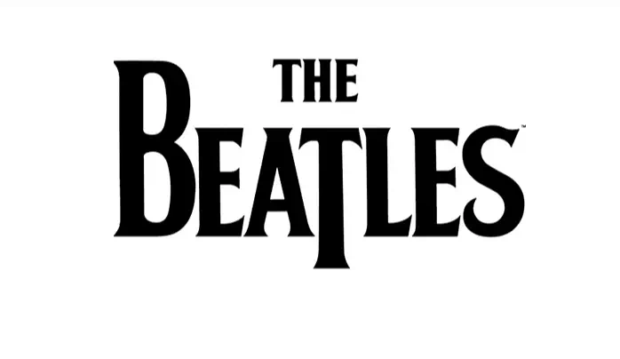
The logo of The Beatles can be an ideal example for those who consider taking music a serious job. The logo may seem like it has nothing special yet we cannot deny its excellence and perfection as a band logo. The big ‘B’ and ‘T’ have completely changed their look making them fitter for a band. With its customized font, it grabs the public attention successfully and gives an energetic vibe.
Pluggers:
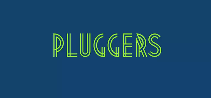
Pluggers is another successful band logo with an eye-catching design and powerful color. The designer has chosen a neon color that is as bright as attractive. And the most striking feature of the logo is its unique customized font. It has given a new height to the logo’s perfection. If your goal is to make stunning logos without much effort, such an idea can help a lot.
Misfits:
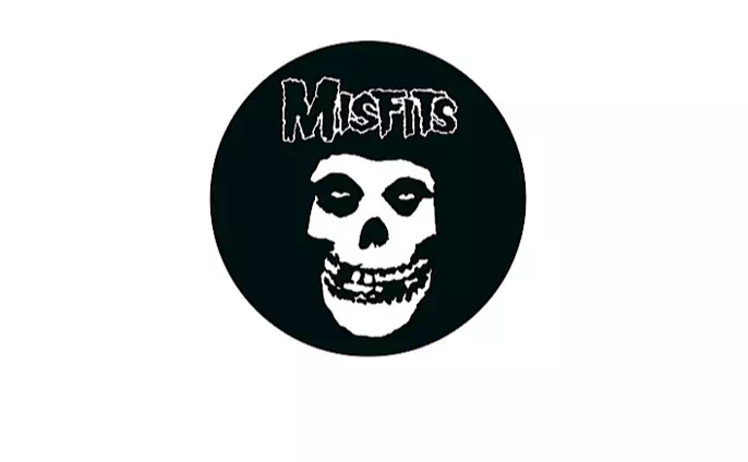
As you have already known band logo is not like those business logos. Here you have to focus on its hidden meaning and the vibe it is spreading. If the logo does not represent your brand perfectly, the design is a failure. So, it’s the main concern for the logo design. Misfits have a logo of a black and white creepy mask that speaks for the band’s real perspectives.
Guns N Roses:
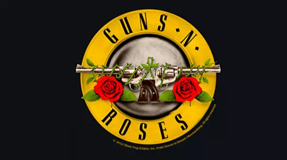
Guns and Roses has a mind-blowing logo design that not only strikes everyone but also serves the best as a band logo. It has an emblem style in its design with bright colors and a familiar bold font. The logo looks absolutely powerful as a band logo. In a similar style, you can create such designs for your band logo.
Metallica:
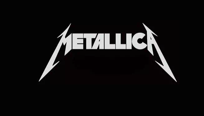
Bands do need a recognizable identity that will be memorable as well as representative. Metallica has done that successfully with its peculiar typography-type logo design. Created with the font Pastor of Muppets, the logo is gorgeous and ‘metallic’. Even the color combination has added another layer of perfection to it. When you are creating your brand logo, experiment more with the color and font to get the best one.
Muse:
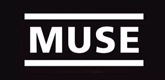
The English Rock band Muse has a straightforward typographic logo. Designed with the Frutiger 65 bold font, it has used two parallel lines framing the band name. Though it may seem nothing special yet we cannot deny its powerful and bold outlook.
It perfectly resembles the spirit of rock music and represents the band’s identity more visibly. If you had the notion that simple is not ‘extraordinary’, time to give a second thought to that.
Daft Punk:
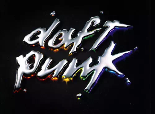
The good old French electronic music duo has a funky-looking logo that is hard to ignore. The logo is extremely energetic and perfectly conveys the vibe that the band shares with their music.
Now that is what we call a successful logo design. If your dream is similar to that, you can take inspiration from here. Be careful about font and colors to make the logo more intriguing and fascinating for people of all generations.
P4DV:
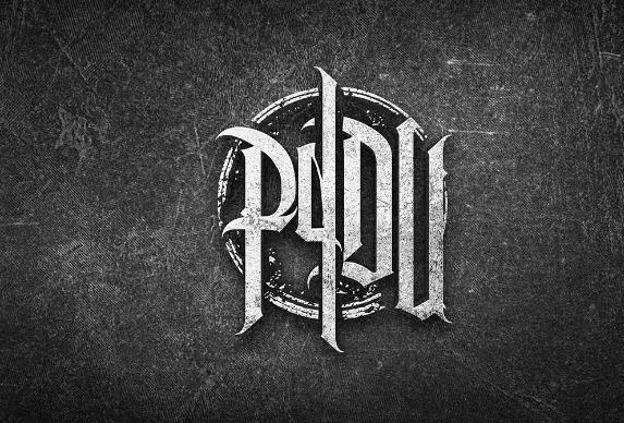
Band logos are meant to be more recognizable and memorable than any other logos. After all, it helps them in publicity. That is why it is important to make a suitable logo with creative ideas and a striking look.
The logo of P4DV shows the way of doing so. The logo has nothing but text with a mismatched size. Some may call it an emblem style. Whatever it is, the logo looks absolutely amazing and eye-catching.
Red Hot Chili Peppers:
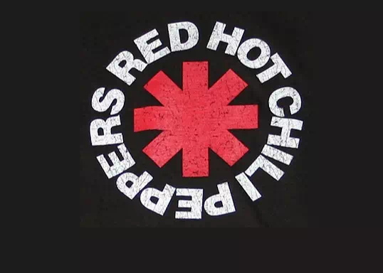
Do you know the logo is created by not any designer but by a band member? Surely, that can be easily done as no one knows better than you about what your music band stands for.
Anyway, the logo of Red Hot Chili Peppers is created with a heavy bold sans serif font along with a red circle. The design resembles the band’s spirit as a rock band. Want to create something similar? Take inspiration from it.
The Who:
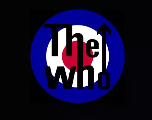
The logo of The Who is another emblem-styled logo with bold colors and extra bold fonts. The font is customized to make the logo more striking and intriguing. Though it was never meant to appear on their album, the logo was found on batches, t-shirts, and mugs.
Anyway, the logo is not very complex if we consider the design. So it inspires you to create logos that are meaningful and representative of your band.
Don’t Tell Marry:
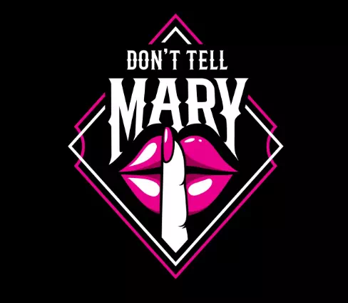
Now it is something to pay attention to. The logo of Don’t Tell Marry clearly makes everyone stunned by its super funky design. as you have seen, many bands want to make a total out-of-the-box design that will attract everyone.
On the other hand, there are always many ways to go simple and straight. It is up to you what types of design you want for your band. If you want something spellbound and captivating, Don’t Tell Mary gives you the idea.
Fall Haven:
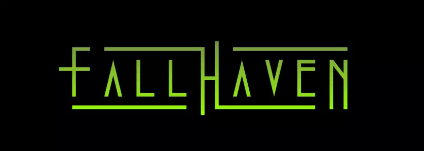
The rock band Fall Haven has an interesting logo design with no fancy design. It is one of the examples of simple, minimal, and effortless logo designs. Simple never means something utterly thoughtless. It is not easy to present something through simplicity.
As you can see in the logo of Fall Haven, they have used a bright neon color in the typography. A slight change in the letters has given the logo a new height.
Kiss:
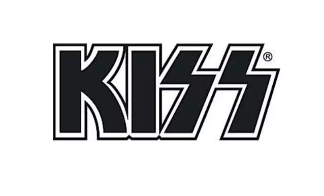
Before getting into the logo description, here is a fun fact. This popular 70s band got controversial for the peculiar logo design they have as it symbolizes Nazi SS Troop. But that did not make the band any less popular.
Anyway, the logo may seem super simple featuring only typography. But when you look carefully, you may recognize the ‘SS’ is written in such a way that it is looking like a lightning bolt.
Nirvana:
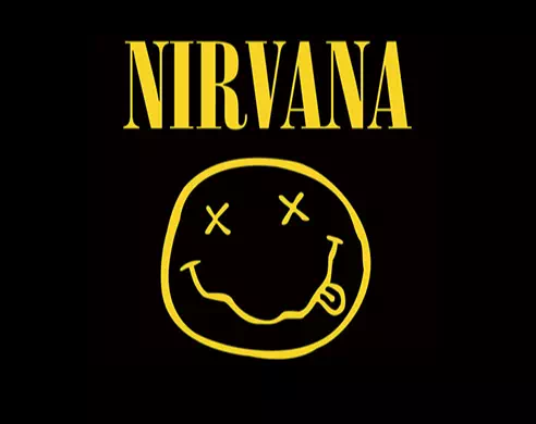
It is one of the most popular logos that found its way out in numerous t-shirt designs and mugs. The logo of Nirvana got its ‘fan-favorite’ title almost immediately after being published. The reason behind its popularity is probably the positive look and heart-warming x-eye smile.
We have listed this logo to tell you that outstanding logos are all about creativity and artistry. Your band logo can get such attractive and mesmerizing if you can create it with more passion and little skill.
Acdc:
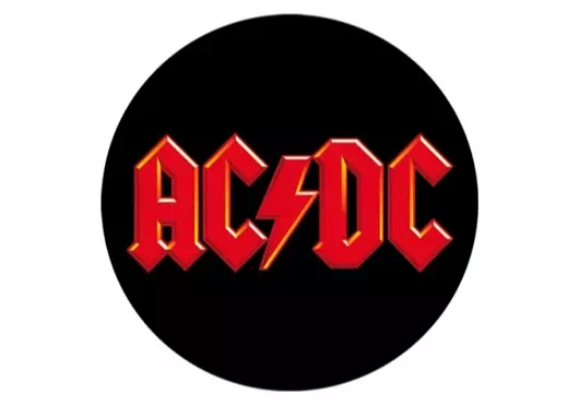
Here is another fabulous logo design idea with an impressive look. The logo is highly inspired by an electric design similar to its name. There is a lightning bolt that has taken its place between AC and DC.
All of these styles work together to make the logo more captivating and effective as a band logo. The color has a great role to play as well in the logo as you can see here.
Rolling Stones:
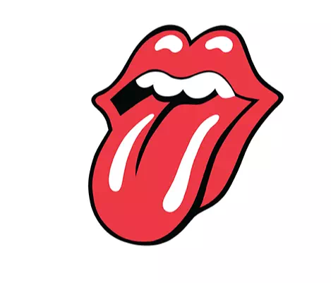
You may know about color psychology and in this logo, this term is clearly depicted. The hot red color is full of optimism and life. The tongue and lips give a bit of sexual connotation but that is not all of it. Such logos do not take much time to introduce the band to people and there lies its greatest success.
Oasis:
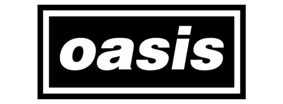
Do you recognize the font? Yes, it is the Helvetica black oblique font. This simple yet impressive logo tells you that you don’t always need to use the customized font to make your exclusive band logo.
You can very well do that with familiar fonts. Still, you do need a creative way to present all of that. The logo of the Band Oasis is the perfect example of this idea.
Bon Jovi:
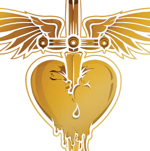
The logo of the famous musical band Bon Jovi is as incredible as its music. So both ways the band amazes its audiences. The golden heart shape that looks like a dagger too, has made the logo more stunning. The color is another of its wonderful feature.
For your exclusive band logo, you can follow a similar style. If you don’t want the band name turning into the logo, go for such designs.
Aerosmith:
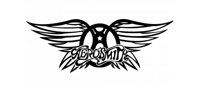
Ray Tabano, the guitarist of the band created the logo for Aerosmith. The wing’s shape has given the logo an impressive look making it more attractive and enchanting. The black and white color has added more excellence to it if truth be told.
The font is another of its chic features. This idea is for all those newcomers in the music band industry as they need immediate public attention for their success. Such a logo can make the way shorter.
Weezer:
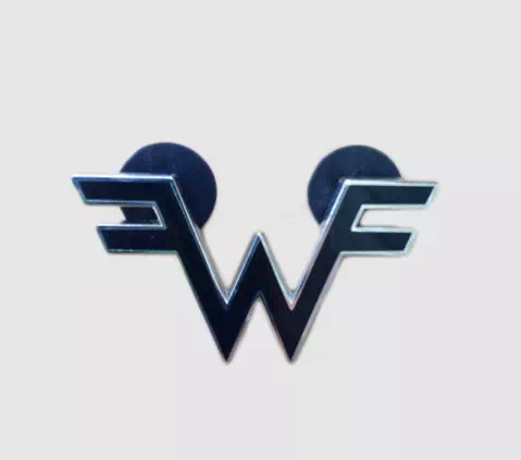
If you have a bit of knowledge of logos and their many types of designs, you may be familiar with this style. Many companies want their logo designed with the first letter of the name. Following that trend, band logos too can get their fascinating look and catchy style.
The technique is not that hard as well. All you need is to find a creative way to use the first letter of the band name. For clarification, the logo of Weezer is here.
Queen:
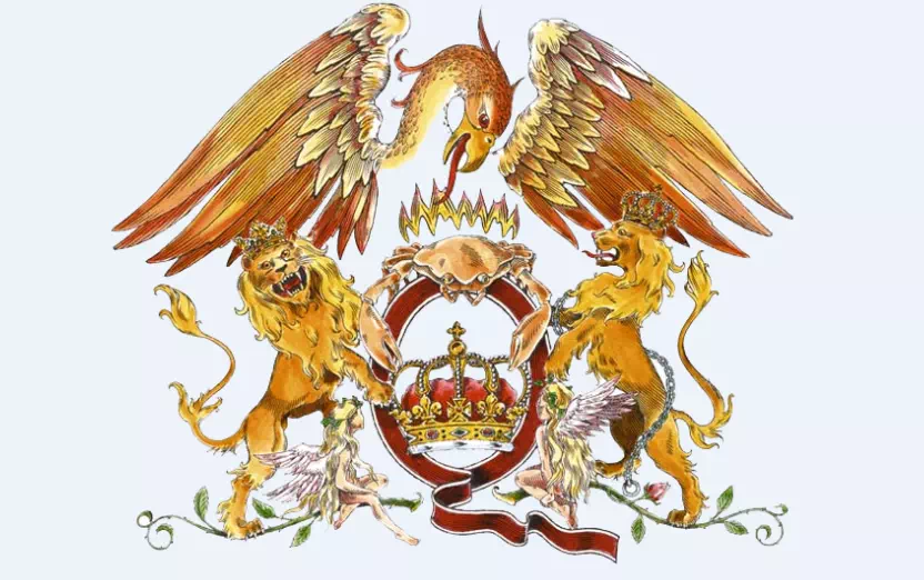
What good of the word ‘mesmerizing’, if we do not use it to describe such a logo. The Queen logo stands separate from all of its competitors for its super intriguing logo design and creative thought.
The logo is not to understand at very first glance. You have to spend some time getting all of the details clearly. That is why we say your creative ideas are essential for designing exclusive and recognizable logos for your band.
Iron Maiden:
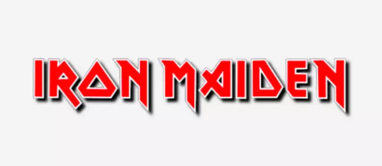
It is another successful band logo designed with typography. The logo of Iron Maiden stands apart from other band logos for its amazing red color and font style. Typography can make your logo more impressive and beautiful and that is what the logo reminds you of.
You can follow such a style to create your exclusive logo for the band. Choose the right color and font and you are good to go.
Run DMC:
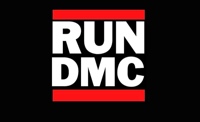
The logo of the band Run DMC is another typography-based logo design for bands. Here the logo has a super simple bold and gothic serif font. It does not have any fancy design yet does not fail to amaze people with its energetic look and straight perspectives.
If you want your musical band logo to possess no elaborate design, go for such techniques.
The Doors:
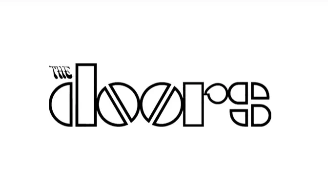
Typography can be done with complex ideas and the logo of The Doors shows you the way to do so. All the letters of the typography have a geometrical look. If you want to experiment with this style, this idea can help you.
Featuring no bold color or extra details, the look of the logo can hardly be denied. Following this example, start creating your very own exclusive band logo.
Wu Tang:
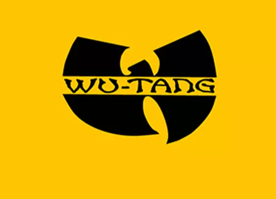
This batman-style logo got immense popularity from the very beginning of its publication. Their album covers kept using it because of its stunning look and marvelous design. Such logos are great for reminding people about the band and attracting them more to the music. Apart from the music, such logos get so popular that people start using them in other stuff as well. Now you can call it a successful logo for a music band for sure.
So now you see, band logos are all about experimenting with different styles that sometimes make people spellbound and astonished. The success of your band may depend on the music but the public attention comes from the logo design. So gather up all the ideas and create the one for your band.